I am disturbed by new ocean data from Greenland every morning before breakfast these days. In 2015 we built a station that probes the ocean below Petermann Gletscher every hour. Data travels from the deep ocean via copper cables to the glacier surface, passes through a weather station, jumps the first satellite overhead, hops from satellite to satellite, falls back to earth hitting an antenna in my garden, and fills an old computer.
-

- The Petermann data machine with batteries (yellow box), solar panels, electronics (white box), antenna, wind vane, and cables to ocean sensors on ground as last seen Aug.-2016.
-
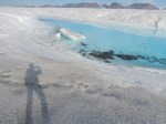
- Central channel at the end of the melt season in August 2015. Shadow of photographer for scale.
-
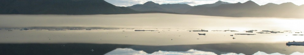
- View to the north-east across Petermann Gletscher from helicopter in August 2015. The growing crack is barely visible emanating from the shear zone near the 1000-m high cliff.
A 7-minute Washington Post video describes a helicopter repair mission of the Petermann data machine. The Post also reported first result that deep ocean waters under the glacier are heating up.

Sketch of Petermann Gletscher’s ice shelf with ocean sensor stations. The central station supports five cabled sensors that are reporting hourly ocean temperatures once every day. Graphics made by Dani Johnson and Laris Karklis for the Washington Post.
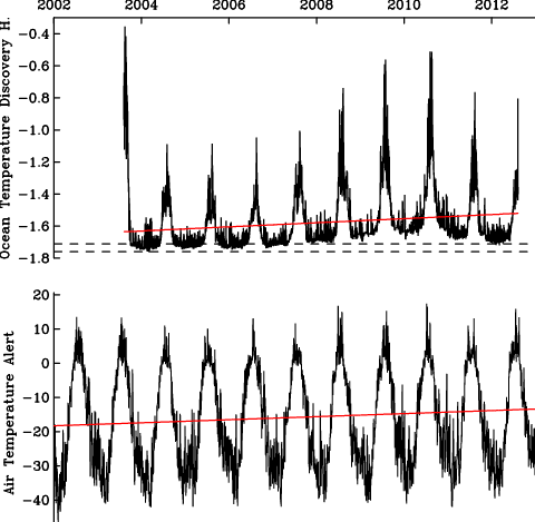
After two years I am stunned that the fancy technology still works, but the new data I received the last 3 weeks does worry me. The graph below compares ocean temperatures from May-24 through June-16 in 2017 (red) and 2016 (black). Ignore the salinity measurements in the top panel, they just tell me that the sensors are working extremely well:

Ocean temperature (bottom) and salinity (top) at 450-m depth below Petermann Gletscher from May-25 through June-16 2017 (red) and 2016 (black). Notice the much larger day-to-day temperature ups and downs in 2017 as compared to 2016. This “change of character” worries me more than anything else at Petermann right now.
The red temperature line in the bottom panel is always above the black line. The 2017 temperatures indicate waters that are warmer in 2017 than in 2016. We observed such warming for the last 15 years, but the year to year warming now exceeds the year to year warming that we observed 10 years ago. This worries me, but three features suggest a new ice island to form soon:
First, a new crack in the ice shelf developed near the center of the glacier the last 12 months. Dr. Stef Lhermitte of Delft University of Technology in the Netherlands discovered the new crack two months ago. The new rupture is small, but unusual for its location. Again, the Washington Post reported the new discovery:

New 2016/17 crack near the center of Petermann Gletscher’s ice shelf as reported by Washington Post on Apr.-14, 2017.
Second, most Petermann cracks develop from the sides at regular spaced intervals and emanate from a shear zone at the edge. Some cracks grow towards the center, but most do not. In both 2010 and 2012 Manhattan-sized ice islands formed when a lateral crack grew and reached the central channel. The LandSat image shows such a crack that keeps growing towards the center.

Segment of Petermann Gletscher from 31 May 2017 LandSat image. Terminus of glacier and sea ice are at top left.
And finally, let’s go back to the ocean temperature record that I show above. Notice the up and down of temperature that in 2017 exceeds the 2016 up and down range. Scientists call this property “variance” which measures how much temperature varies from day-to-day and from hour-to-hour. The average temperature may change in an “orderly” or “stable” or “predictable” ocean along a trend, but the variance stays the same. What I see in 2017 temperatures before breakfast each morning is different. The new state appears more “chaotic” and “unstable.” I do not know what will come next, but such disorderly behavior often happens, when something breaks.
I fear that Petermann is about to break apart … again.
![Icebreaker taking on waves on the stern during a fall storm in the Beaufort Sea in October 2004. [Photo Credit: Chris Linder, Woods Hole Oceanographic Institution]](https://icyseas.org/wp-content/uploads/2016/06/picture1.png)


