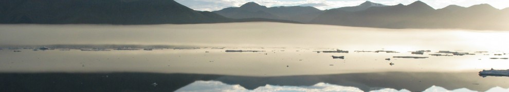
While cables are designed at a small company in southern California,while instruments are shipped to friends at the British Antarctic Survey in England, while instrument locations are contemplated by a small group of scientists, technicians, and graduate students, I am also on a journey back in time to check up on the heart beat of the air we breath and the oceans we sail. The Arctic heartbeat to me is the annual change from the total darkness of polar night to total sunlight of polar day. This cycle, this heartbeat takes a year. There is 24 hours of day in summer the same way that there is 24 hours of night now. Let me first show, however, where we are heading before I look at the heartbeat.
I love making maps and this is a rich and pretty one that shows North America from the top where Petermann Fjord and Glacier are (tiny blue box on left map). The colors are water depths and land elevations. The thick dotted red line is where a very large iceberg from Petermann traveled within a year to reach Newfoundland. Teresa, one of the contributors to my crowd-funding project, sailed up there to Newfoundland to see this iceberg. And she made a movie out this voyage. So, what happens up there in northern Greenland only takes a year, maybe two, to reach our more balmy shores. What happens in Greenland does NOT stay in Greenland. Vegas, Nevada this is not.

Now on to the map on the right. This is the tiny blue box made much larger. It looks like a photo, and in a way it is, but a photo taken by a satellite, well, only one “channel” of this specific satellite, the many shades of gray are mine, it is NOT the real color. The glacier is in the bottom right as the white tongue sticking out towards 81 N latitude. Red lines there are water depths of 500 and 1000m. The blue dot in the top-left is where I had to leave an ocean sensor in a shallow bay for 9 years, because we could not get there to retrieve it for 6 years. Lucky for me (well, some smart design helped), the instrument was still there, collecting and recording data that we knew nothing about for 9 long years. It took smart and hardy fishermen from Newfoundland aboard the CCGS Henry Larsen to dangle my sensor out of the icy waters. And here is the heart beat it revealed:
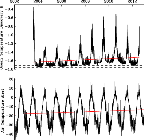
Top graph is ocean temperature, bottom panel is air temperature nearby. And as you go from left to right, we move forward in time starting in 2002 until the end of 2012 when the last ocean measurements were made. The red lines are a linear trend that represents local (as opposed to global) warming. Both go up which means it gets warmer, but careful, the bottom one for air is no different from a straight line with zero slope meaning no warming. It does go up, you say correctly, but if I do formal statistics, this slope is no different from zero just due to chance. The top curve for the ocean, however, is very different. It does not look different, but the same statistics tell me that the warming is NOT due to chance alone. Oh, in case you wondered, the two dashed lines in the top panel are the temperatures at which seawater freezes and forms ice for the salinity range we see and expect at this embayment. As you add salt to water, it freezes at a lower temperature. This is why we put salt on our roads in winter, it makes the water freeze less fast.
I am a doctor, so here is my conclusion: Ocean heart beat is a little irregular and the trend is not good news for the ice. Air heart beat looks normal, the trends may need watching, but I am not too worried about that just yet. Watch the oceans … that’s where the heat and the action is these days.


Reblogged this on David Fratantoni's Blog.