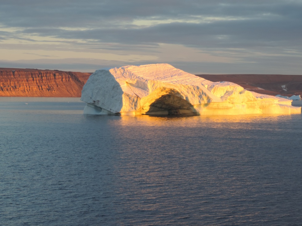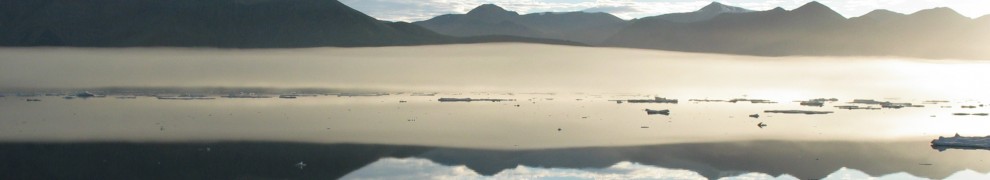
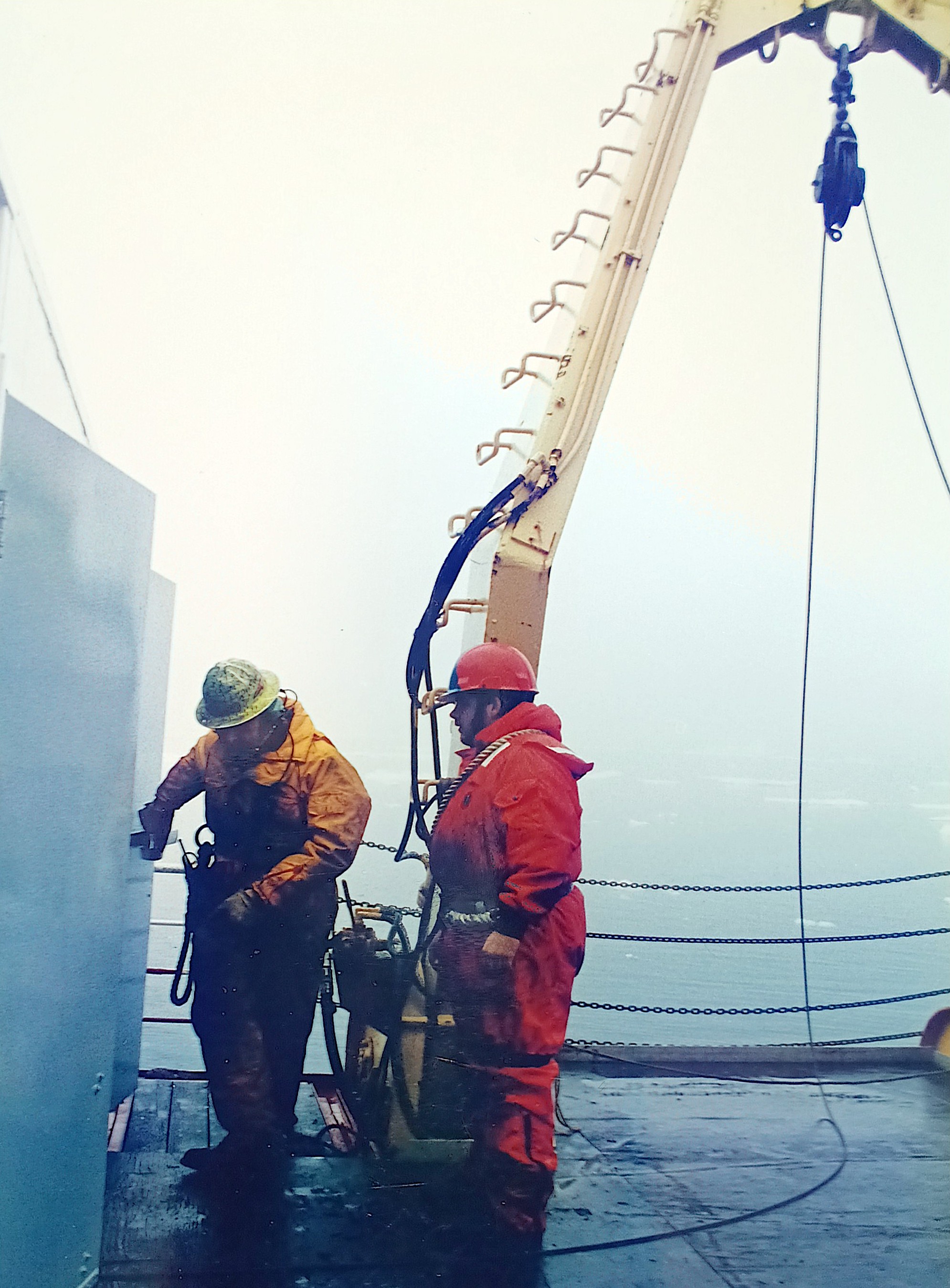
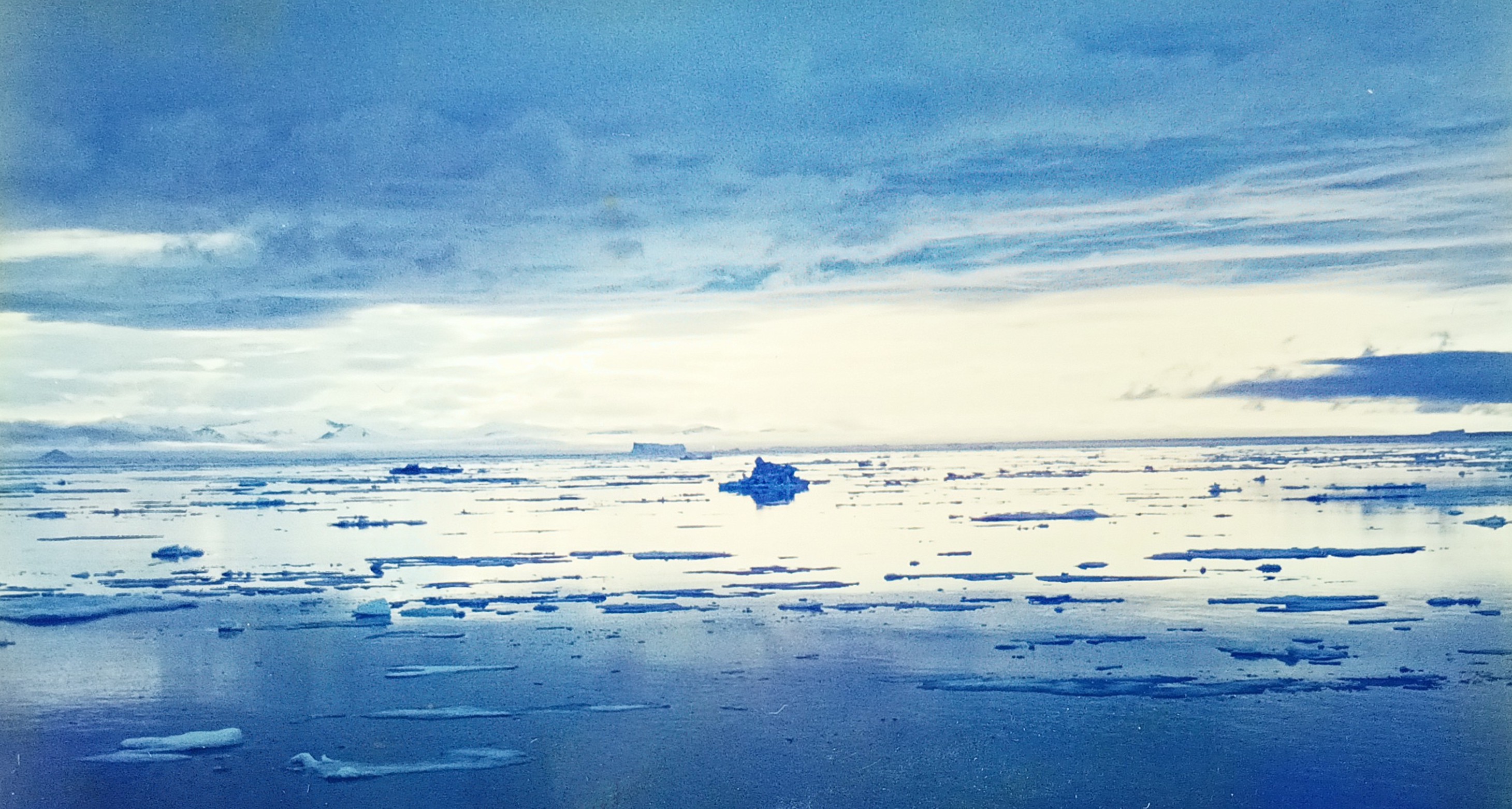
Science and Greenland both combine discovery, adventure, and diverse people. I do this work free of academic constraints, responsibilities, and pay, because I retired from my university three months ago drawing on savings that accumulated since 1992 with my first job in San Diego, California. It was there and then, that my interest in polar physics started, but my first glimpse of Greenland had to wait until 1997 when a Canadian icebreaker got me to the edge of the ice in northern Baffin Bay between Canada and Greenland. It was a cold and foggy summer day as these pre-digital photos show:
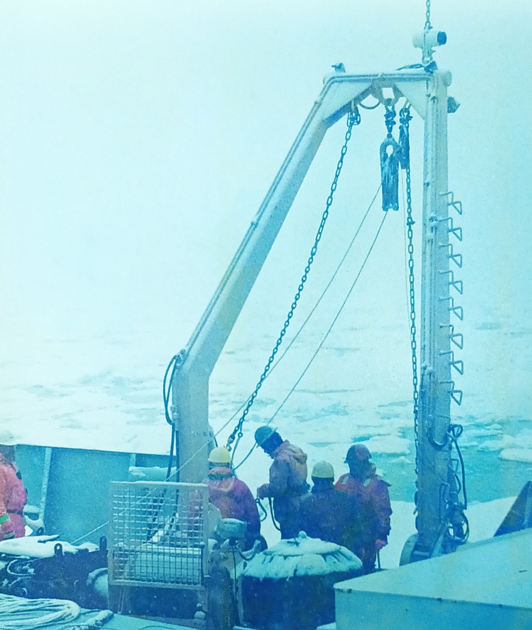
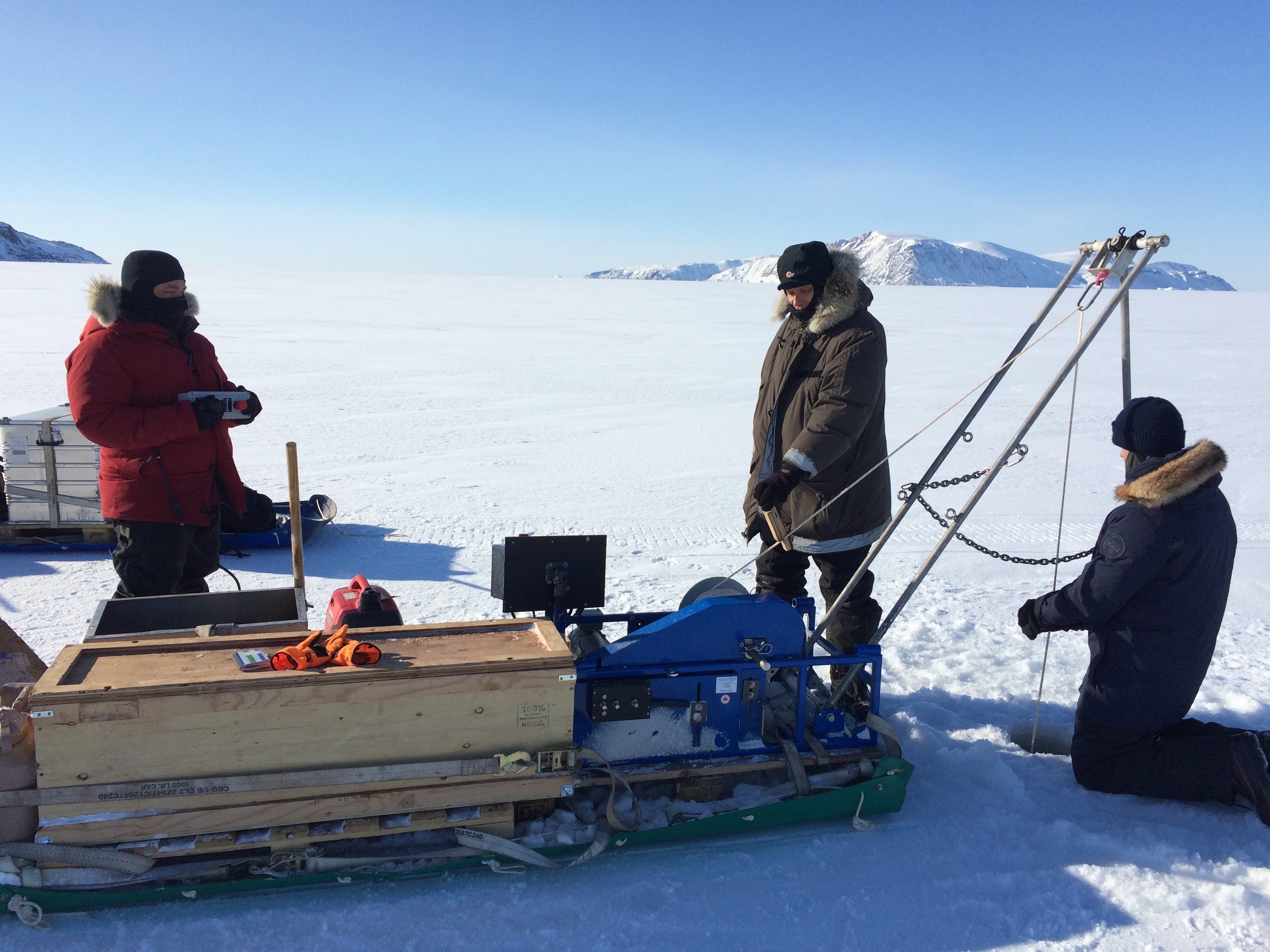
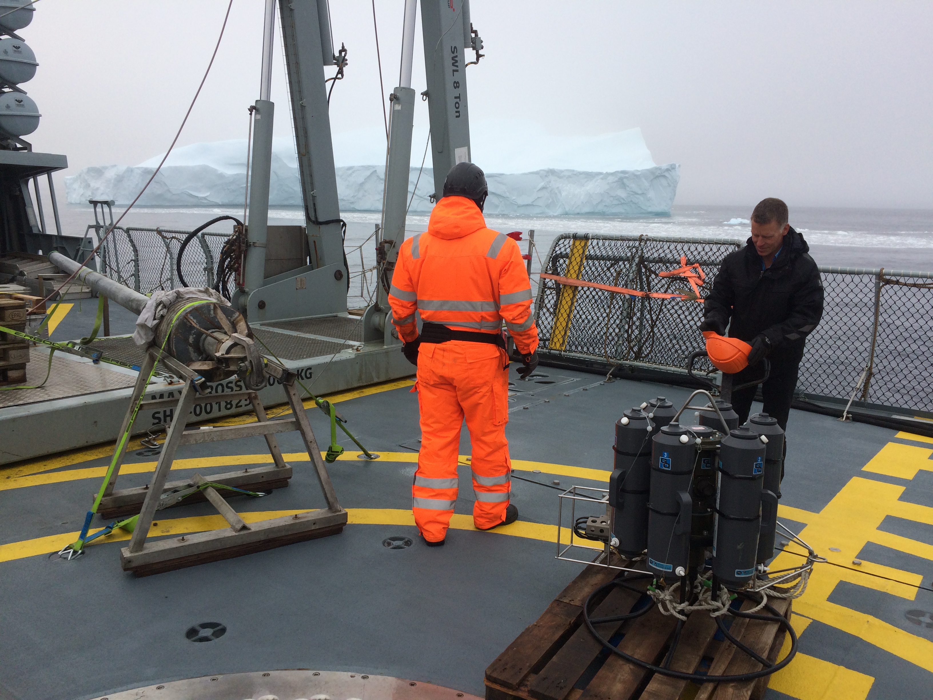
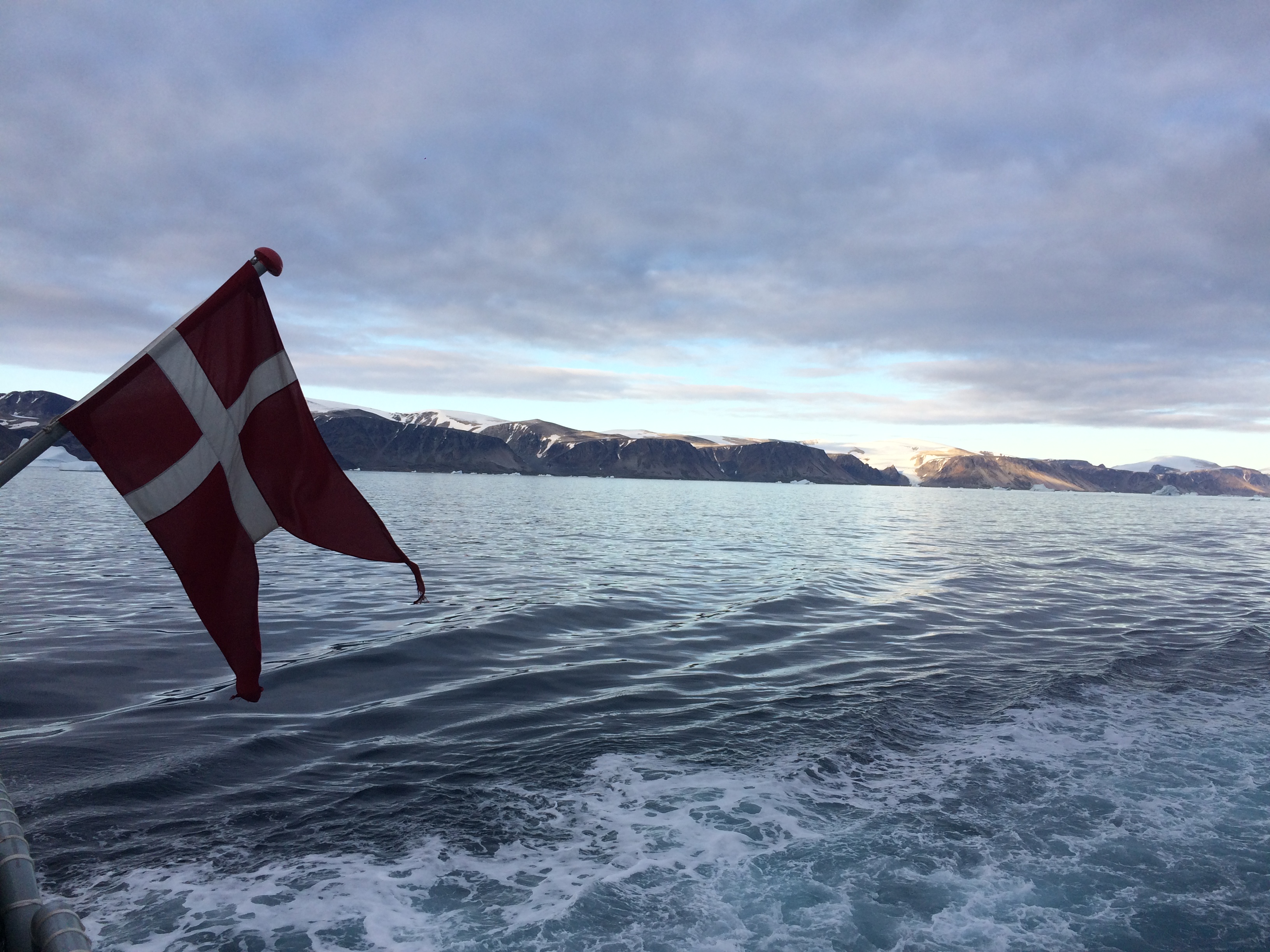
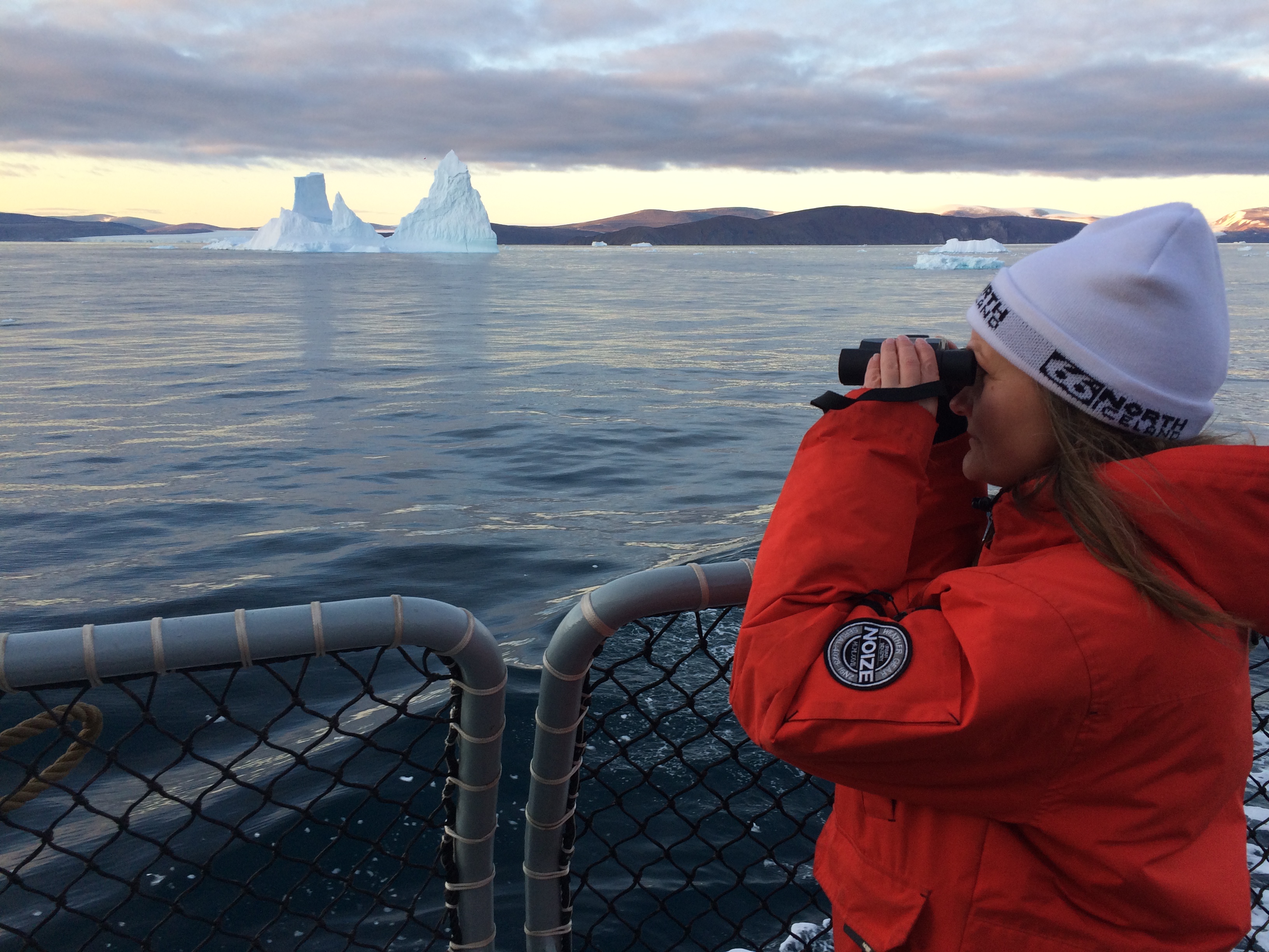
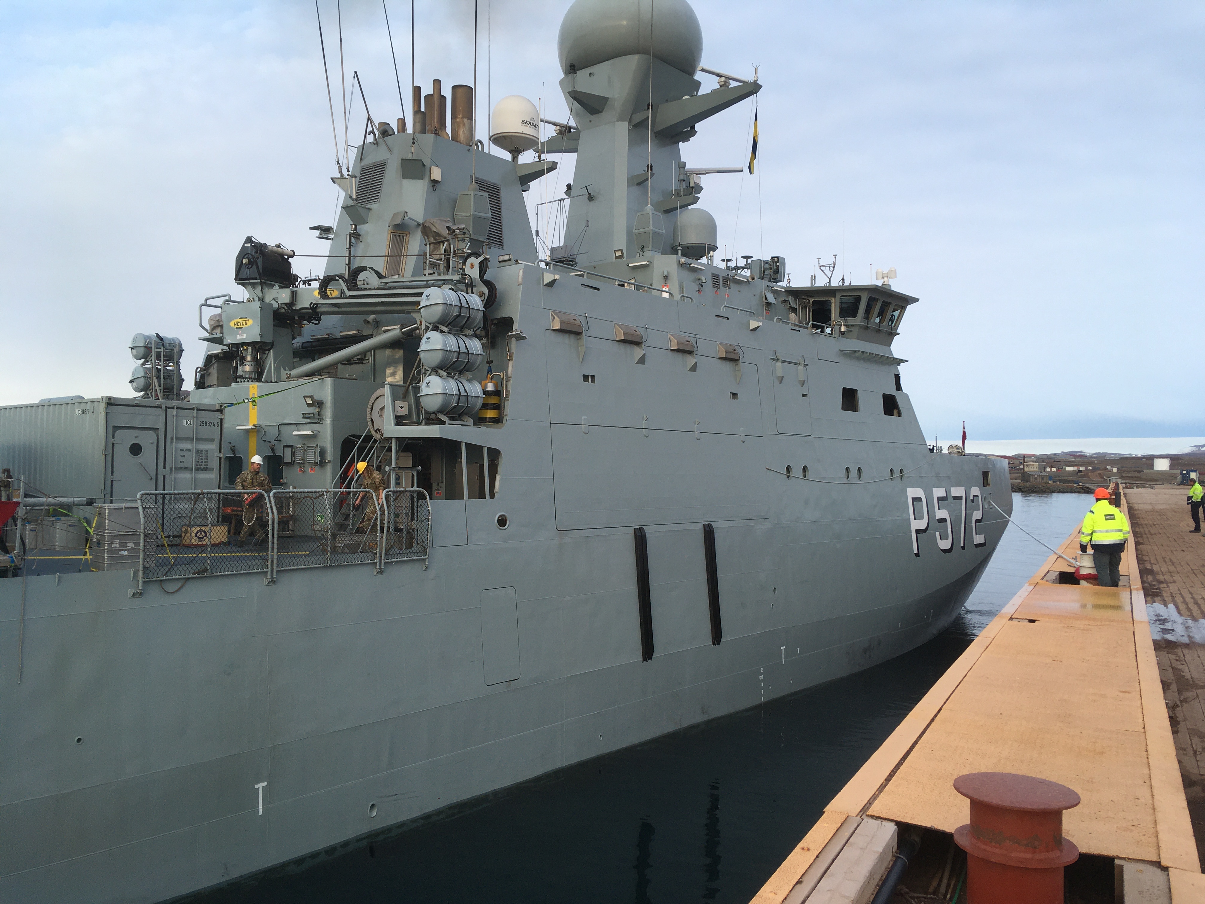
Almost 25 years later I visited the area again with Her Danish Majesty Ship HDMS Lauge Koch, a Danish Navy vessel, which surveyed the coastal waters between Disko Bay in the south and Thule Air Base (now Pituffik Space Base) in the north. Two Danish goverment agencies led this expedition: the Geological Survey of Denmark and Greenland (Dr. Sofia Ribeirio, GEUS) and the Danish Metorological Institute (Dr. Steffen Olsen, DMI). Our small team of 11 scientists and 12 soldiers surveyed the seafloor with fancy acoustics, drilled into the bottom with piston corers, fished for plankton with towed nets, and collected water properties with both electronics and bottle samples. As this was during the Covid-19 pandemic, all scientists had to be both vaccinated and tested prior to boarding the flight from Copenhagen to Greenland. We also quarantined for 3 days in Aasiaat, Greenland prior to boarding the ship.
Now in retirement, I thoroughly enjoy the time to just just revisit the places and people via photos that finally get organized. More importantly, I finally feel free to explore the data fully that we collected both on 14 separate expeditions to Greenland between 1997 and 2021. For example, only in retirement did I discover that Baffin Bay was visited in 2021 by both a Canadian and an American in addition to our Danish ship. Data from these separate Baffin Bay experiments are all online and can be downloaded by anyone. I did so and processed them for my own purposes. Furthermore, NASA scientists of the Ocean Melts Greenland program flew airplanes all over Greenland to drop ocean sensors to profile and map the coastal ocean with fjords and glaciers hard to reach by ships. All these are highly complementary data that describe how icy glaciers, deep fjords, coastal oceans, and deep basins connect with each other and the forces that winds, sea ice, and abundant icebergs impose on them.
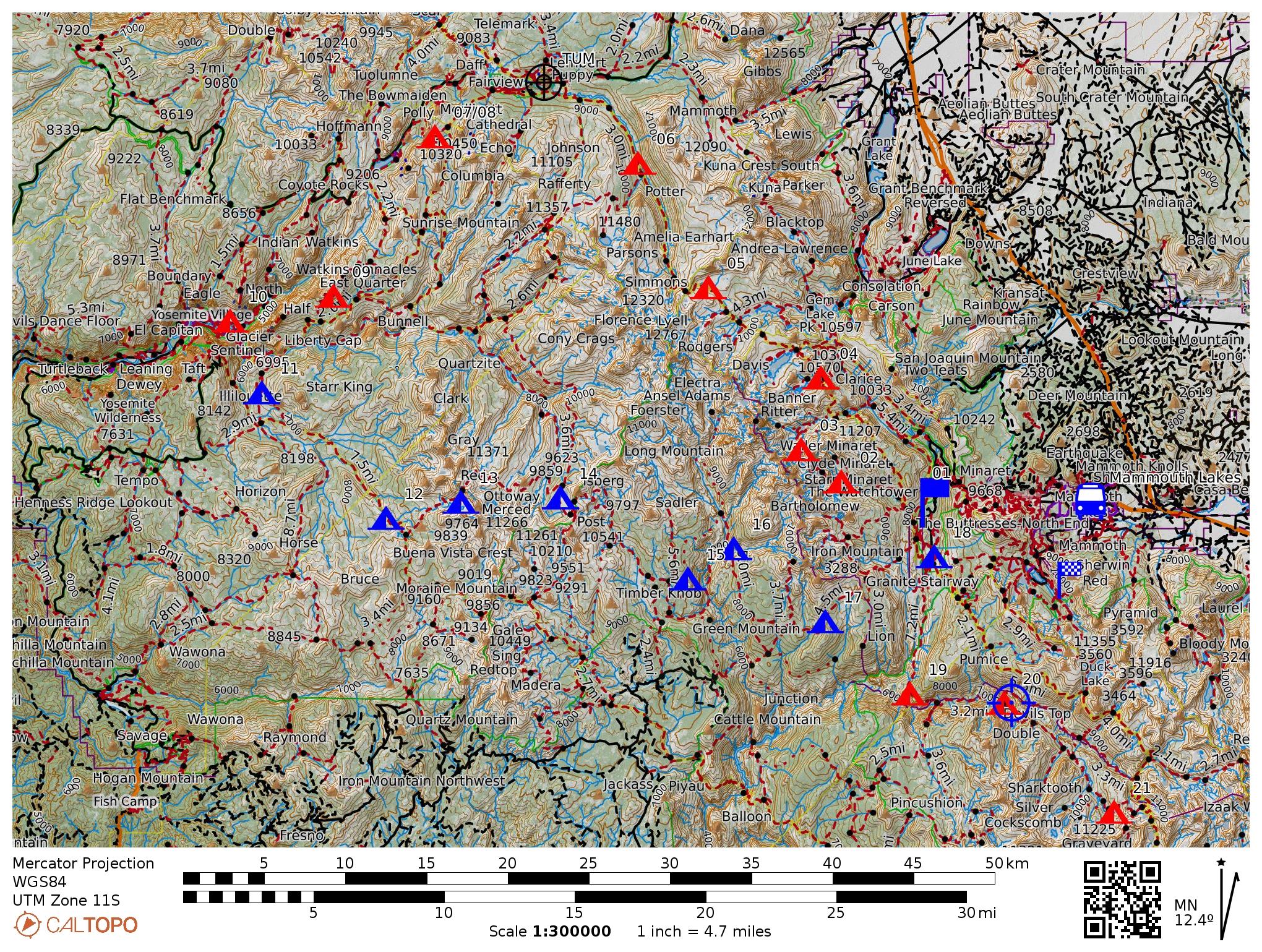
It requires a bit of skill and computer code, however, to process data from different ships, countries, and sensors into a common format to place onto a common map for different years, but here is one such attempt to organize:
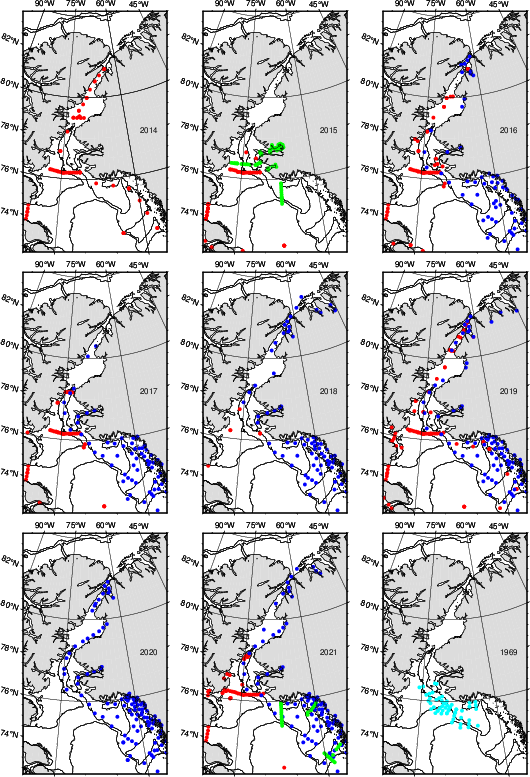
There is one map for each of 9 years, i.e., station locations are shown in a top (2014, 2015, 2016), center (2017, 2018, 2019), and bottom row (2020, 2021, 1968). Land is gray with Canada on the left (west) and Greenland on the right (east) while the solid contour lines represent the 500-m and 1000-m water depth. Each colored symbol represents one station where the ship stopped to deploy a sensor package to measure temperature, depth, and salinity of the ocean water from the surface to the bottom of the ocean adjacent to the ship. The different colors represent data from Canada in red, Denmark in green, and USA in blue. The light blue color represents historical data from a study that investigated the waters after a nuclear armed B-52 bomber crashed into the ocean near Thule/Pituffik on 17 Jan. 1968 with one nuclear war head still missing. A Wikipedia story called 1968 Thule Air Base B-52 Crash provides details, references, and Cold War context, but lets return to the data and ocean physics:
Notice a single red dot near the bottom center of some maps such as 2015, 2017, or 2021. For this single dot I show the actual temperature and salinity data and how it varies with depth (labeled pressure, at 100-m depth the pressure is about 100 dbar) and from year to year:
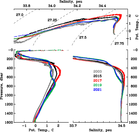
The two bottom panels show how temperature (left) and salinity (right) change with depth (or pressure). Notice that the coldest water near freezing temperature of -1.8 degrees Celsius (29 Fahrenheit) occurs between 30-m and 200-m depth (30 to 200 dbar in pressure). Below this depth the ocean water actually becomes warmer to a depth of about 500-600 m to then become cooler again. The effects of pressure on temperature are removed, this is why I call this potential temperature and label it “Pot. Temp.” The warmest waters at 600-m depth are also the most salty (about 34.5 grams of salt per 1000 grams of water). This saltiness makes this water heavier and denser than the colder waters above. This is a common feature that one finds almost anywhere in polar regions. The top panel shows the same data without reference to depth (or pressure), but contours of density show how this property changes with temperature and salinity. It takes a little mental gymnastic to “see” how density always increases as pressure increases, but the main thing here is that both salinity and temperature can change the density of seawater.
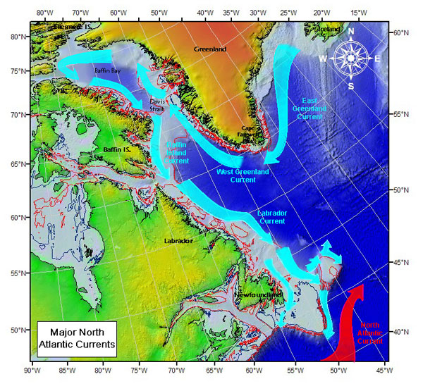
Sketch of ocean current systems off Greenland and eastern Canada. Colors represent topography of ocean, land, and Greenland ice sheet.
U.S. Coast Guard, International Ice Patrol
The origin of the warmer (and saltier) waters is the Atlantic Ocean to the south. Currents move heat along the coast of Greenland to the north. Icebergs in Baffin Bay extend into this Atlantic Layer and thus move first north along the coast of Greenland before turning west in the north and then south along the coast of Canada. This deep ocean heat does reach coastal tidewater glaciers which are melted by this warm ocean water. So the year-to-year changes of temperature and salinity determine in part how much the coastal glaciers of Greenland melt. The temperature and salinity maxima change from year to year being warmest in 2015 and 2017 and coldest in 2019 and 2021. No “global warming” here, but notice what happens closer to the bottom at 1500-m, say. These waters are separated from the Atlantic and Arctic Oceans to the south and north by water depths that do not exceed 600-m in the south and 400-m in the north. These almost stagnant waters increase their temperatures steadily from 2003 to 2015 to 2017 to 2019 to 2021. This is the global warming signal.
My former student Melissa Zweng published a more thorough and formal study in 2006 using all then available data from Baffin Bay between 1916 and 2003. Her Figure-7 shows the results for those parts of Baffin Bay that are deeper than 2000-m for two different depth ranges. Notice that the year to year variations (up and down) is small, but a steady increase in temperature is apparent from perhaps -0.3 Celsius in 1940 to -0.05 in 2003 for the 1400-1600 m depth range. We also did a very formal error analysis on the straight line we fitted to the data and find that deep temperatures increase by +0.03 C/decade. We are 95% sure, that the error or uncertainty on this warming is +/- 0.015 C/decade. So there is a 1 in 20 chance, that our deep warming trend is below +0.005 C/decade and an equal 1 in 20 chance, that our warming trend exceed +0.045 C/decade. In 19 out of 20 cases the (unknown) true warming value is between 0.005 and 0.045 C/decade.
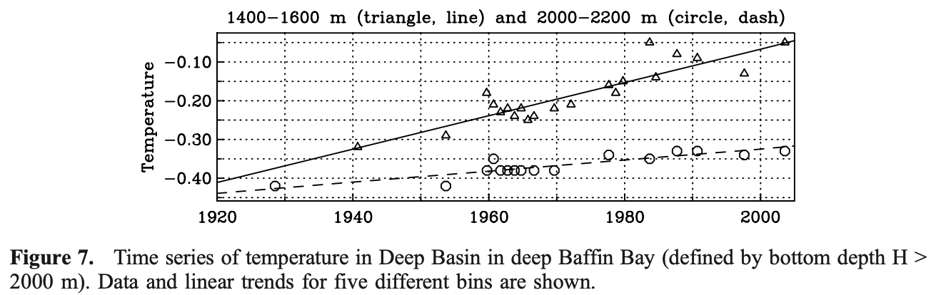
So, more than 20 years have passed since Melissa’s work. The data I here showed between 2003 and 2021 thus gives us a chance to test our statistical predictions that we made 20 years ago. So, deep temperatures should be between 0.01 and 0.09 degrees Celsius warmer than they were in 2003. I have not done this test yet, but science is fun even if the data are old.
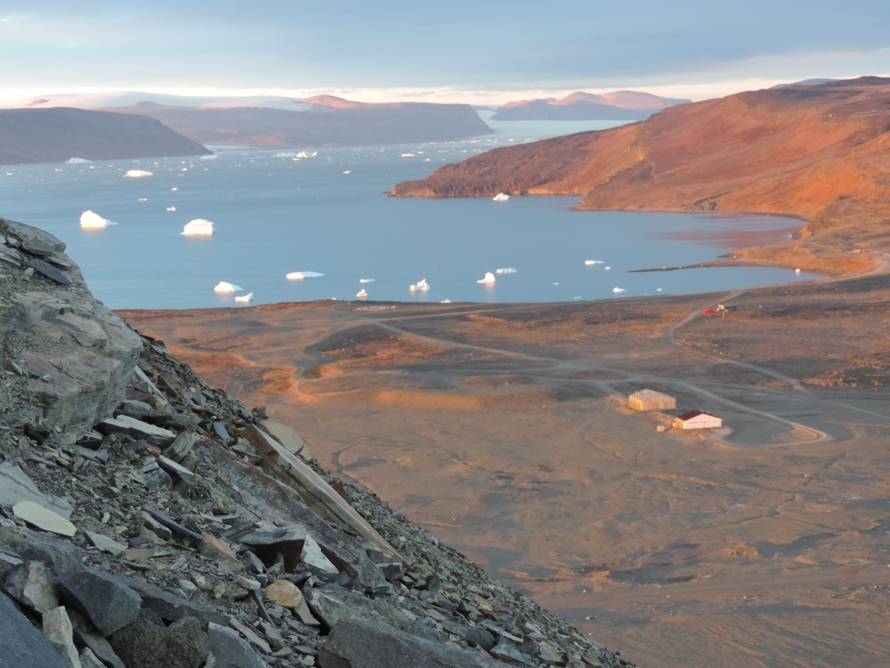
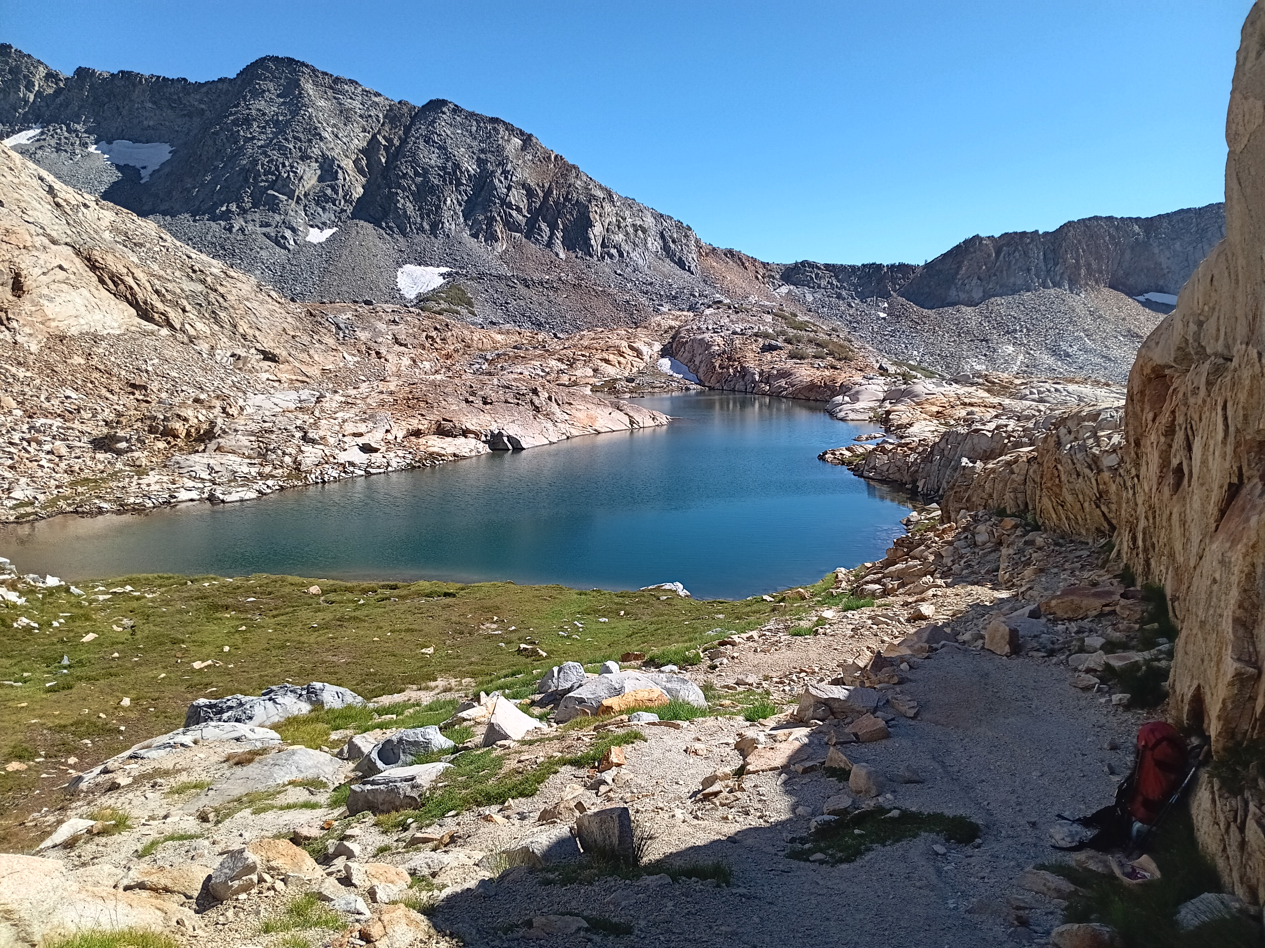
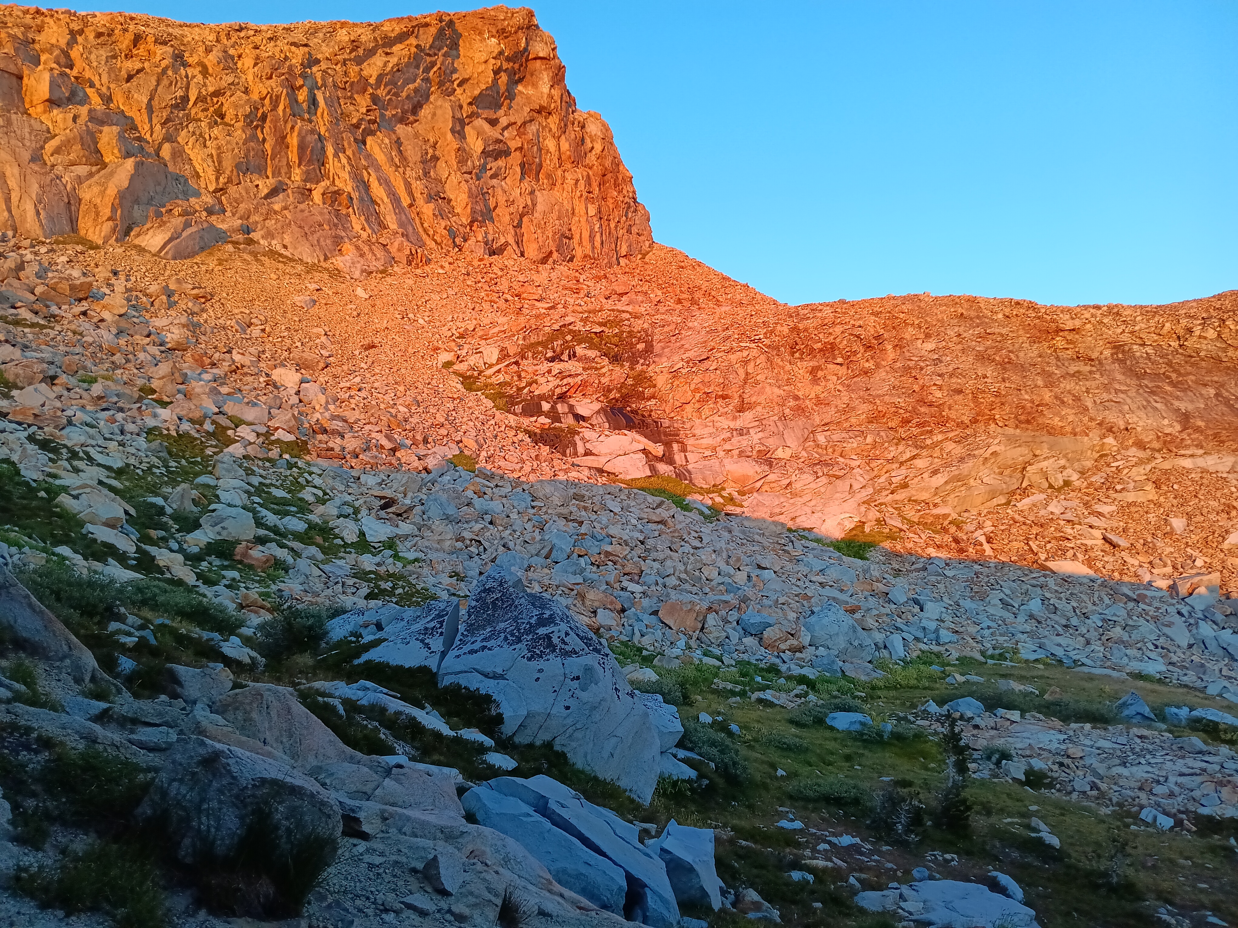
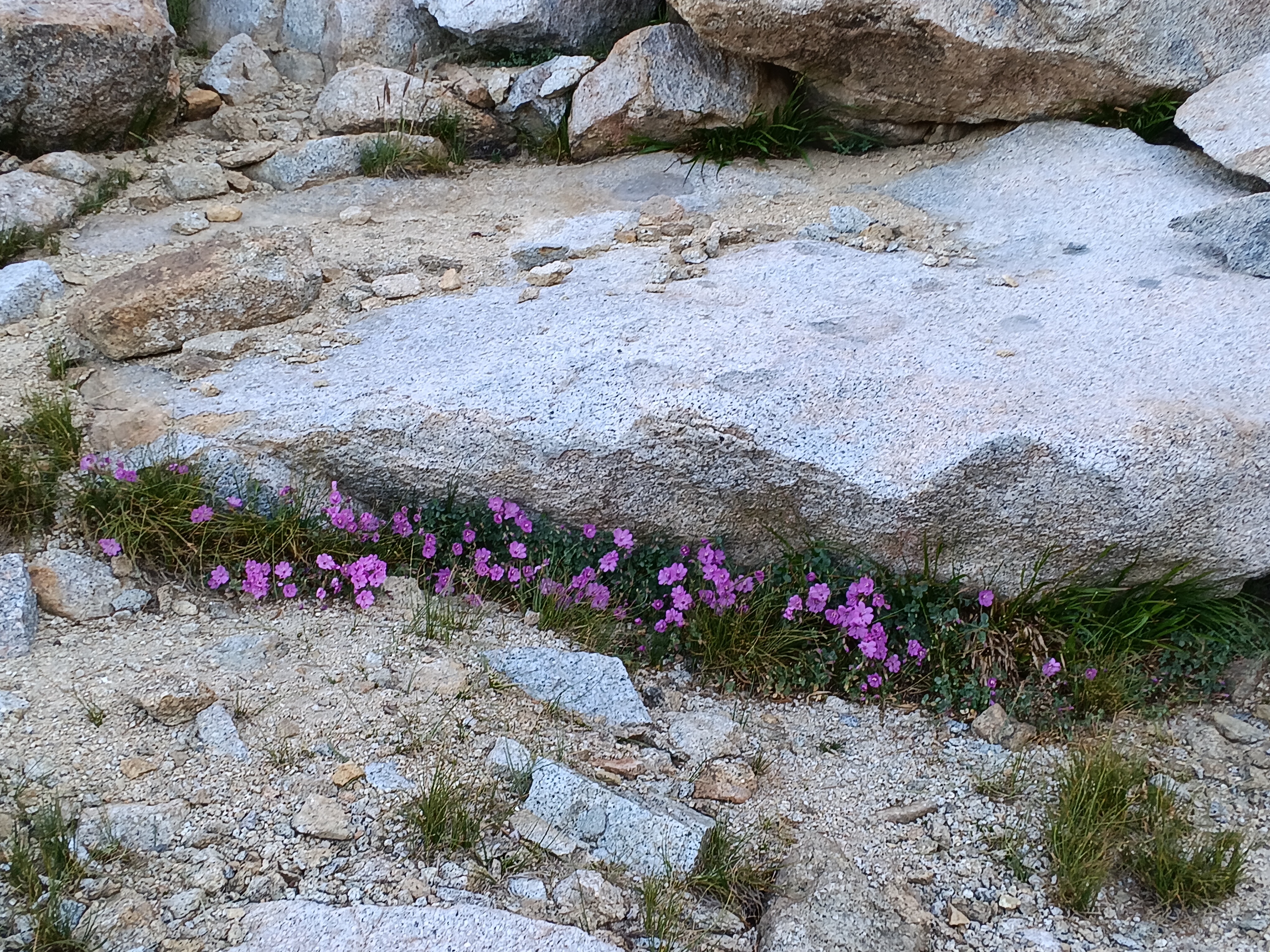
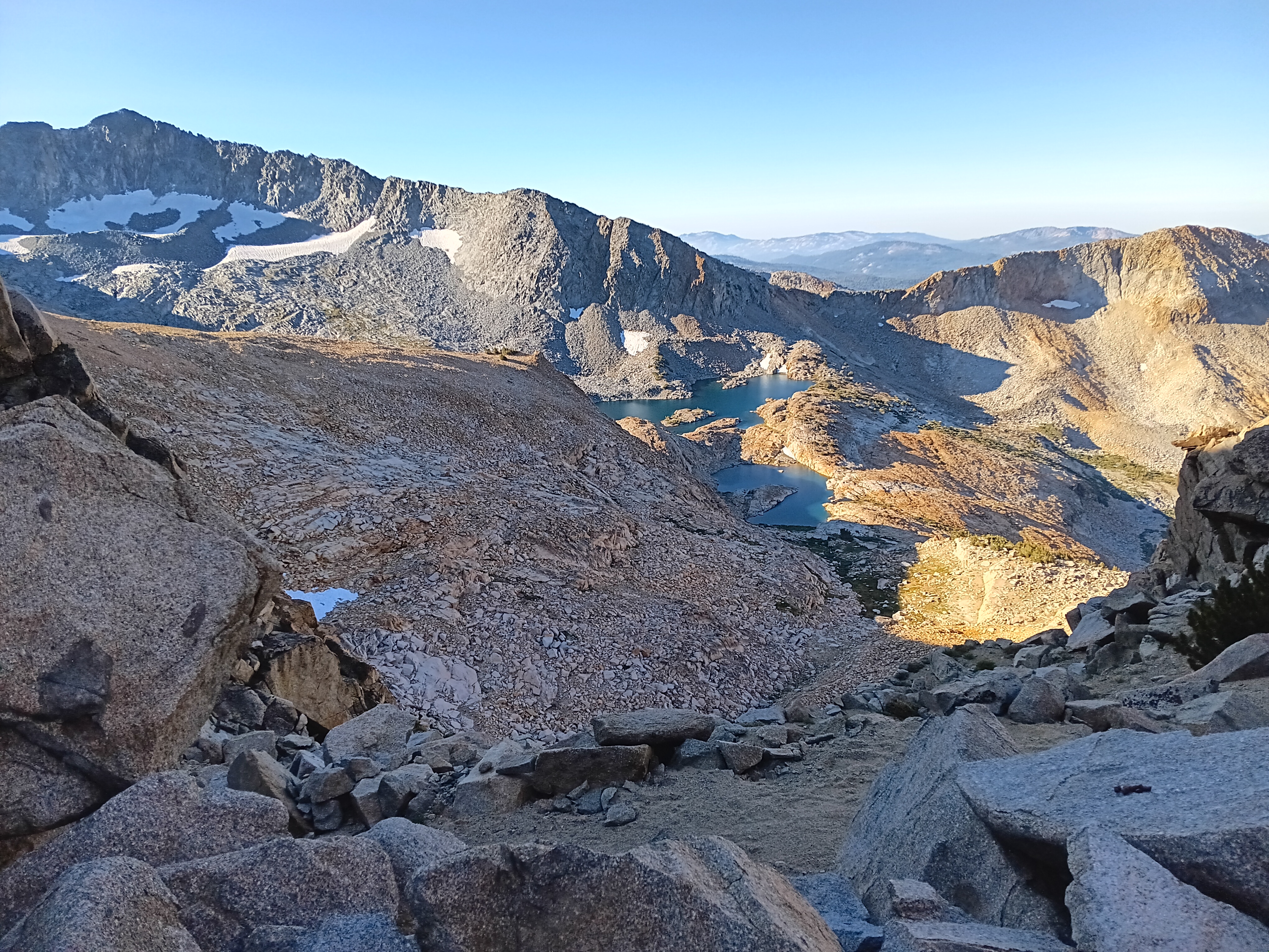
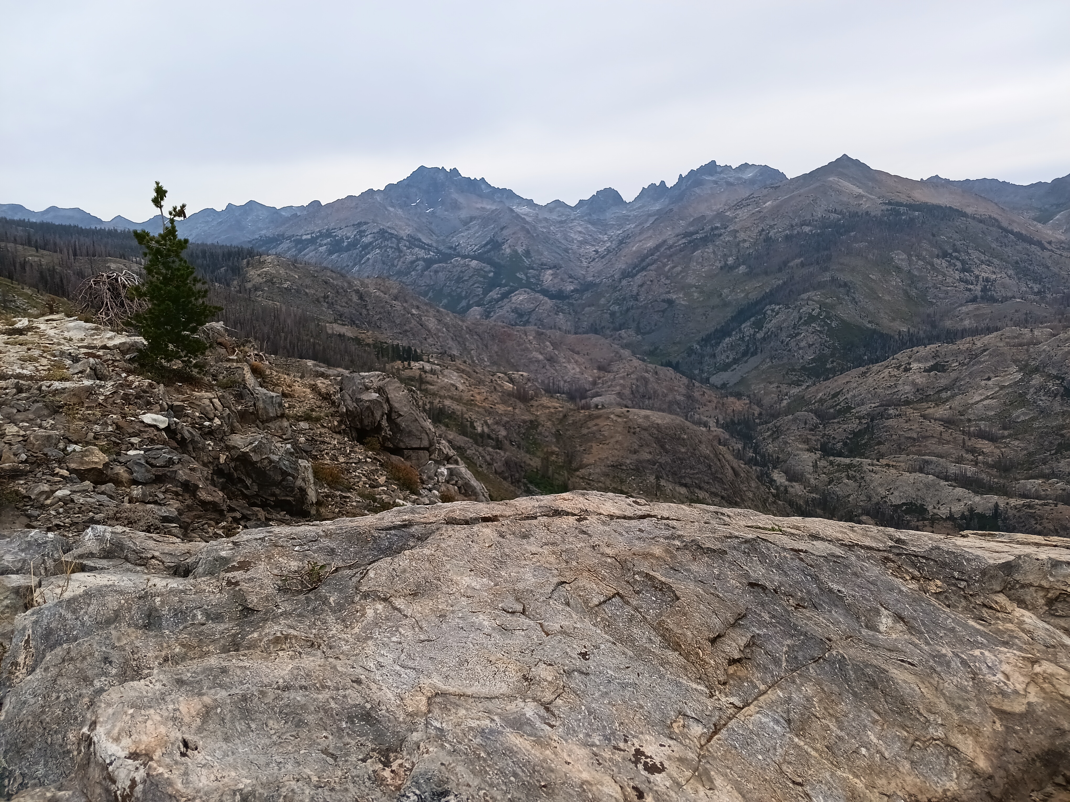
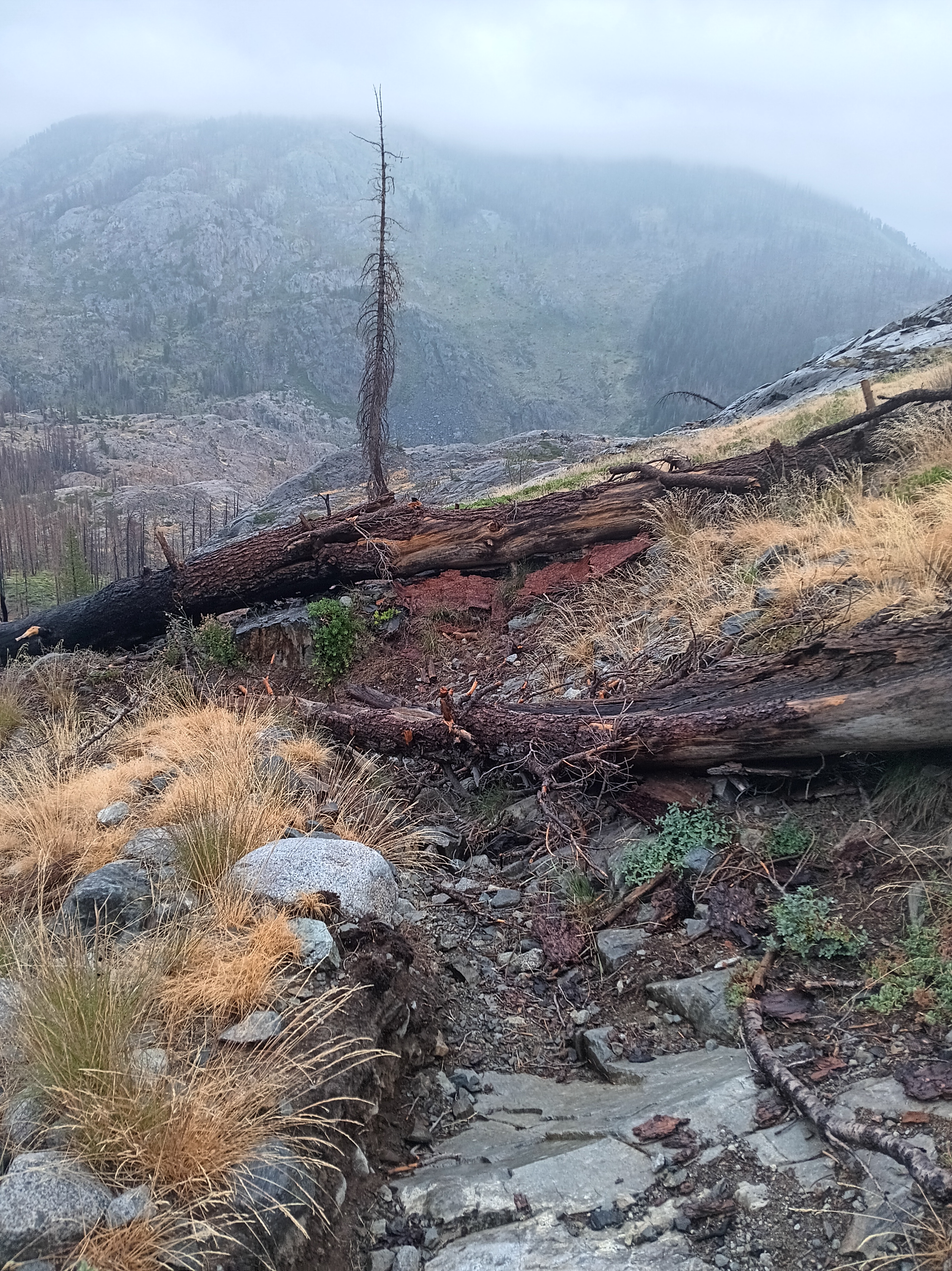
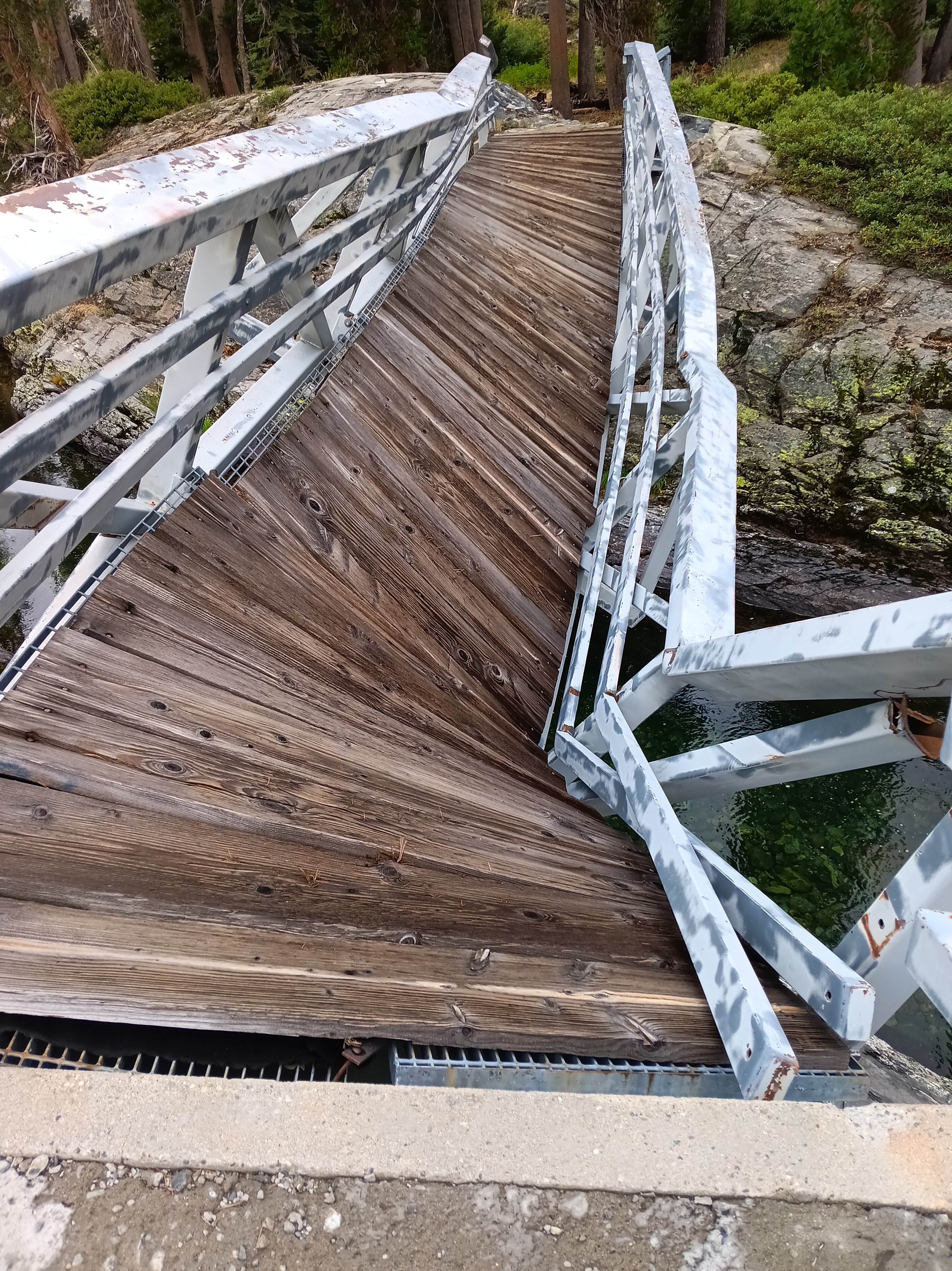
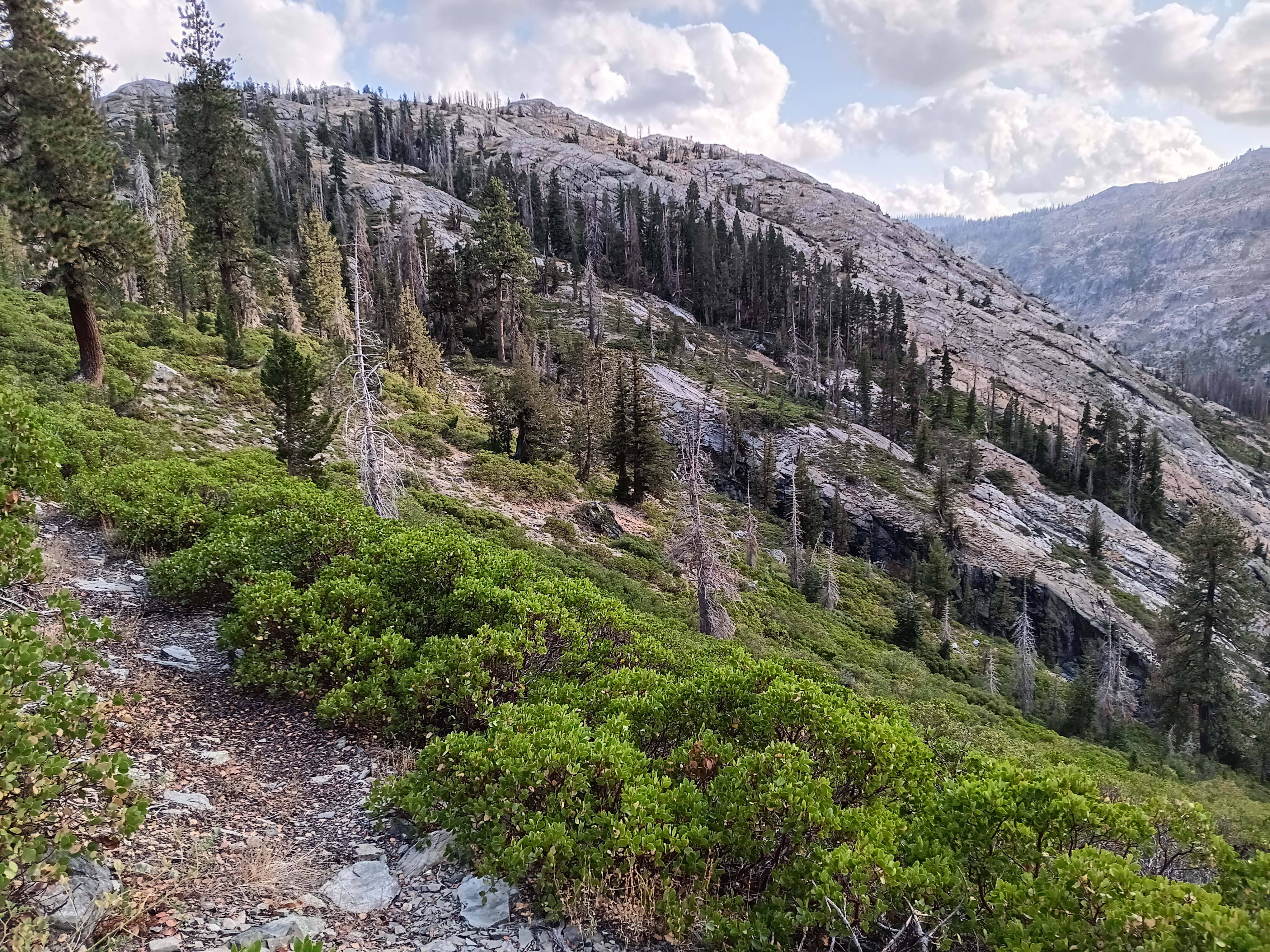
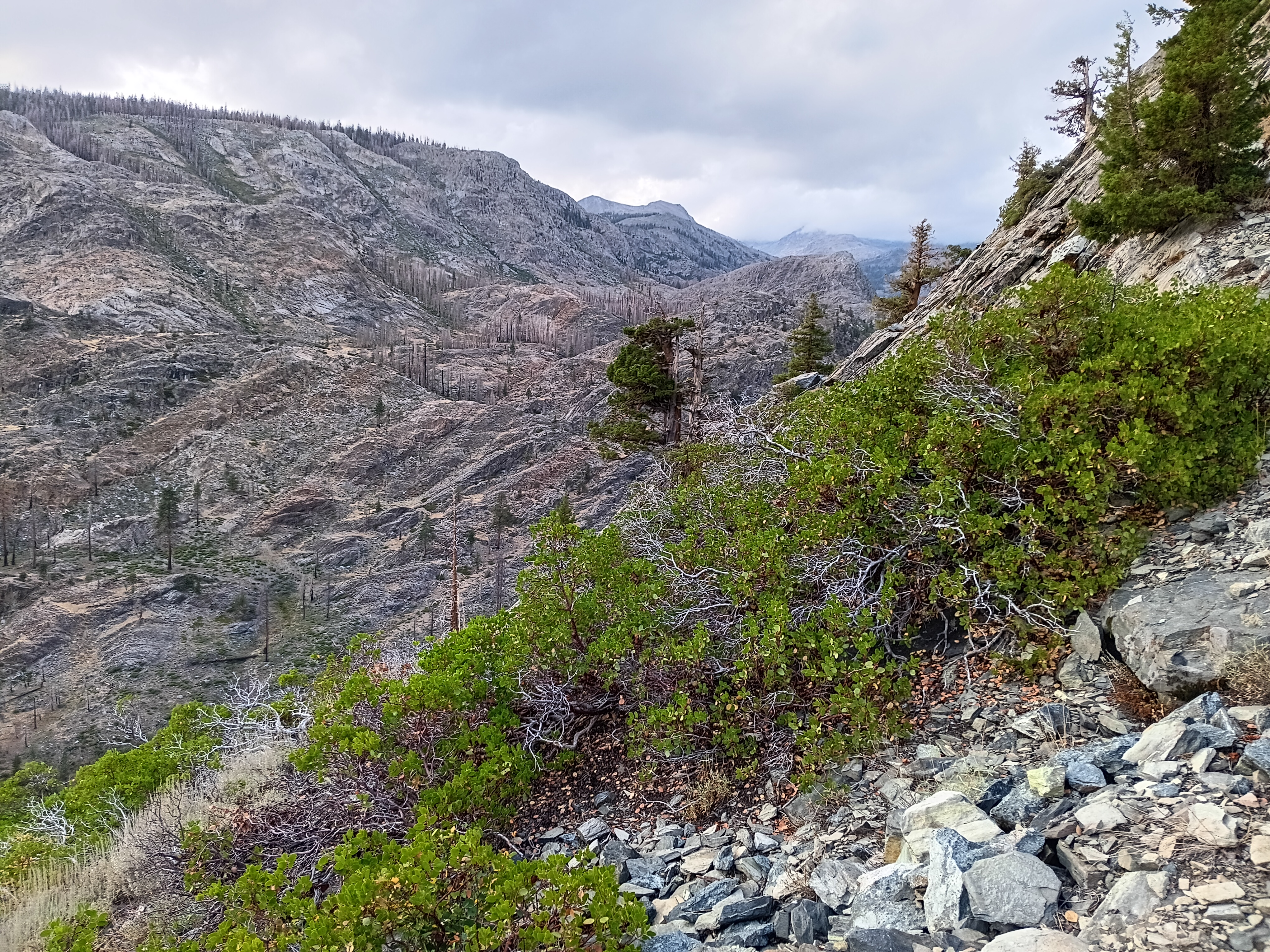
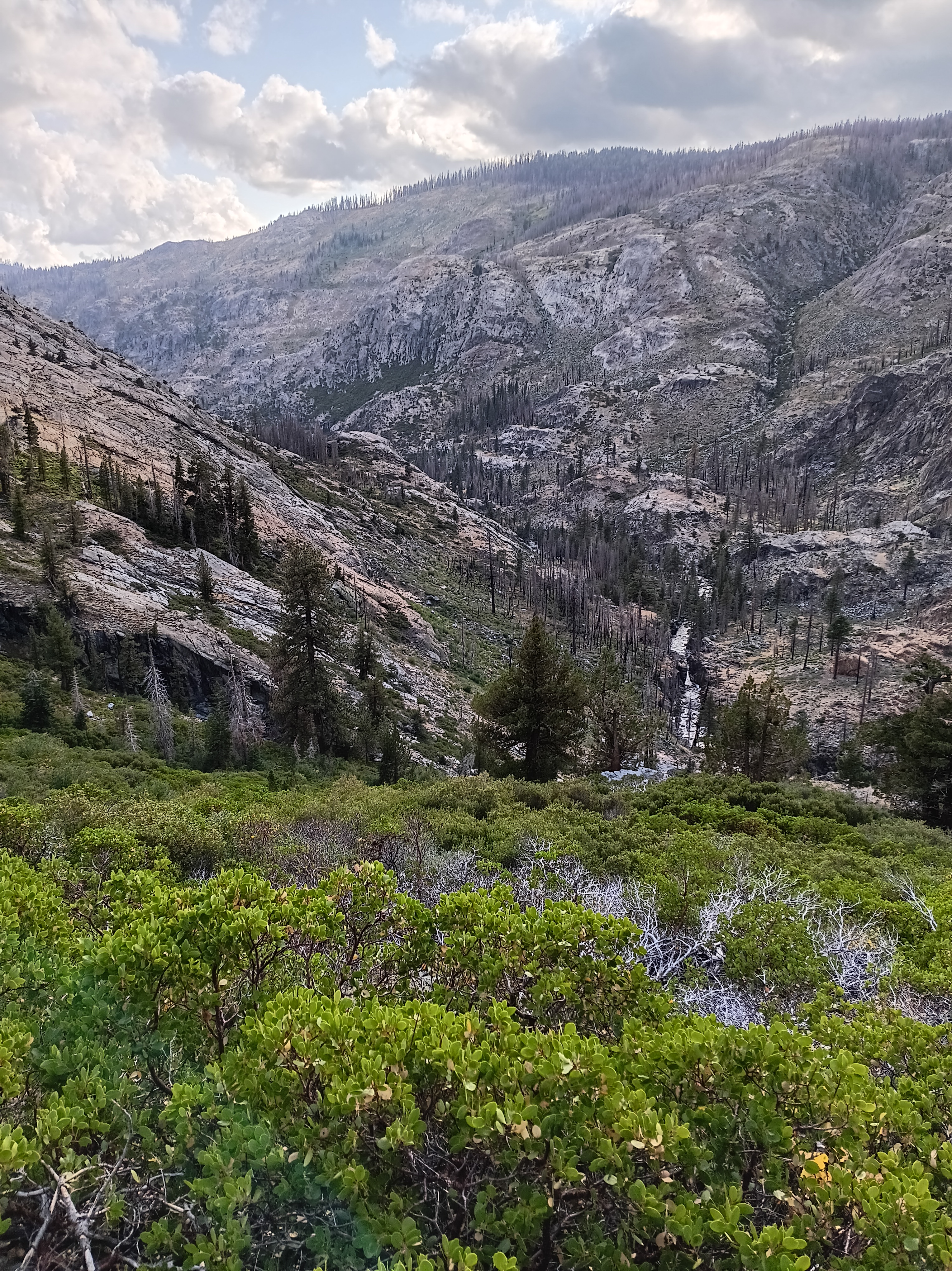
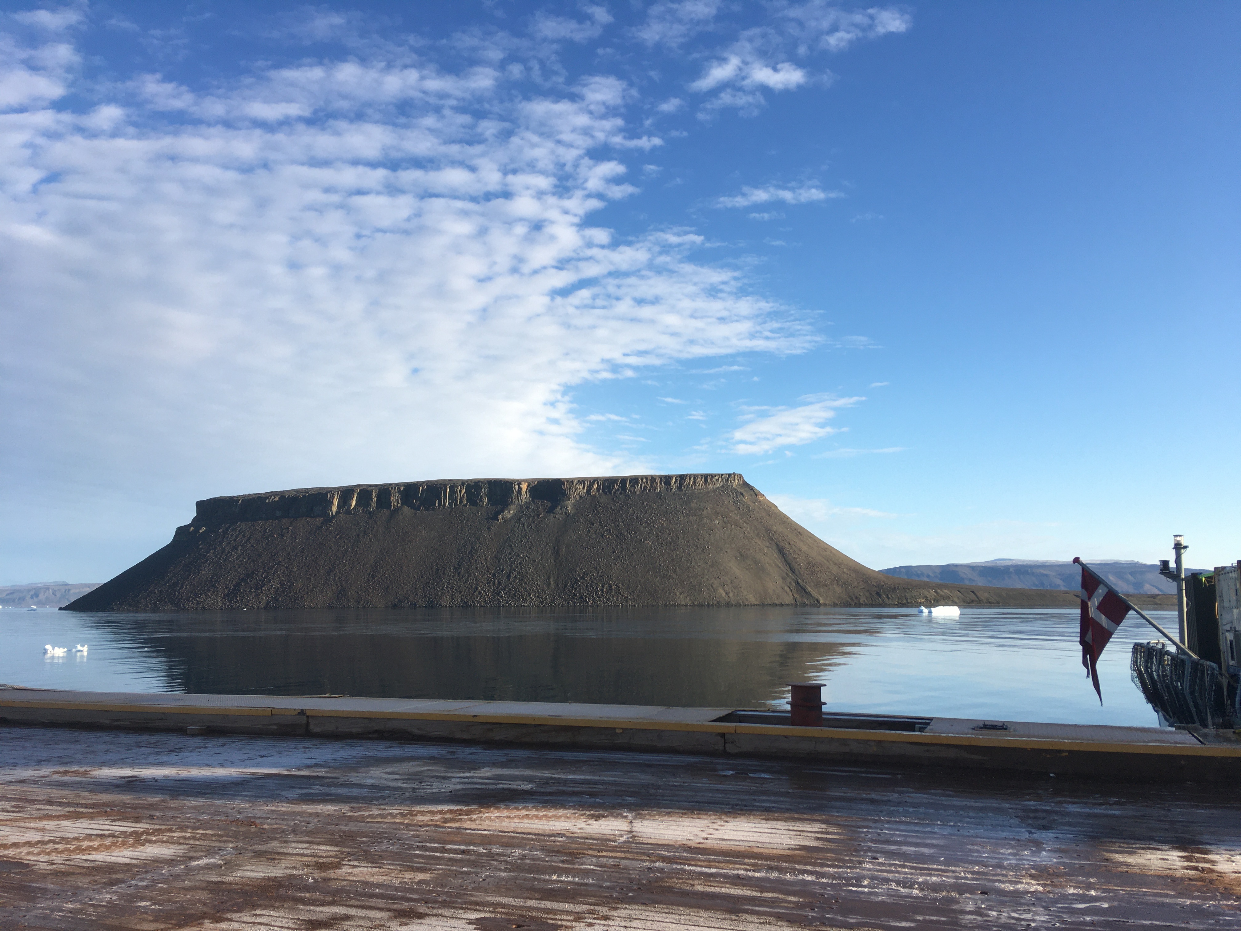
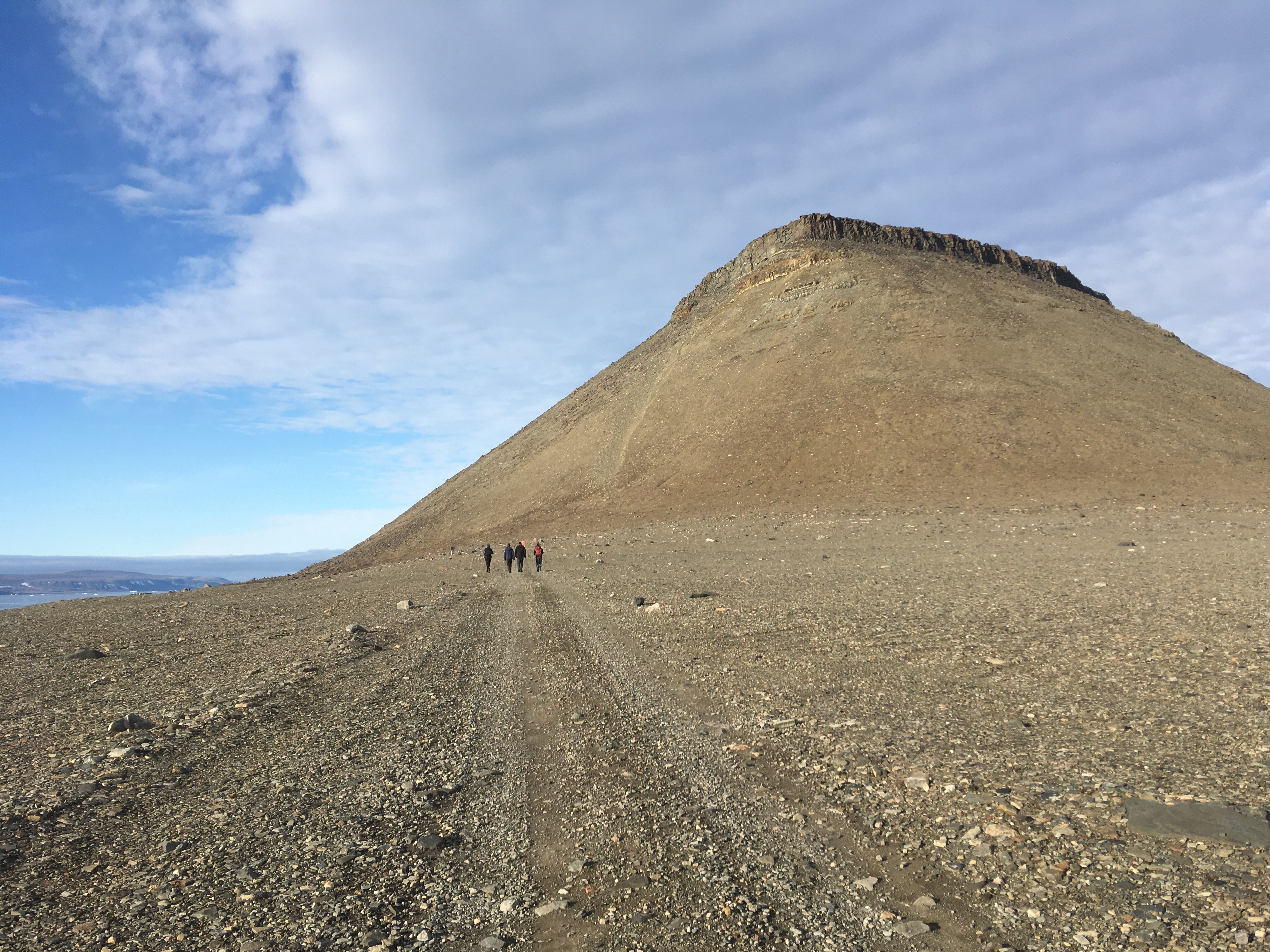
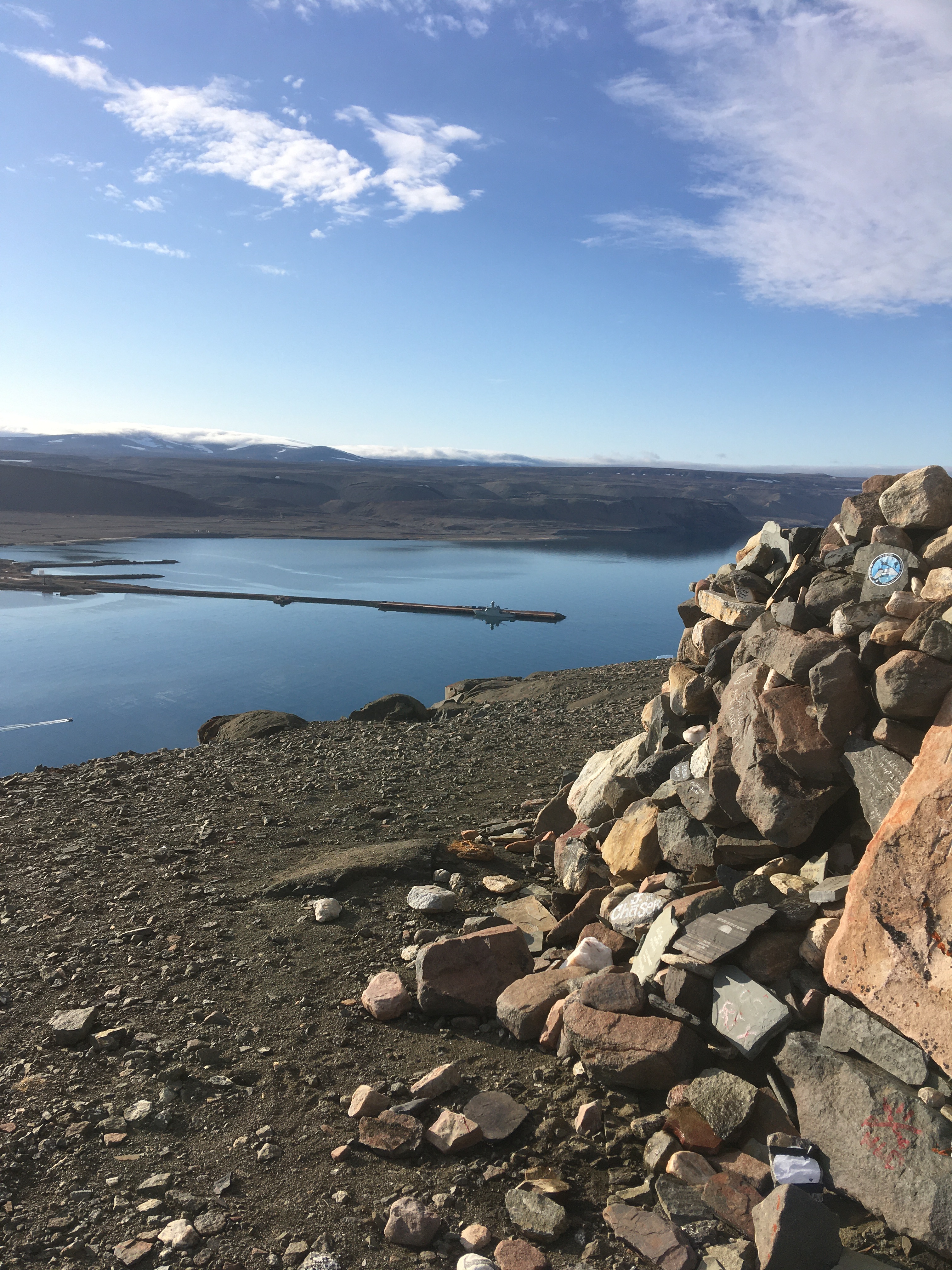
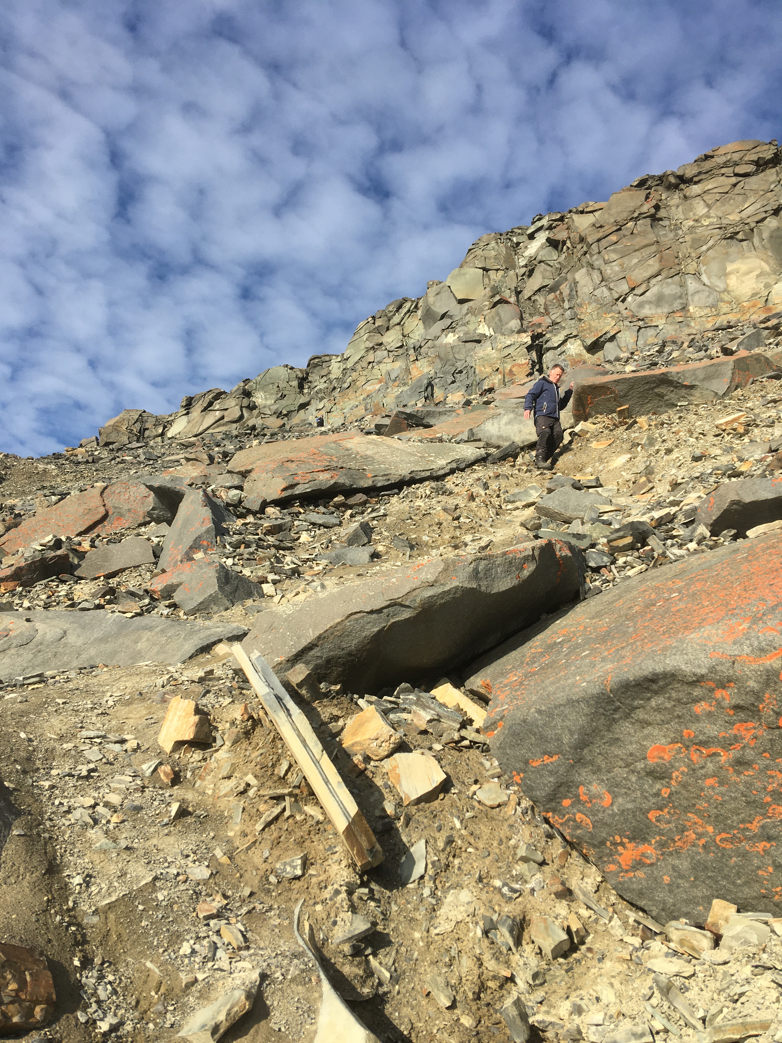
After getting off the ship at Thule Air Base (now called Pituffik Space Base) in 2021, us scientists climbed Dundas Mountain to stretch our legs, take in the varied landscape, and view our ship and home for a week from a distance. Notice how small HDMS Lauge Koch at the pier appears. All photos below were taken by geophysicist Dr. Katrine Juul Andresen of Aarhus University, Denmark:
References:
Münchow, A., Falkner, K.K. and Melling, H.: Baffin Island and West Greenland Current Systems in northern Baffin Bay. Progr. Oceanogr., 132, 305-317, 2015.
Ribeiro, S., Olsen, S. M., Münchow, A., Andresen, K. J., Pearce, C., Harðardóttir, S., Zimmermann, H. H., & Stuart-Lee, A.: ICAROS 2021 Cruise Report. Ice-ocean interactions and marine ecosystem dynamics in Northwest Greenland. GEUS, Danmarks og Grønlands Geologiske Undersøgelse Rapport, 70, 2021.
Zweng, M.M. and Münchow, A.: Warming and Freshening of Baffin Bay, 1916-2003. J. GEOPHYS. RES., 111, C07016, doi:10.1029/2005JC003093, 2006.