
I emigrated in 1987 to the United States of America leaving Germany in 1985 to study oceanography in the United Kingdom. After graduate school, marriage, kids, U.S. citizenship, career, and finally retirement I arrived again in Germany, again as an immigrant, but now to the country where I was born. Renting a 2-bedroom appartment in the port city of Bremerhaven near the North Sea, I just received a 2-year residence permit. My status is that of a “former German” who speaks the language. With it came a work permit and a clear path to regain my long lost German citizenship.

Arriving in Bremerhaven from Greenland in Oct. 2025.
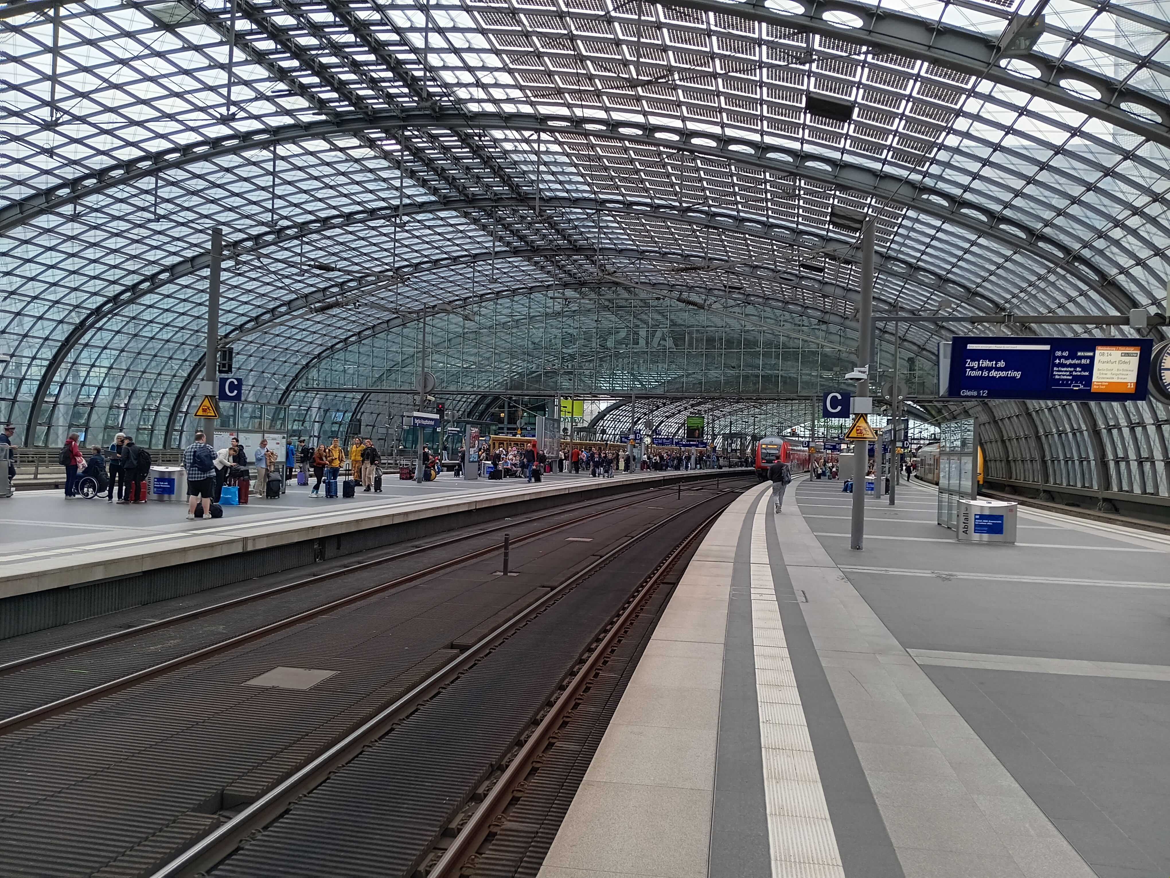
My first action in my new/old country was to take an 8-hour train ride to my 44-year High School reunion in Gross-Gerau. It felt good to re-connect with 5-6 people (out of ~200) with whom I shared classes and interests in motorcycles, history, politics, and travel. Oh, the price of the train ticket was about $60 return. Furthermore, this “Deutschland-Ticket” allows me to use ALL local trains, subways, and buses in ALL of Germany for an entire month. It was subsequently used to visit my parents 4 hours away and even friends and collegues in Denmark 6 hours away. Keep in mind, though, that while trains in Germany no longer run on time, they still go on at least an hourly schedule between 6 am and midnight on almost all routes. So, should you miss a train somewhere, well, relax a little, have a bite to eat or drink, chat with people, and take the next train at the always busy train stations.


Train travel in Germany: Berlin, Bremerhaven, and along the Rhine Valley near Koblenz in 2025.
Next, I joined a local tabletennis club, the Geestemünder TV for $15/month. It takes less than 10 minutes on a bicycle to reach each of the 2 public schools where our club uses the gym in the evenings to practice. Many members have keys to open on mondays, tuesdays, wednesdays, and thursdays. It was supposed to run fridays also, but nobody shows up then. Communication happens via WhatsApp in diverse groups of friends, teams, or the entire club. Our club is surrounded by perhaps 50 similar clubs located to the north, east, and south by the rural County of Cuxhaven:
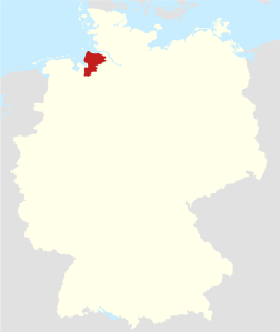
Location of Cuxhaven and Bremerhaven (red area), Germany. The blue areas in the north are the Baltic Sea (top-right) and North Sea (top-left). Hamburg is the largest city about 2 train hours east. I was born in Lübeck on the Baltic Sea and raised close to Denmark 8 miles from the North Sea. [Source].
Within a week I was added to a competitive travel team. You can watch my competitive prowness in the 3rd county league online at www.mytischtennis.de. There are about 16 different county leagues, each league has about 10 teams, and each team has at least 4 players. That comes to about 640 active and competitive players for a small rural county where 200,000 people live plus the 110,000 people who live in Bremerhaven. Leagues are sorted by skill level (scored daily after each play). Above the county leagues there also exist several regional, state, and national leagues up to the professional “Bundesliga.” Here average salaries are $30,000 to $50,000 per year, so, it is not a get-rich-quick scheme. For comparison, a full-time city bus-driver in Bremerhaven makes about $40,000 per year before taxes.
It is these sport clubs (“Sportvereine” in German) that hold Germany together socially and mix up its populations. The people on my team range from 16 to 69 years of age. I train with people aged 12 as well as people aged 78 as well as teenagers from Ukraine, Russia, and Syria. I play with people who have lived and worked the port, construction, government, or academia for the last 40 years. After each competitive match a social gathering of who played follows over beer or juice as well as snacks that range from a warm sausage to fruit and sandwiches. Stories of games, people, life, and adventures follow before everyone heads home. Oh, people no longer smoke during these indoor socials, but people frequently disappear outside for a cigarette even between games. So not everyone does this for healthy living …
Stepping off the ship back last fall, I noticed difficulty breathing while bicycling, playing table tennis, or even climbing the stairs to my 3rd floor apartment. I visited a doctors office 5 minutes on foot from my home without an appointment. Within an hour a doctor interviewed me, initiated a blood test, and gave me referals. When the blood indicated the possibility of a blood clot in my lung (pulmonary embolism) in the evening of the same day, the doctor called me back to her office to pick up the prescription of a blood thinner. With 10 minutes to spare before closing time of the pharmacy I picked up a 90-day supply (200 tablets of 5 mg) of Eliquis for about $280. It removed the embolism within a week. The charge for the doctor’s visit and blood test was $140. My doctor also prescribed an inconclusive chest x-ray ($60) and a very conclusive Cat-Scan of my lung after a tracer was injected into my veins to map the flow of blood through my lungs ($520).
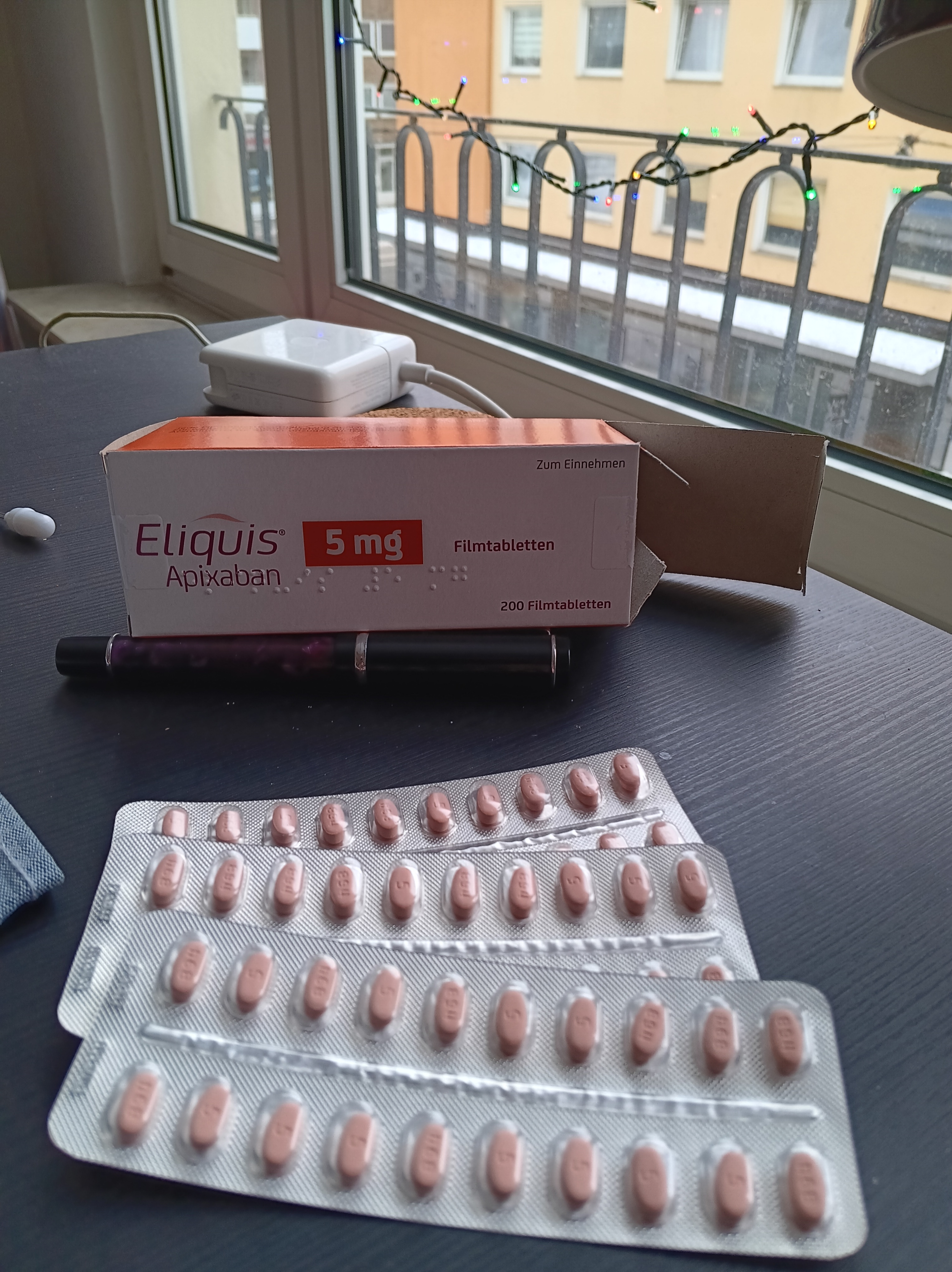
So, within 4 weeks I had both a solid diagnosis and successful treatment of a serious health issue. The total cost came to under $1000. In the USA the medication alone would cost $1153 AFTER 40% discount that Bristol-Myers Squibb and Pfizer offer to those who buy Eliquis directly from them bypassing pharmacies. This “reduction” was triggered by pressure from the U.S. Government as reported by CNBC.
Every legal resident of Germany must have health insurance. That is the Law in Germany. Neither visa nor residence permit is issued without proof of health insurance. The market for short-term (1-6 months) health insurance is competitive and tailors to immigrants, expats, and long-term travelers. Within a week of arrival, I had purchased such insurance for $58/month for 6 months. As I do have excellent health insurance in the USA (at ~$2300/month for my family; I pay 20% or $500/month and my former employer the rest), I here went with the absolute bare minimum required by German Law, so it will be interesting to see what it will cover. I just submitted the bills for reimburstment and expect very little, but I may be surprised, as I was, when I paid the low cost of the outstanding health care that I received in one of the poorest cities in Germany.
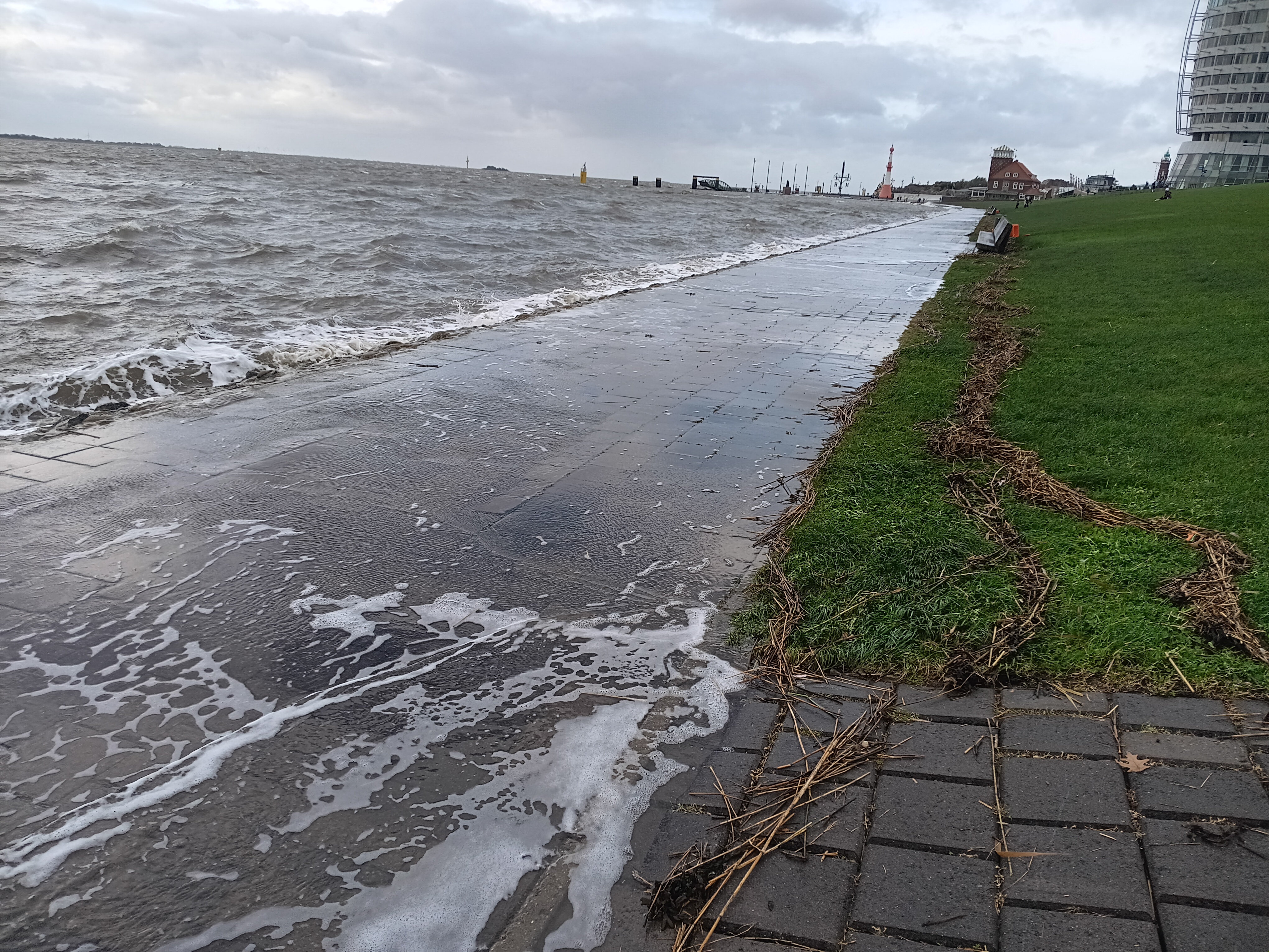
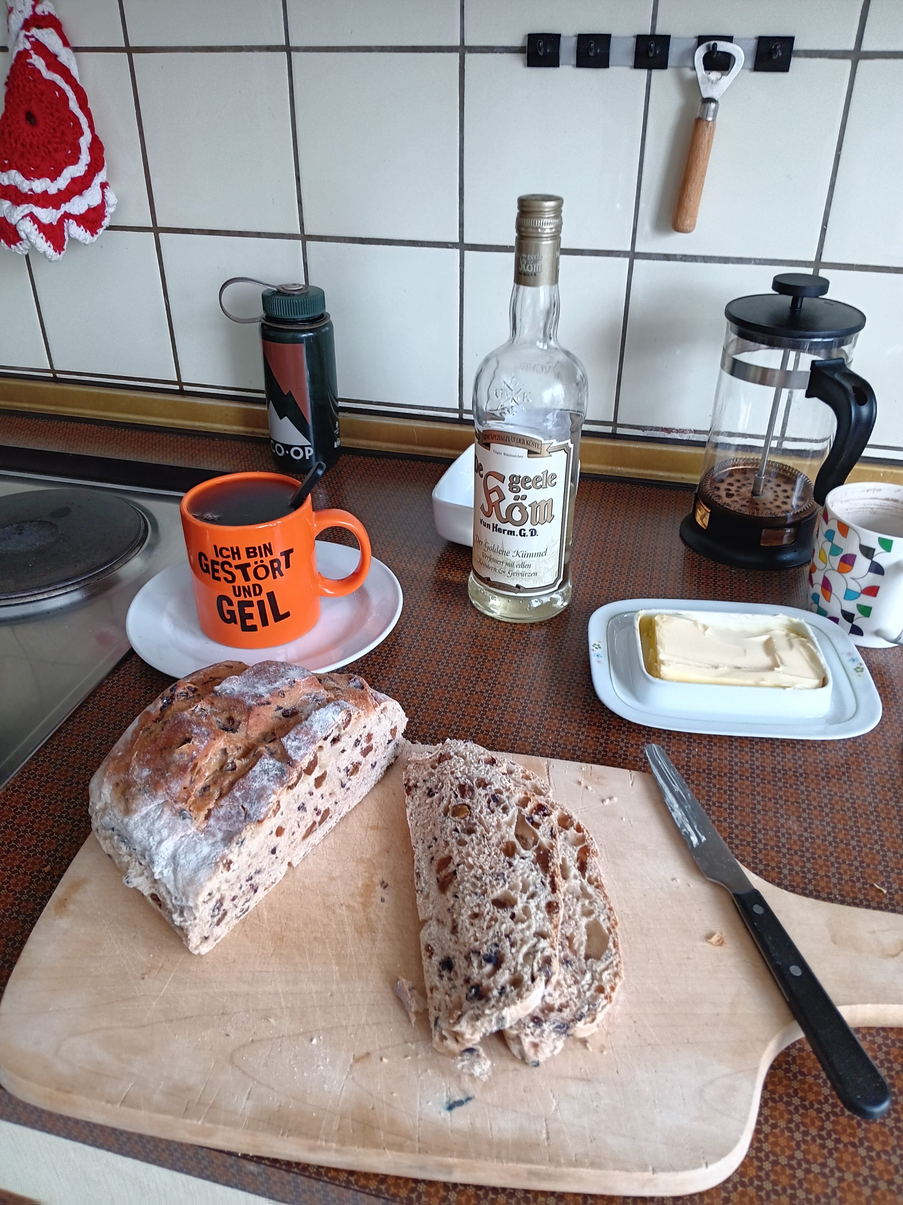
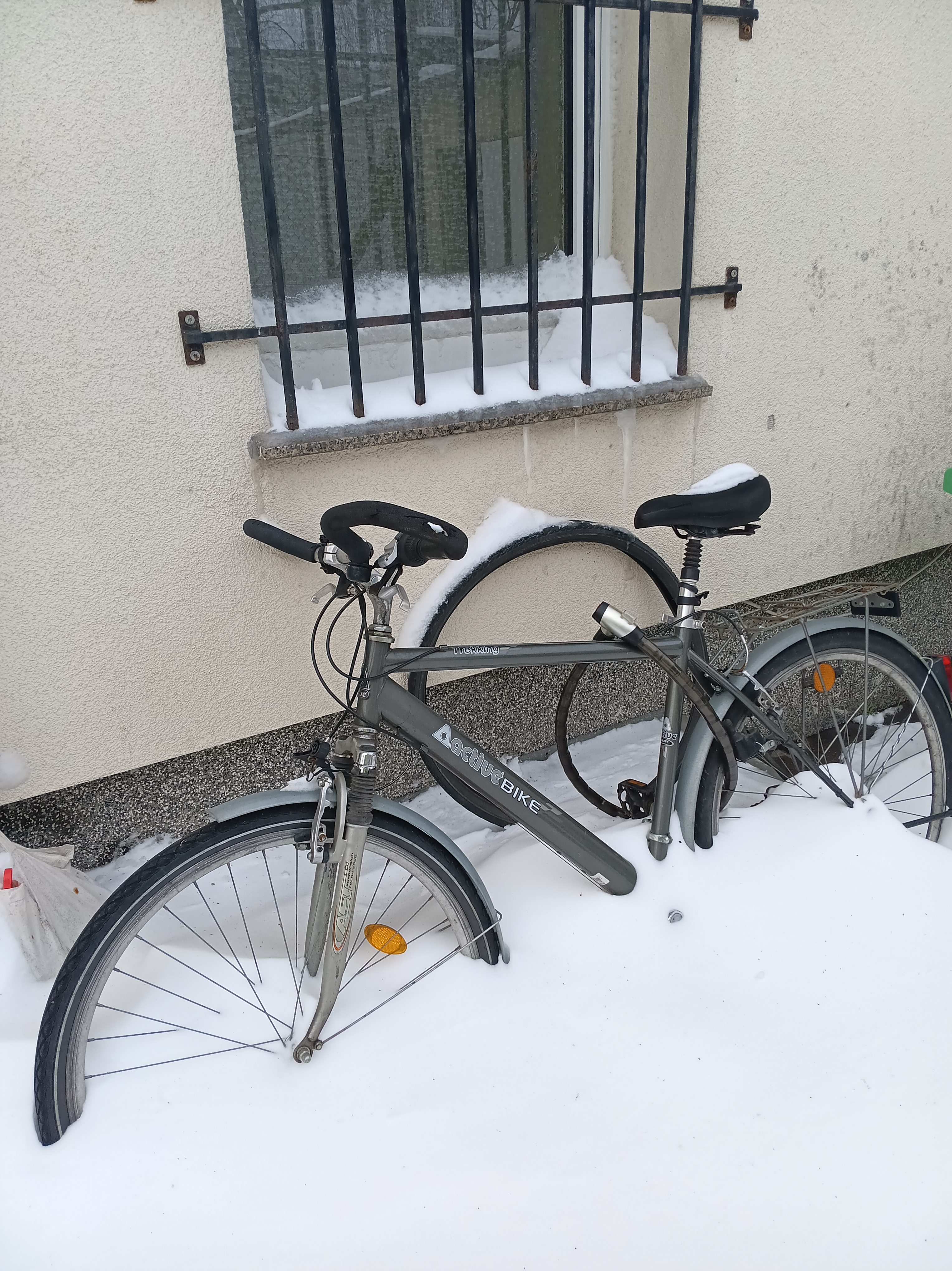
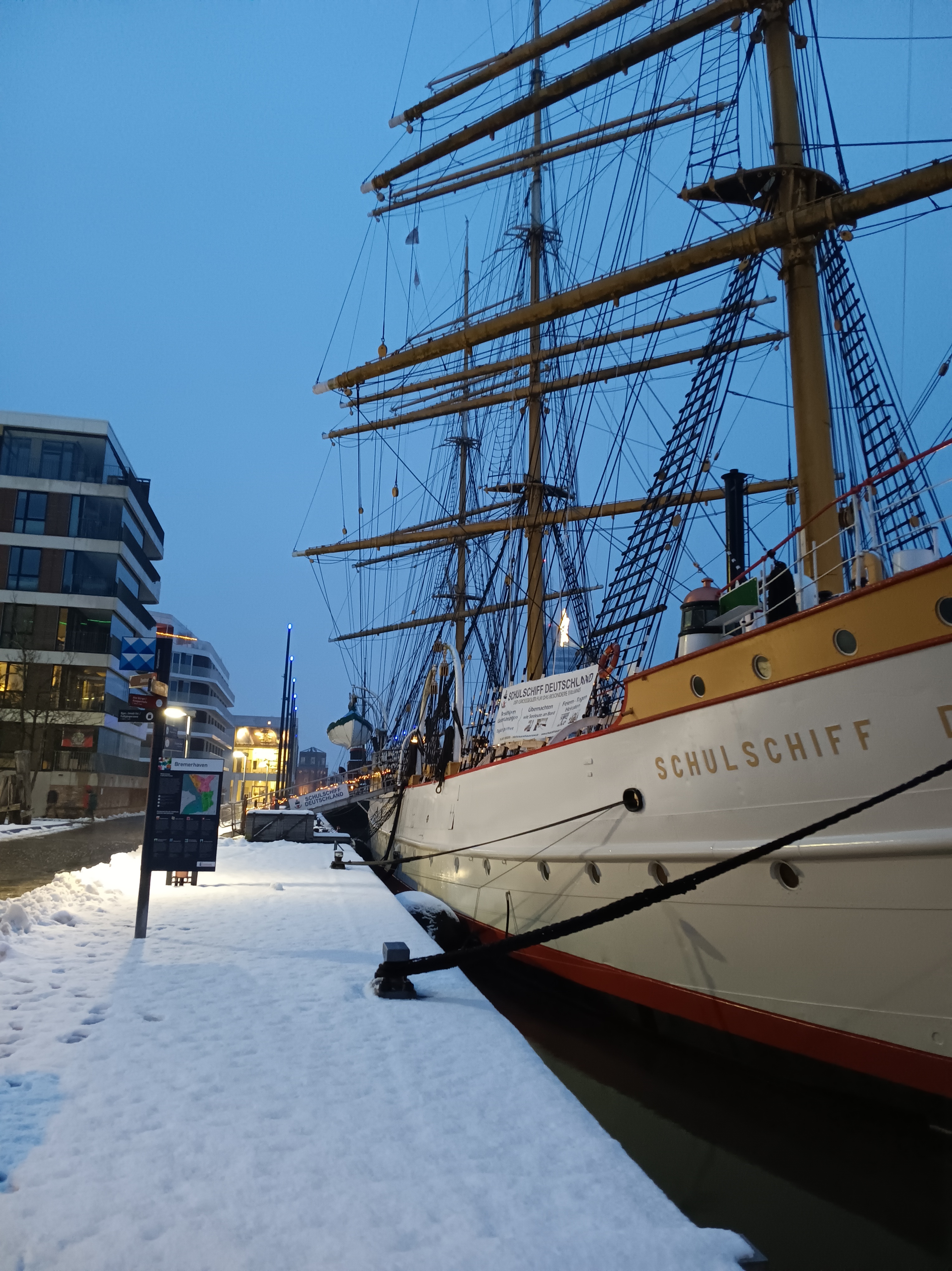
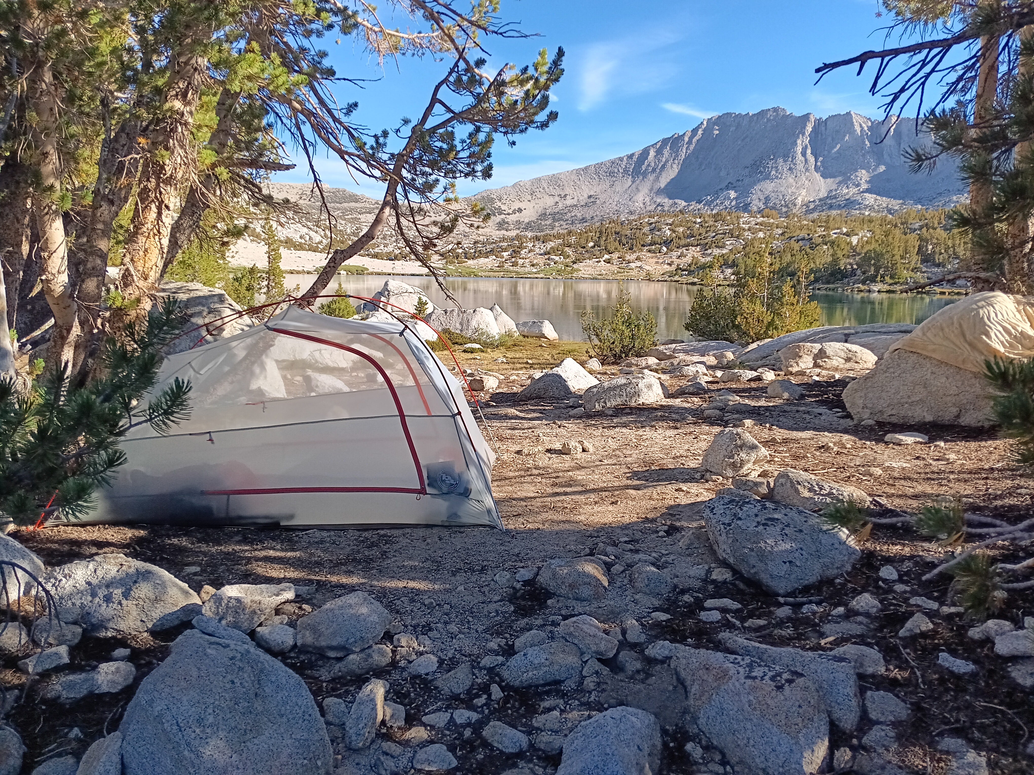
In the meantime, an unusual snowstorm called “Ellie” hit northern Germany yesterday. Schools were closed, trains were canceled, and people were asked to stay home … which I did. Today, however, I was back on my bicycle to head to the farmers market to buy my bread, eggs, vegetables, and meats. Only my favorite cheese stand was not there today. Here are a few photos of my kitchen and living room today as well as my parked bicycle and some scenery during an afternoon walk around the block along the water:


