Tag Archives: data

Data Obsessions while in Self-Quarantine

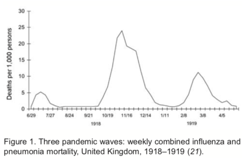
I sit in my home office looking into a garden which explodes in yellow from the forsythia with splashes of pink from the camellias. Both flourish after a large shading cherry tree fell down a few years ago. The tree stump is covered by moss and provides a natural border. My native American Flame azaleas (Rhododendron calendulaceum) now stand 8 feet tall in front after I planted them in 2001 as 3 inch sticks. They are the pride of my garden along with Piedmont, Sweet, Okonee, and Plum azaleas all purchased from Callaway Gardens in Georgia. They grow well, because I correctly predicted that the warmer climate zones of Georgia would move northward towards Delaware. Here are the azaleas in blooms in early May or four weeks from now:

These are distractions, because I need to process and analyze ocean velocity data off Greenland. My student from South Korea rightfully expects numbers that she can work with for her Masters degree. We plan to meet via Zoom video call every Friday and Wednesday. She is ordered to stay at home in Maryland while I am ordered to stay at home in Delaware. We also meet Monday and Wednesday evenings when I teach “Waves” via Zoom to eight University of Delaware graduate students from China, South Korea, Thailand, and the USA. Our topic yesterday was the waves in the wakes of a ship or a duck or an island. To me physics are as beautiful as are the flowers in my garden:

Now these are the things that I should work on during my self-quarantine, but I am obsessed and distracted with new data. The Johns Hopkins University in Baltimore, MD distributes data on the number of people who were diagnosed with Covid-19, who died of it, and who have recovered. While it is easy to access their excellent data displays as global health authorities report them, the actual raw digital data files are accessible at

https://github.com/CSSEGISandData/COVID-19

These data require computer programming and data handling skills that a well trained physical ocean, climate, or data scientist masters. The raw data, however, do not tell a story, because it just looks like gibberish,

but there is a most orderly system to this madness. With 143 lines of computer code (one C-shell and two awk scripts) I convert these data into a single graph to tell a story:

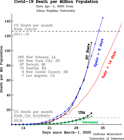
First, I focus only on the number of people who have died, because I consider this the most reliable (albeit morbid and depressing) estimate of how the virus is spreading.

Second, I present the number of people who died relative to the population. It hardly seems fair to compare the numbers from the USA with 327 million people to those of Malta with only 0.5 million people. The technical term is “normalization,” that is, all numbers are relative to 1 Million people. So, 5 dead in Malta give 10 dead per million. The same 10 dead per million correspond to 3270 dead Americans. This way I am comparing apples to apples as opposed to Americans to Maltese.

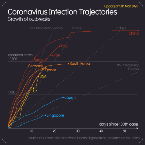
Third, I want to compare the spread of the pandemic over time on different continents, different countries, different states, and different cities. This requires to time-shift countries hit by the virus earlier than others. In the above graph, for example, I moved the curve for Italy 14-days forward and that of Spain 6-days forward relative to all other places listed.

Fourth, I am most interested in New York State (population 20 million), because it contains New York City (population 8 million) and, I believe, it gives Americans a good idea what is coming. Furthermore, I believe, that the Government of New York State is a little more efficient, smart, and forward-thinking than many other government entities. It also has resources not necessarily available to less affluent communities.

The curve for New York State initially (until Mar.-25) followed the trajectory of Italy 14 days earlier, but then it switched over to the steeper trajectory of Spain 6 days earlier. Notice that Italy’s curve has a flatter trajectory than the steep curve of Spain and New York State. From Mar.-28 to Mar.-31 the New York curve was almost exactly that of Spain 6 days ago, but yesterday, the number of people dying in New York grew even faster than those in Spain or Italy ever did. This is scary stuff.

Yesterday, New York State had about 111 dead per million people. While this is still less than the 180 dead per million people that both Italy and Spain had yesterday, it may take only 4-5 additional days for New York State to reach those numbers also, but I still do not know what these numbers mean. I do not “feel” them. So I try to compare them to other causes of death such as people getting killed every month in (a) car accidents (9 per million) or (b) gun violence (8 per million) or (c) cancer (126 per million). These references help me to visualize the scale and impact of this pandemic.

So, while Covid-19 has killed about as many people in the US the last 4 weeks as people died in car accidents, in New York State the number of Covid-19 dead is about to exceed those who died of cancer in this same period. The hardest hit place in the US, however, is not New York City (160 dead per million), but New Orleans (295 dead per million). The County or Parish of New Orleans, Louisiana has about 400,000 people or a little less than New Castle County in Delaware where I live, but New Orleans has 115 dead compared to 5 in New Castle County (9 dead per million).

There are a few bright spots and I want to close on those. Los Angeles (7 dead per million) and California (5 dead per million) are doing remarkable well as does Germany (11 dead per million). Despite physical separations from others, I feel closer to friends, family, and neighbors both overseas and across the street. With more than 10 feet distance we have impromptu get-togethers between the door and the end of the driveway of 4 different households. I am happy to know that my neighbor Joyce from Kenya is safe back home living quarantined across the street with her African friends from Mali. She runs Water for Life which is a small non-profit that provides clean drinking water for rural communities in Kenya. It makes me happy to know her as a neighbor across the street.

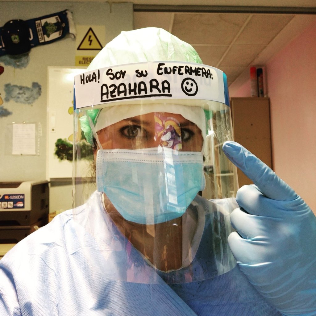
And then there are the true warriors who fight this virus while endangering themselves to help others. Here is a nurse from Spain whose photo at work I took from her Twitter feed. We are all surrounded by wonderful and beautiful people.

Waves

Almost 300 years ago a brave scientist boldly stated that everything can be described as waves. It took mathematicians another 200 years to prove that Joseph Fourier, the bold scientist, had it right. I am comforted by this fact while the Covid-19 pandemic appears to grow without bounds. And yet, bounds do exist, because Fourier states that what goes up must come down. This includes the global Covid-19 pandemic of 2020/21 as well as the Influenza pandemic of 1918/19. The latter had three distinct peaks in the United Kingdom that varied both in amplitude and duration:

Adapted from Taubenberger, J.K. and D.M. Morens: 1918 Influenza: The mother of all pandemics, Emerging Infectious Diseases, 12 (1), 2006.

This pandemic of 100 years ago came in three distinct pulses in the spring of 1918, in the fall of 1918, and in the winter of 1919. The graph shows that during the first wave about 0.5% of all infected people died while the second and third wave were more deadly with 2.5% and 1.3% fatality rates. These rates are somewhat similar to those we see today with Covid-19, but there is much we do not yet know.

We do not yet know, for example, how long it will take for the Covid-19 waves to pass through populations. We do not know the amplitude of the waves either, because it all depends on how well we distance ourselves from each other both now and into the future to minimize transmission of the virus. There is no control, yet, because no vaccine exist, but smart distancing will impact how many people will get infected (the amplitude) over time (the period).

These two factors (amplitude and duration) will determine how many of our friends, partners, parents, brothers, and sisters we will lose to the virus. As the German Chancellor Angela Merkel said yesterday: “Im Moment ist nur Abstand Ausdruck von Fuersorge,” which translates as “At the moment only distance is an expression of care.”

German Chancellor Angela Merkel on Mar.-18, 2020 on German TV.

Waves change as they propagate from one medium to another. As ocean wave forms move from deep to shallow water they change both amplitude and speed until they eventually break. I view today’s Covid-19 waves in a similar way.

Covid-19 waves will propagate through all societies on our planet, but they will propagate differently in different regions, countries, and societies. Amplitudes, periods, and propagation speeds will differ. Some of this is already visible by global statistics that are collected and shared in real time:

From https://informationisbeautiful.net/visualizations/covid-19-coronavirus-infographic-datapack/

The spread of the virus in China differs from that in South Korea which differs from that in Iran, Italy, Germany, and the United States. Different political systems, different skills of and trust in governments, and different personal behaviors all provide a different medium within which these waves propagate and, eventually, will dissipate.

This is day-8 for me and my wife to distance ourselves from our friends, family, and neighbors. We are fine. My wife turns the bedroom into a painted mural while I read and write at home and spent much time in the spring garden. It slowly sinks in, that this will not be over next week or next month. The goal is to make the amplitude as small as possible by spreading the period out as long as possible which will allow our hospitals, nurses, and doctors to provide the best care for those who need it. As a wise woman said yesterday: “At the moment only distance is an expression of care.”

Reference:

Taubenberger, J.K. and D.M. Morens: 1918 Influenza: The mother of all pandemics, Emerging Infectious Diseases, www.cdc.gov/eid, 12 (1), 2006.”

Ghosts of Discovery Harbor: Digging for Data

Death by starvation, drowning, and execution was the fate of 19 members of the US Army’s Lady Franklin Bay Expedition that was charged in 1881 to explore the northern reaches of the American continent. Only six members returned alive, however, they carried papers of tidal observations that they had made at Discovery Harbor at almost 82 N latitude, less than 1000 miles from the North Pole. Air temperatures were a constant -40 (Fahrenheit or Celsius) in January and February. While I knew and wrote of this most deadly of all Arctic expeditions, only 2 days ago did I discover a brief 1887 report in Science that a year-long record of hourly tidal observations exist. How to find these long forgotten data?

My first step was to search for the author of the Science paper entitled “Tidal observations of the Greely Expedition.” Mr. Alex S. Christie was the Chief of the Tidal Division of the US Coast and Geodedic Survey. He received a copy of the data from Lt. Greely. His activity report dated June 30, 1887 confirms receipt and processing of the data, but he laments about “deficient computer power” and requests “two computers of standard ability preferable by young men of 16 to 20 years.” Times and language have changed: In 1887 a computers was a man hired to crunch numbers with pen and paper.

Data table of 15 days of hourly tidal sea level observations extracted from Greely (1888).

Data table of 15 days of hourly tidal sea level observations extracted from Greely (1888).

While somewhat interesting, I still had to find the real data shown above, but further google searches of the original data got me to the Explorer’s Club in New York City where in 2003 a professional archivist, Clare Flemming, arranged and described the “Collection of the Lady Franklin Bay Expedition 1881-1884.” This most instructive 46 page document lists the entire collection of materials including Series III “Official Research” that consists of 69 folders in 4 Boxes. Box-4 File-15 lists “Manuscript spreadsheet on Tides, paginated. Published in Greely (1888), 2:651-662” as well as 3 unpublished files on tides and tide gauges. With this reference, I did find the official 1888 “Report on the United States Expedition to Lady Franklin Bay” of the Government Printing Office as digitized from microfiche as

https://archive.org/details/cihm_29328

which on page 641 shows the above table. There are 19 more tables like it, but at the moment I have digitized only the first one. Unlike my colleagues at the US Coast and Geodedic Survey in 1887, I do have enough computer power to graph and process these 15 days of data in mere seconds, e.g.,

Hourly tidal observations at Discovery Harbor taken for 15 days by Greely in 1881 and Peary in 1909.

Hourly tidal observations at Discovery Harbor taken for 15 days by Greely in 1881 and Peary in 1909.

A more technical “harmonic” analyses reveals that Greely’s 1881 (or Peary’s 1909) measured tides at Discovery Harbor have amplitudes of about 0.52 m (0.59) for the dominant semi-diurnal and 0.07 m (0.12) for the dominant diurnal oscillation. My own estimates from a 9 year 2003 to 2012 record gives 0.59 and 0.07 m for semi-diurnal and diurnal components. This gives me confidence, that both the 1881 and 1909 data are good, just have a quick look at 1 of the 9 years of data I collected:

Tidal sea level data from a pressure sensor placed in Discovery Harbor in 2003. Each row is 2 month of data starting at the top (August 2003) and ending at the bottom (July 2004).

Tidal sea level data from a pressure sensor placed in Discovery Harbor in 2003. Each row is 2 month of data starting at the top (August 2003) and ending at the bottom (July 2004).

There is more to this story. For example, what happened to the complete and original data recordings? Recall that Greely left Discovery Harbor late in the fall of 1883 after supply ships failed to reach his northerly location two years in a row. This fateful southward retreat from a well supplied base at Fort Conger and Discovery Harbor killed 19 men. Unlike ghostly Cape Sabine where most of the men perished, Discovery Harbor had both local coal reserves and musk ox in the nearby hills that could have provided heat, energy, and food for many years.

It amazes me, that a 1-year copy of tidal data survived the death march of Greely’s party. It took another 18 years for the complete and original records to be recovered by Robert Peary who handed them to the Peary Arctic Club which in 1905 morphed into Explorer’s Club of New York City. I suspect (but do not know), that these archives contain another 2 years of data that nobody but Edward Israel in 1882/83 and the archivist in 2003 laid eyes on. Sergeant Edward Israel was the astronomer who collected the original tidal data. He perished at Cape Sabine on May 29, 1884, 25 years of age.

Edmund Israel, astronomer of the Lady Franklin Bay Expedition of 1881-1884.

Edmund Israel, astronomer of the Lady Franklin Bay Expedition of 1881-1884.

References:

Christie, A.S., 1887: Tidal Observations of the Greely Expedition, Science, 9 (214), 246-249.

Greely, A.W., 1888: Report on the Proceedings of the United States Expedition to Lady Franklin Bay, Grinnell Land, Government Printing Office, Washington, DC.

Guttridge, L., 2000: The ghosts of Cape Sabine, Penguin-Putnam, New York, NY, 354pp.

Greenland Calling: Iridium Satellite Phone

I have trouble calling Petermann Gletscher, Greenland where I am collecting ocean data that feeds into a remote weather station. This station is run on a pair of car batteries, because the solar panels do not work until the sun rises again in two months and the next electrical outlet is about 300 miles away. A computer controls power to sensors and a satellite phone. All calls from and to the station are routed via a commercial satellite phone system that consists of about 66 satellites orbiting our planet. They often appear as shooting stars in the night sky that are called Iridium flares. As beautiful as these orbiting satellites are, they have driven me mad.

Screen shot of Iridium satellite orbits observed in real-time from http://www.satflare.com/track.asp?q=iridium

Screen shot of Iridium satellite orbits observed in real-time from http://www.satflare.com/track.asp?q=iridium

Iridium satellite phones and modems connected to computers are the only way to get data from remote areas of the Arctic and Antarctic. Some modems send small text messages called Short-Burst-Data (SBD) while other modems support a true two-way dial-up connection that includes all the hand-shaking of a telephone call. This computer-to-computer calling is more tricky than the person-to-person calls that this system was originally designed for. Working near Petermann Fjord, we had much trouble with even the person-to-person calls. Senator John McCain’s of the U.S. Congress was rudely disconnected, when he called us on the ship while in Sweden working with Government officials. And the Iridium phones on our Swedish icebreaker I/B Oden were thoroughly checked by field technician Robert Holden:

Rob Holden testing Iridium phones above the bridge of I/B Oden.

Robert Holden testing Iridium phones above the bridge of I/B Oden in August of 2015.

The building and coding of this ocean weather station is cool stuff for someone like me who likes Legos, computer games, and hacking electronics. Our Greenland ocean observing system uses both the text message SBD system at two smaller stations and the dial-up system at the larger weather station. The SBD system is great for small burst of data smaller than 1960 bytes per message. The Greenland station makes the call to a ground station that then e-mails the message forward to us. The method is very reliable, but there are small connection gaps that become data gaps.

Inside of University of Delaware command and control of five ocean sensors and surface weather station. Two computers are stacked above each other on the left.

Inside of University of Delaware command and control of five ocean sensors and surface weather station. Two computers are stacked above each other on the left with satellite modem 9522B on bottom left with RS-232 cable connecting to computer (Campbell Scientific CR1000).

In contrast, the dial-up method delivers a gap-free data set, but its bi-polar behavior drives me nuts. There are periods when each scheduled call results in a connection and new data, but there are also periods when each scheduled call fails to connect. Over the last 4 months I made 1450 calls to Greenland. Only 189 of these 1450 calls resulted in a connection. That is a failure rate of 87%. It admittedly includes one desperate day (Sept.-18) when I made a call every 3 minutes and each call failed. This desperation was after a 10-day sequence of failed calls when I lost my cool. There were 86 out of 130 days when a successful connection was made, that’s still a large failure rate of 34%, but there are zero missing data so far. [The station was set up Aug.-20.]

Logs-OWS

The advantage of the fickle dial-up connection is that I only need one connection to recover all data that has been collected since the last successful call. This differs from the SBD text message, where a lost connection means lost data. Furthermore, the connection to the Greenland station is a regular RS-232 connection which acts the same as the iPhone connected to the computer from which I type these lines. Hence software changes are possible, too, as scary as they may be.

Now why is the Iridium connection acting in a such a bi-polar fashion, that is, working like a charm for weeks and months to suddenly shut down completely for days to weeks just as suddenly? My honest answer is that I do not know. Furthermore, nobody really knows for sure. There is some talk in hidden places that Iridium modems or phones “de-register” themselves from the Iridium network, if they do not start a phone call. This is no problem for the SBD message as the Greenland modem always does the calling. It does matter for my dial-up, because the Greenland modem never initiates a call, it only responds when called after the Greenland computer gives it the power to do so. Which brings me to

‘Fake call’
Register_Modem = “ATDT 1234″ & CHR(13) & CHR(10)
SerialOpen (ComRS232,19200,0,0,2000)
Delay (0,1,Sec)
SerialOut (ComRS232,Register_Modem,””,0,0)
SerialClose (ComRS232)

The “fake call” is a software update that tells the Greenland modem to, well, make a fake call. The text string Register_Modem contains a non-existing phone number (I hope) 1234 as well as a carriage return CHR(13) and a line feed CHR(10) and the string is send via SerialOut to the modem that is addressed here as ComRS232 after the serial port between Greenland computer and modem is opened via SerialOpen. Lets see how this works over the next days, weeks, and months. For the first time, I received this morning a response from Greenland that it was “BUSY.” I took this as a good sign …

PostScript: Data look awesome with new, large, and unexpected diurnal variations that started Dec.-8.

Ocean temperature (black) and salinity (red) below Petermann Gletscher from Dec.-6 (Day-340) through Dec.-31 (Day-365). Top panel is just below the glacier ice at 95-m below sea level while bottom panel shows data 810-m below sea level.

Ocean temperature (black) and salinity (red) below Petermann Gletscher from Dec.-6 (Day-340) through Dec.-31 (Day-365). Top panel is just below the glacier ice at 95-m below sea level while bottom panel shows data 810-m below sea level.