The Ukrainian Catholic University in Lviv invited me to teach at their Summer Language School. Until last week I worked with ~50 Ukrainian students from about 10 in the morning to 5 in the evening monday through saturday. We met daily in classrooms, on the lawn outside, and in pubs over food and beer. The main purpose of the Summer School for the 17-21 year old students was to learn German as their second, third, or fourth foreign language. Their Ukrainian teachers knew every rule of German grammar, spoke perfect German, and half of them had PhDs in German literature, linguistics, education, and/or language theory.
Students and teachers alike love their country, their faith, and their freedom deeply. All hate the war that Russia wages on them personally: Every day Russia tries to kill them by drones and missiles, tries to erase their history, tries to pillage their resources, and tries to exterminate their language, culture, and freedom. Russia’s war is present in Ukraine at every location for every person at all times. Nevertheless, I went to open-air concerts, bars, restaurants, and churches filled with joyous young and old people with and without small children. This very public life serves as a defiant and powerful act of resistance to Russia’s war as does vibrant street art and music.
The people of Ukraine need our weapons to protect their freedom to be human and to be free from the violence, terror, and oppression imposed by Russia on them. Never have I seen a people believing in God as strongly as the Ukrainian students and teachers whom I met last 3 weeks. Furthermore, Lviv centers many overlapping faiths with churches of the Greek Catholic, Roman Catholic, Armenian Catholic, Ukrainian Orthodox, Russian Orthodox, and even a small Jewish community. Furthermore, I met both atheist and agnostic students studying at the Ukrainian Catholic University. This rich and diverse tapestry of believes exists in overlapping circles of ancient history, song, prayers, and common purpose. All are united and opposed to Russia’s terror of random death by drone or missile. People are tired, yes, tired and exhaused by 3.5 years of war, but people are united for the noble purpose to be free, to be at peace with their neighbors, and to be part of a liberal and democratic Europe. Russia responded to these desires with war, because Russia perceives a free, creative, and productive Ukraine as a threat to its own sclerotic, decadent, and corrupt society.
Unlike Russia, Ukraine values individual life and liberty, but Russia has 4 soldiers for every one Ukraine has. How can I best help my Ukrainian friends in their just defence to protect their freedom and to be part of a peaceful Europe? They need air defence radars and missile systems, they need artillery shells and cannons, they need tanks, helicopters, and fighter jets, they need drones and electronic jamming gear. I struggle with this question, write and call my U.S. senators and Congresswoman in Delaware to support Ukraine, and talk to friends and family about my travels to Ukraine, but it all seems puny and I am frustrated and impatient. In those moments I recall the wise words passed on to me 2 weeks ago by an older man of Irish-Catholic faith:
Act like the world depends on you, but pray it depends on God.
Elections are messy, but patterns emerge. Elections have consequences, but people learn. Elections make news, but do we all know how they work? I did not and thus decided to learn. I served as a sworn-in Election Clerk in the State of Delaware this week to collect first-hand experiences. I wanted to decide for myself rather than just “believe” or “dismiss” abundant disinformation propagated by Russian and American troll farms on social media. I wanted to answer for myself, if the American election system is safe, fair, and secure. My answer is a resounding yes for New Castle County, Delaware.
My badge for the Sept,-15, 2020 Closed Primary Election in New Castle County, DE, USA.
Any registered voter can apply to serve at a polling station as an Election Clerk, Judge, or Inspector:
The State of Delaware needs more than 4,500 registered voters to work in polling places for the General Election. This is a unique opportunity to serve your community by participating in the electoral process!
Pay comes to about $10 per hour for a 19 hour commitment. Students enrolled at a university in Delaware and local High School students older than 16 can apply as well. Within a week of mailing my application I was assigned a date and location for both a 4-hour training session and an election. I worried about the many, usually elderly election workers during our current Covid-19 pandemic. I took a calculated risk, but our democratic system by the People for the People requires the People to actually run the elections. Random citizens working the polls on Election Day are one check on State Governments who organize the elections.
Election Day started at 6 am to set-up computers, machines, and voter information in the gym of a local Elementary School. The first voter appeared at 7 am sharp while the last voter left shortly after 8pm. I left the school at 9 pm after votes were tallied, results were signed by each of poll workers and posted at the school. Multiple signed copies of votes and results were delivered by different people to different officials and offices. This includes both electronic and paper copies of each vote. I was home at 9:15 pm, exhausted, sore, and tired. A Samuel Smith’s Imperial Stout helped me to end the day happy, proud, content, and with many stories to share.
The best part was a wonderful, random, fun, and most diverse group of 11 poll workers. We ranged in age from 21 to 75 (or so), almost evenly split male/female, black/white, college/non-college, etc. and all with a refreshing sense of humor and purpose. One of us was a pastor, a postal worker, a home-maker, two professors, a school psychologist, a teacher, and we had at least three grand-parents. About 540 people came in to vote, only one person tried (and failed) to cheat by voting twice. He tried to vote in-person after he had mailed-in his absentee ballot which the State received already. He was politely told to leave which he did quietly. Perhaps he just tried to test the system, or he just forgot that he mailed his ballot, or he just listened to a paranoid and ignorant politician who told people to vote early by mail and then try to vote again in person. Either way, nobody voted twice.
Example of a mask violating Delaware’s Electioneering Laws, if worn inside a polling place.
We only had 3-4 people who tried to violate State Electioneering Laws (Del. Code Ann. tit. 15, §4942(a); (d)) by displaying partisan buttons, masks, hats, or t-shirts inside the polling place. This is illegal in Delaware and elsewhere; so please do not bring Biden/Harris or Trump/Pence buttons or similar partisan apparel or clothing to the the polling place. The “Electioneering” link is from the bipartisan National Association of Secretaries of State. Interestingly, all three “electioneers” were angry, white, male, 45-60 years old, and affiliated with the same party. They represented less than 2% of that party, but the three men succeeded in causing drama, emotional turmoil, and disruptions both inside the polling place and afterwards. I will fight for them to express their views as guaranteed by the U.S. Constitution, but their freedom of speech is limited inside the 50 feet diameter of the polling place during the 13 hours that people vote there. Several U.S. Supreme Court decisions back this view.
Only one person did not wear a mask, but this was my fault. He entered with a mask that carried in large letters a partisan political statement not allowed inside the polling place. When called on this by an Election Clerk he got angry and started to argue, but he was happy when I told him that he did not have to wear as mask that he promptly took off. [It was my mistake to tell him that not wearing a mask does not disqualify him from voting.] I asked to handle this person and borrowed the crutches of our oldest poll worker (with her permission) to use as a “teaching prop” of the 6 feet distance that I needed. He co-operated nicely and I thanked him for his important participation in an important process.
A more positive experience for me was to see how diverse my local community is. People of all colors, genders, ages, handicaps (both physical and mental) gave me a new perspective on who lives in the same town with me. I noticed an especially happy and celebratory atmosphere of the many black women of all ages who often came with their teenage sons and daughters to vote also. Many couples had different party affiliations and got along just fine. Kids came, too, as their parents voted and show them how its done. There is Hope and Strength in Diversity.
As a skilled physical scientist and computer geek, I conclude that it is almost impossible to “cheat” on the actual vote both for absentee (often called mail-in) or in-person ballots. I also conclude that Russian and American trolls and politicians try to suppress, manipulate, and disrupt the vote by spreading lies and disinformation to create doubt and confusion. The threat becomes real, if we the People believe and spread such lies. Our voting system has evolved over more than 200 years. It is secure as (a) both electronic and paper copies of each ballot exist; (b) all containers, machines, and access points are sealed, documented, and traced; (c) custody of all materials is transparent with multiple checks; and (d) it is random People like you and me who run the nitty-gritty of elections. The process is transparent and open to anyone willing to spent 4 hours of training and 14-15 hours on Election Day.
P.S.: I had myself tested for Covid-19 this morning. The sore throat and cough probably resulted from talking to more people than I have seen the last 7 months and breathing through a mask for 15 hours straight.
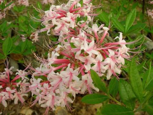
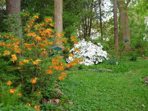
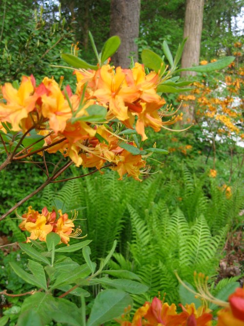
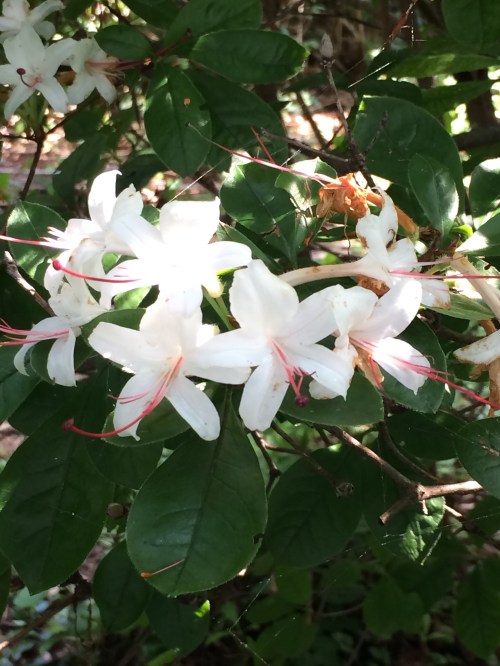
I sit in my home office looking into a garden which explodes in yellow from the forsythia with splashes of pink from the camellias. Both flourish after a large shading cherry tree fell down a few years ago. The tree stump is covered by moss and provides a natural border. My native American Flame azaleas (Rhododendron calendulaceum) now stand 8 feet tall in front after I planted them in 2001 as 3 inch sticks. They are the pride of my garden along with Piedmont, Sweet, Okonee, and Plum azaleas all purchased from Callaway Gardens in Georgia. They grow well, because I correctly predicted that the warmer climate zones of Georgia would move northward towards Delaware. Here are the azaleas in blooms in early May or four weeks from now:
American native azaleas blooming in my garden in April and May.
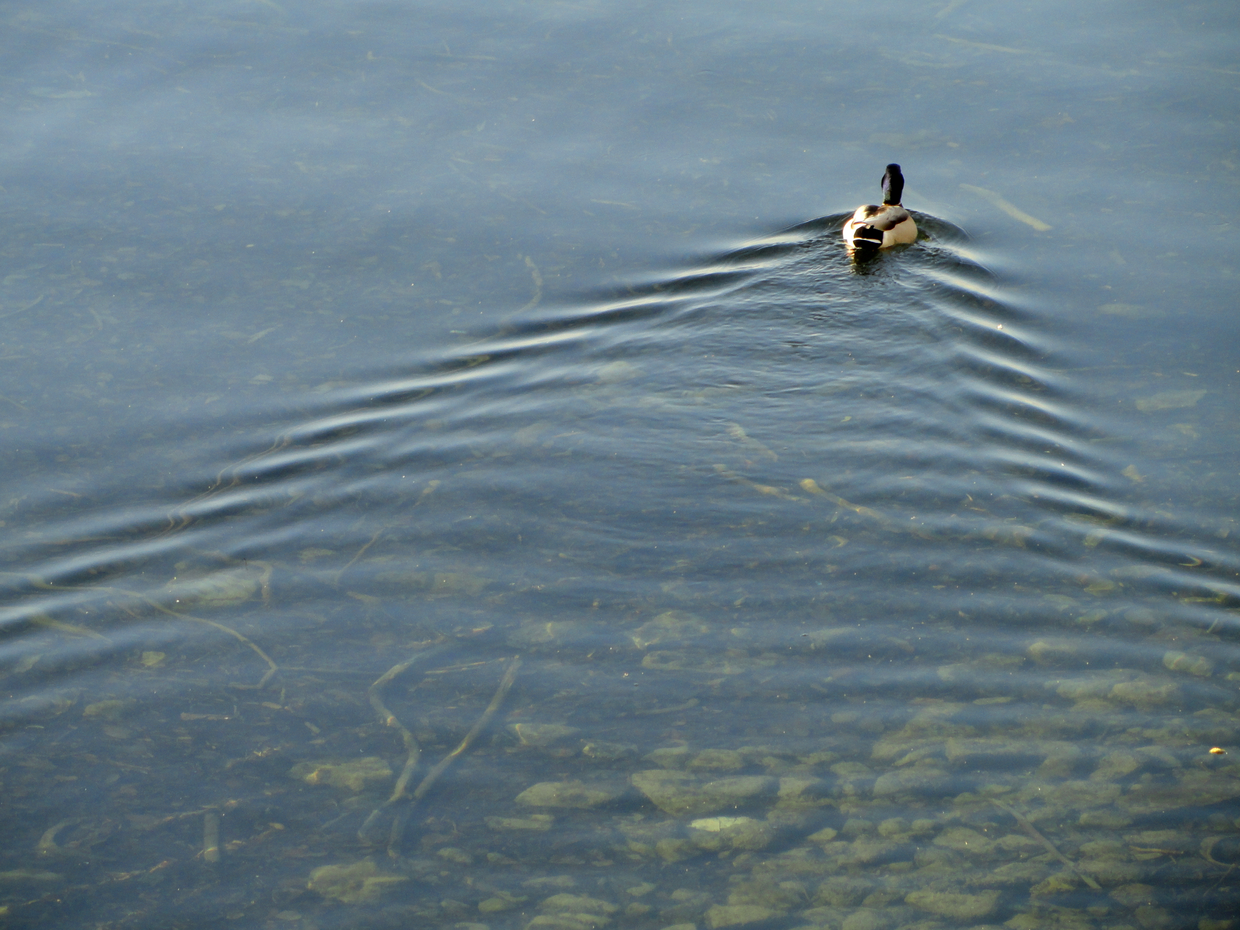
These are distractions, because I need to process and analyze ocean velocity data off Greenland. My student from South Korea rightfully expects numbers that she can work with for her Masters degree. We plan to meet via Zoom video call every Friday and Wednesday. She is ordered to stay at home in Maryland while I am ordered to stay at home in Delaware. We also meet Monday and Wednesday evenings when I teach “Waves” via Zoom to eight University of Delaware graduate students from China, South Korea, Thailand, and the USA. Our topic yesterday was the waves in the wakes of a ship or a duck or an island. To me physics are as beautiful as are the flowers in my garden:
Now these are the things that I should work on during my self-quarantine, but I am obsessed and distracted with new data. The Johns Hopkins University in Baltimore, MD distributes data on the number of people who were diagnosed with Covid-19, who died of it, and who have recovered. While it is easy to access their excellent data displays as global health authorities report them, the actual raw digital data files are accessible at
These data require computer programming and data handling skills that a well trained physical ocean, climate, or data scientist masters. The raw data, however, do not tell a story, because it just looks like gibberish,
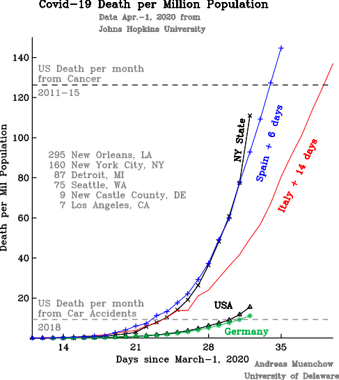
but there is a most orderly system to this madness. With 143 lines of computer code (one C-shell and two awk scripts) I convert these data into a single graph to tell a story:
First, I focus only on the number of people who have died, because I consider this the most reliable (albeit morbid and depressing) estimate of how the virus is spreading.
Second, I present the number of people who died relative to the population. It hardly seems fair to compare the numbers from the USA with 327 million people to those of Malta with only 0.5 million people. The technical term is “normalization,” that is, all numbers are relative to 1 Million people. So, 5 dead in Malta give 10 dead per million. The same 10 dead per million correspond to 3270 dead Americans. This way I am comparing apples to apples as opposed to Americans to Maltese.
Third, I want to compare the spread of the pandemic over time on different continents, different countries, different states, and different cities. This requires to time-shift countries hit by the virus earlier than others. In the above graph, for example, I moved the curve for Italy 14-days forward and that of Spain 6-days forward relative to all other places listed.
Fourth, I am most interested in New York State (population 20 million), because it contains New York City (population 8 million) and, I believe, it gives Americans a good idea what is coming. Furthermore, I believe, that the Government of New York State is a little more efficient, smart, and forward-thinking than many other government entities. It also has resources not necessarily available to less affluent communities.
The curve for New York State initially (until Mar.-25) followed the trajectory of Italy 14 days earlier, but then it switched over to the steeper trajectory of Spain 6 days earlier. Notice that Italy’s curve has a flatter trajectory than the steep curve of Spain and New York State. From Mar.-28 to Mar.-31 the New York curve was almost exactly that of Spain 6 days ago, but yesterday, the number of people dying in New York grew even faster than those in Spain or Italy ever did. This is scary stuff.
Yesterday, New York State had about 111 dead per million people. While this is still less than the 180 dead per million people that both Italy and Spain had yesterday, it may take only 4-5 additional days for New York State to reach those numbers also, but I still do not know what these numbers mean. I do not “feel” them. So I try to compare them to other causes of death such as people getting killed every month in (a) car accidents (9 per million) or (b) gun violence (8 per million) or (c) cancer (126 per million). These references help me to visualize the scale and impact of this pandemic.
So, while Covid-19 has killed about as many people in the US the last 4 weeks as people died in car accidents, in New York State the number of Covid-19 dead is about to exceed those who died of cancer in this same period. The hardest hit place in the US, however, is not New York City (160 dead per million), but New Orleans (295 dead per million). The County or Parish of New Orleans, Louisiana has about 400,000 people or a little less than New Castle County in Delaware where I live, but New Orleans has 115 dead compared to 5 in New Castle County (9 dead per million).
There are a few bright spots and I want to close on those. Los Angeles (7 dead per million) and California (5 dead per million) are doing remarkable well as does Germany (11 dead per million). Despite physical separations from others, I feel closer to friends, family, and neighbors both overseas and across the street. With more than 10 feet distance we have impromptu get-togethers between the door and the end of the driveway of 4 different households. I am happy to know that my neighbor Joyce from Kenya is safe back home living quarantined across the street with her African friends from Mali. She runs Water for Life which is a small non-profit that provides clean drinking water for rural communities in Kenya. It makes me happy to know her as a neighbor across the street.
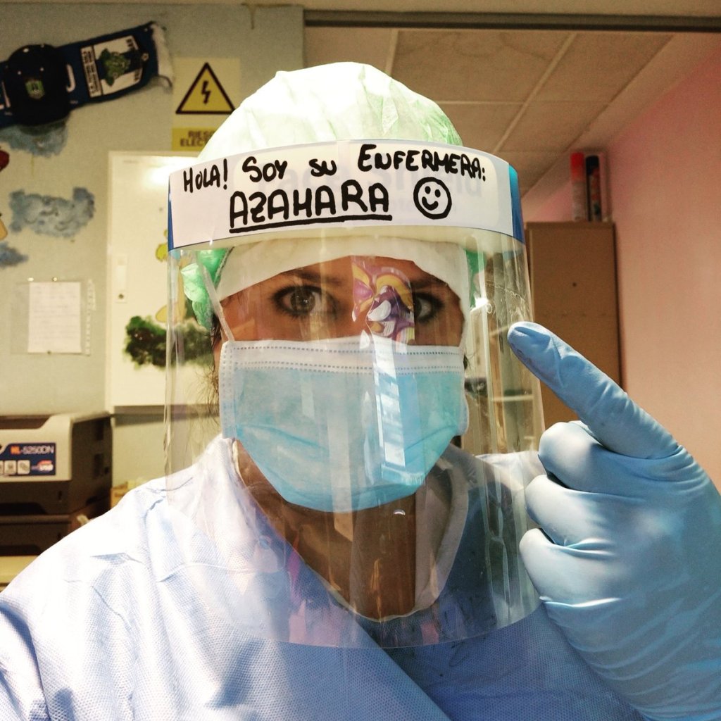
And then there are the true warriors who fight this virus while endangering themselves to help others. Here is a nurse from Spain whose photo at work I took from her Twitter feed. We are all surrounded by wonderful and beautiful people.
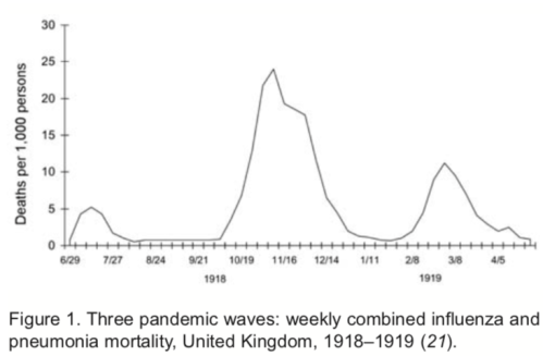
Almost 300 years ago a brave scientist boldly stated that everything can be described as waves. It took mathematicians another 200 years to prove that Joseph Fourier, the bold scientist, had it right. I am comforted by this fact while the Covid-19 pandemic appears to grow without bounds. And yet, bounds do exist, because Fourier states that what goes up must come down. This includes the global Covid-19 pandemic of 2020/21 as well as the Influenza pandemic of 1918/19. The latter had three distinct peaks in the United Kingdom that varied both in amplitude and duration:
Adapted from Taubenberger, J.K. and D.M. Morens: 1918 Influenza: The mother of all pandemics, Emerging Infectious Diseases, 12 (1), 2006.
This pandemic of 100 years ago came in three distinct pulses in the spring of 1918, in the fall of 1918, and in the winter of 1919. The graph shows that during the first wave about 0.5% of all infected people died while the second and third wave were more deadly with 2.5% and 1.3% fatality rates. These rates are somewhat similar to those we see today with Covid-19, but there is much we do not yet know.
We do not yet know, for example, how long it will take for the Covid-19 waves to pass through populations. We do not know the amplitude of the waves either, because it all depends on how well we distance ourselves from each other both now and into the future to minimize transmission of the virus. There is no control, yet, because no vaccine exist, but smart distancing will impact how many people will get infected (the amplitude) over time (the period).
These two factors (amplitude and duration) will determine how many of our friends, partners, parents, brothers, and sisters we will lose to the virus. As the German Chancellor Angela Merkel said yesterday: “Im Moment ist nur Abstand Ausdruck von Fuersorge,” which translates as “At the moment only distance is an expression of care.”
German Chancellor Angela Merkel on Mar.-18, 2020 on German TV.
Waves change as they propagate from one medium to another. As ocean wave forms move from deep to shallow water they change both amplitude and speed until they eventually break. I view today’s Covid-19 waves in a similar way.
Covid-19 waves will propagate through all societies on our planet, but they will propagate differently in different regions, countries, and societies. Amplitudes, periods, and propagation speeds will differ. Some of this is already visible by global statistics that are collected and shared in real time:
The spread of the virus in China differs from that in South Korea which differs from that in Iran, Italy, Germany, and the United States. Different political systems, different skills of and trust in governments, and different personal behaviors all provide a different medium within which these waves propagate and, eventually, will dissipate.
This is day-8 for me and my wife to distance ourselves from our friends, family, and neighbors. We are fine. My wife turns the bedroom into a painted mural while I read and write at home and spent much time in the spring garden. It slowly sinks in, that this will not be over next week or next month. The goal is to make the amplitude as small as possible by spreading the period out as long as possible which will allow our hospitals, nurses, and doctors to provide the best care for those who need it. As a wise woman said yesterday: “At the moment only distance is an expression of care.”
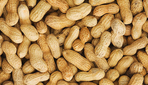
I got in trouble in class today. When the earth was introduced as a sphere, I disagreed and stated that the earth was shaped like a peanut instead. While it got me laughs from some students, not everyone was amused. And yet, I am serious on two counts:
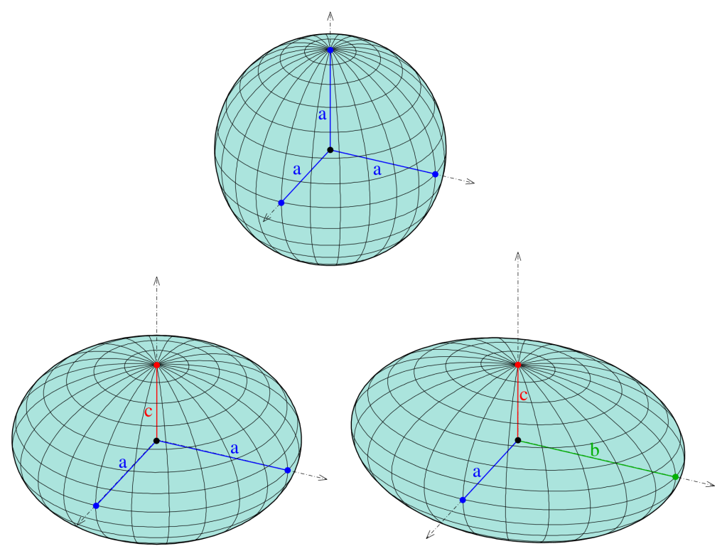
First, a sphere is a well defined shape that depends only on its radius. A sphere is a perfect mathematical idealization without a blemish such as a scratch, a bump, or a hole. It is also perfectly symmetric in two angles that I call longitude and latitude.
Second, a peanut eludes definition, because each peanut differs slightly from the next. It approximates a sphere poorly. Perhaps a spheroid is better approximation. It results when an air-filled beach ball is squished at its North-Pole. Still this does not look like a peanut, but instead of one parameter (its radius a), we now use two parameters (a and b) to describe it better. Or better yet, let us use three parameters (a and b and c).
For a perfect sphere three perpendicular lines from the center to the surface all have the same distance a (top) while for a spheriod only two of the three perpendicular lines have the same distance from the center (bottom right). If all three perpendiculars are different then we have something called a triaxial spheroid [Adapted from WikiPedia].
We can keep going like this for many, many more parameters by fancy sounding mathematical constructs. Still, neither peanut nor earth will ever be defined by perfectly defined mathematical objects, but a finite sum of them may approximate a true shape well enough. Both peanut and earth occur in nature and thus reflect physics, biology, and chemistry. As such our peanut earth can only be approximated by something mathematical, but the mathematics are always off by an amount that we can always make smaller by adding more parameters to describe the shape. In my glacier work off Greenland I use about 2200 such parameters to describe the shape of the earth to accurately represent its floating ice shelf.
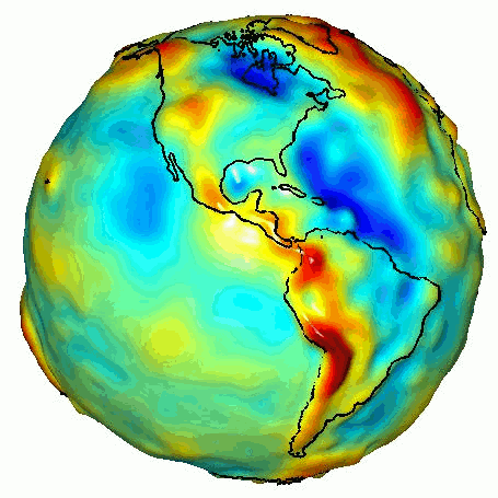
Closing my argument, I find that the little peanut has more in common with our planet earth than a sphere. Peanut and earth may look different from a distance, but the closer we look, and the better our sensors become, and the more accuracy we require, the closer our approximation of earth resembles our approximation of the peanut. The sphere is just the first of many approximations of the real thing. The real thing has a name and the Smithonian Institution defines and describes geoid much better than I do here calling it peanut earth.
The colors in this image represent the gravity anomalies measured by GRACE. One can define standard gravity as the value of gravity for a perfectly smooth ‘idealized’ Earth, and the gravity ‘anomaly’ is a measure of how actual gravity deviates from this standard. Red shows the areas where gravity is stronger than the smooth, standard value, and blue reveals areas where gravity is weaker. [Credit: NASA/JPL/University of Texas Center for Space Research]


