Shots of Airborne Lasers at Petermann Gletscher, Greenland

If shots of whiskey make you dizzy, shots of laser stun. NASA stunned me this week, when I discovered that they provide millions such shots of Greenland from which to construct detailed images of the landscape. The shots are free, no age-limit. This is better than the usual remote sensing or photography of “just” brightness. The laser gives us height, and not just the perception of it by shadows and fake angles of illumination, but hard and direct measurements of, well, height above sea level. Have a look at several million such shots of Petermann Gletscher taken in 2010 before the glacier broke to Manhattan-sized pieces:
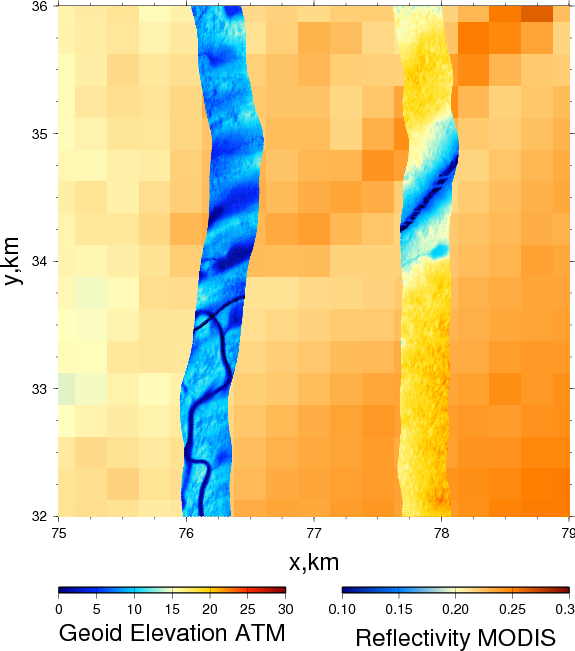
Petermann Glacier surface elevation from laser shots on Mar.-24, 2010 at the site where the Manhattan-sized ice island formed Aug.-6, 2010. The background shows the same scene at the same time at 250-m resolution from MODIS (see below). Colors along the 350-m wide laser track line show height above sea level in meters.
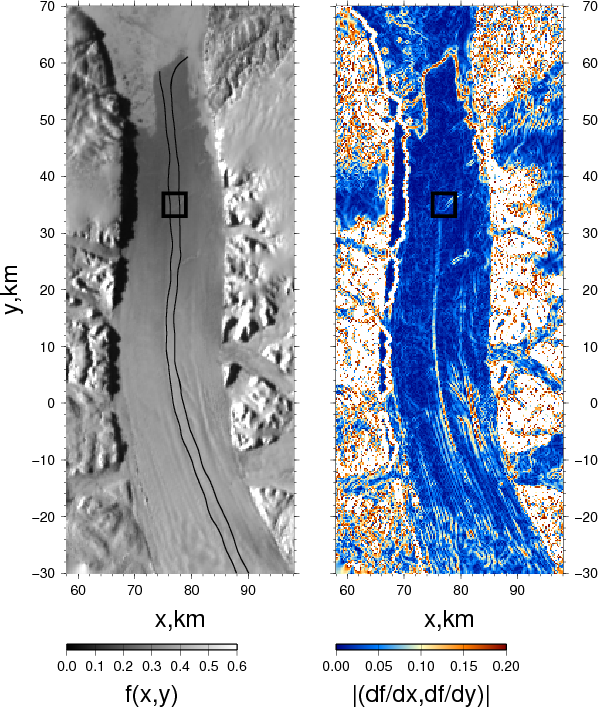
Petermann Glacier on March 24, 2010 as seen from MODIS satellite at 250-m resolution with two flight tracks along which laser data are collected. The black box shows the site of the figure above. The color figure on the right shows the slope or gradients of the data shown on left. It emphasizes regions where brightness changes fast. Multivariate calculus is useful!

We see two tracks: the one on right (east) has the ice stick more than 20-m above sea level (yellow colors) while about a mile to left (west) the ice’s surface elevation is only 10-m above sea level (light blue). Since the ice is floating and densities of ice and water are known, we can invert this height into an ice thickness. Independent radar measurements from the same track prove that this “hydrostatic” force balance holds, the glacier is indeed floating, so, multiply surface elevation by 10 and you got a good estimate of ice thickness. The dark blue colors of thin ice show meandering rivers and streams, ponds and undulations, as well as a rift or hairline fracture from east to west. This rift is visible both in the right and left track, it is the line along which the glacier will break to form the 2010 ice island. All ice towards the top of this rift has long left the glacier and some of it has hit Newfoundland as seen from the International Space Station by astronaut Ron Garan:
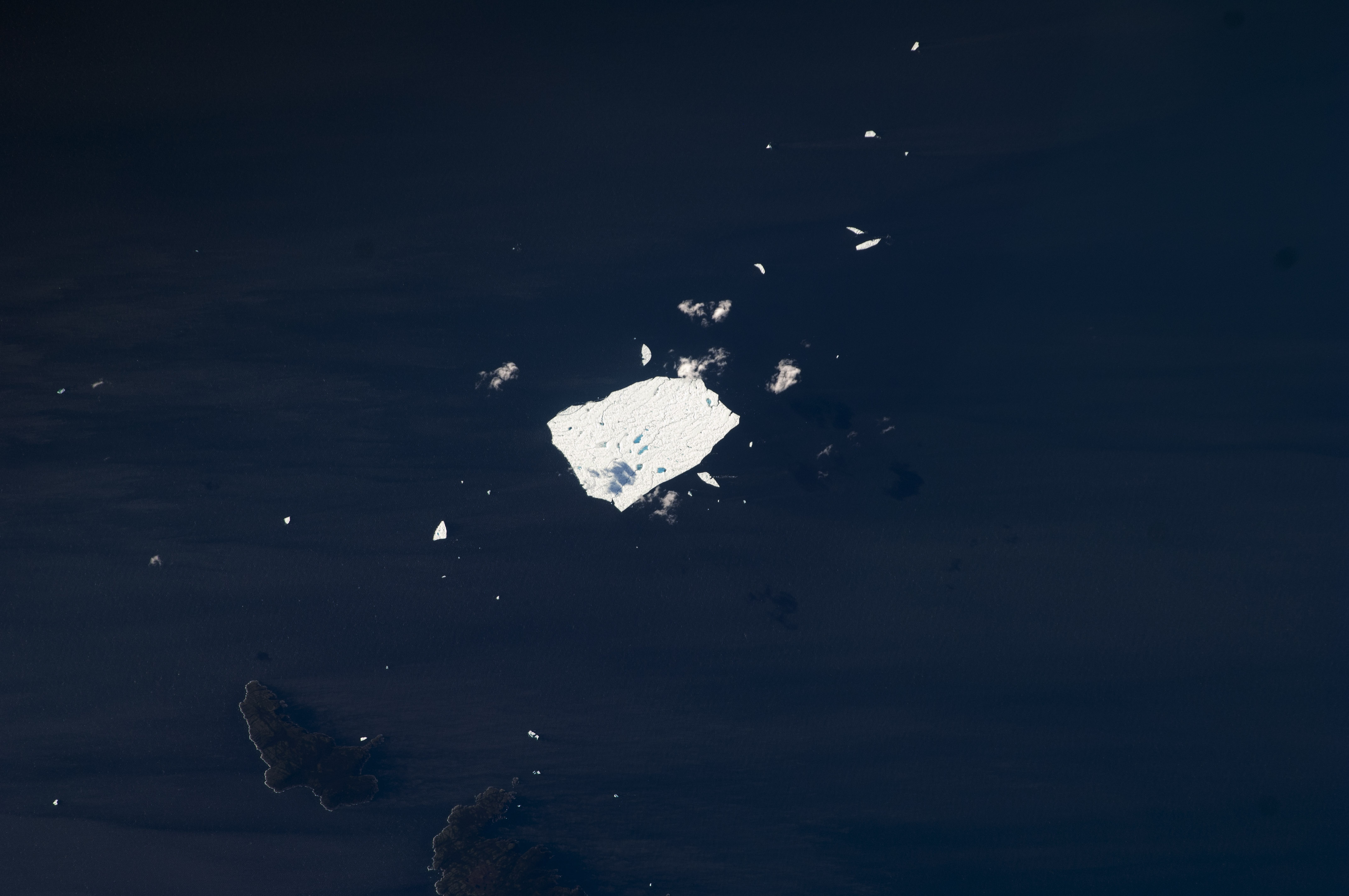
Last remnant of Petermann Ice Island 2010-A as seen from the International Space Station on Aug.-29, 2011 when it was about 3.5 km wide and 3 km long [Photo credit: Ron Garan, NASA]

Both are images of Petermann ice. The photo measures the brightness that hits the lens, but the laser measures both brightness and ice thickness. The laser acts like flash photography: When it is dark, we use a flash to provide the light to make the object “bright.” Now imagine that your camera also measures the time between the flash leaving your camera and brightness from a reflecting object to return it. What you think happens at an instant actually takes time as light travels fast, but not infinitely fast. So you need a very exact clock to measure the distance from your camera to the object. Replace the flash of the camera with a laser, replace the lens of your camera with a light detector and a timer, place the device on a plane, and you got yourself an airborne topographic altimeter. So, what use is there for this besides making pretty and geeky pictures?

The laser documents some of the change in “climate change.” Greenland’s glaciers and ice-sheets are retreating and shrinking. Measuring the surface and bottom of the ice over Greenland with lasers and radars gives ice thickness. The survey lines above were flown in 2002, 2003, 2007, 2010, and 2011. These data are a direct and accurate measure on how much ice is lost or gained at Petermann Gletscher and what is causing it. My bet is on the oceans which in Nares Strait and Petermann Fjord have increased the last 10 years to melt the floating glacier from below.

There is more, but Mia Zapata of the Gits sings hard of “Another Shot of Whiskey.” What a voice …

ResearchBlogging.org

Johnson, H., Münchow, A., Falkner, K., & Melling, H. (2011). Ocean circulation and properties in Petermann Fjord, Greenland Journal of Geophysical Research, 116 (C1) DOI: 10.1029/2010JC006519

Krabill, W., Abdalati, W., Frederick, E., Manizade, S., Martin, C., Sonntag, J., Swift, R., Thomas, R., & Yungel, J. (2002). Aircraft laser altimetry measurement of elevation changes of the greenland ice sheet: technique and accuracy assessment Journal of Geodynamics, 34 (3-4), 357-376 DOI: 10.1016/S0264-3707(02)00040-6

Münchow, A., Falkner, K., Melling, H., Rabe, B., & Johnson, H. (2011). Ocean Warming of Nares Strait Bottom Waters off Northwest Greenland, 2003–2009 Oceanography, 24 (3), 114-123 DOI: 10.5670/oceanog.2011.62

Thomas, R., Frederick, E., Krabill, W., Manizade, S., & Martin, C. (2009). Recent changes on Greenland outlet glaciers Journal of Glaciology, 55 (189), 147-162 DOI: 10.3189/002214309788608958


Nares Strait Ice Arches and Petermann Ice Island 2012

Arching barriers of ice locked solidly to land are presently closing off Nares Strait for all ice leaving or entering this ocean passage from the Arctic to the North Atlantic Oceans. Gothic cathedrals have flying buttressing to hold them in place while ice arches have buttressing land that keeps them stable. The sea ice becomes land-fast until these ice arches collapse in June or early July. As the ocean under the ice is still moving, generally from north to south, one often finds very thin ice or even open water to the immediate south of these ice arches. Some of these temperature signals let us “see” large ice structures even in the dark of night which in Nares Strait lasts from early October to late March.

Surface temperature in degrees Celsius for Nares Strait on Nov.-10, 2012 from MODIS Terra. Thick ice is blue (cold) while thin ice is red (warm).

Surface temperature at the northern entrances to Nares Strait with the Arctic Ocean to the north.

Surface temperature at the southern entrance of Nares Strait with the North Atlantic Ocean to the south.

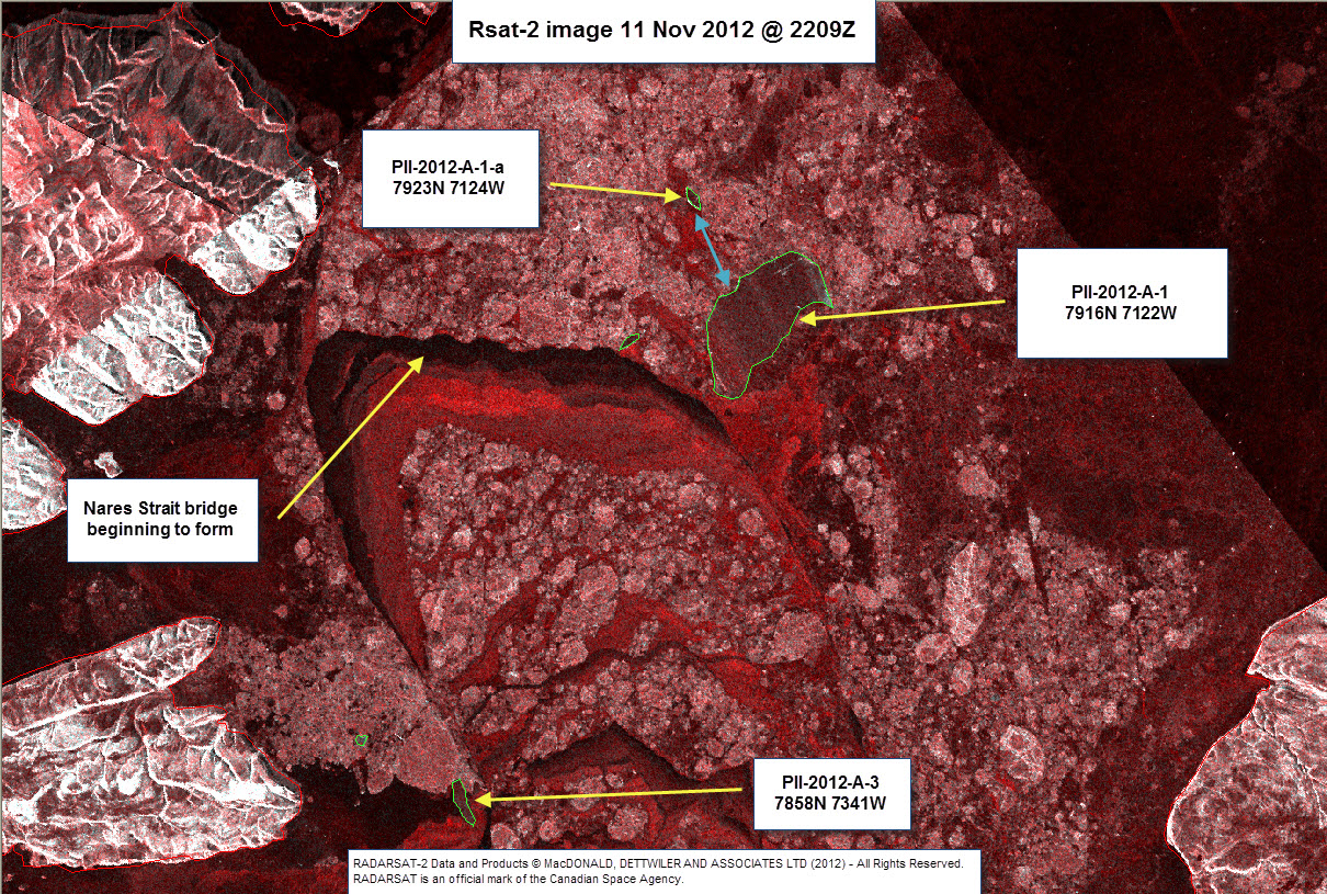
Southern entrance of Nares Strait as seen from RADARSAT showing ice arch formation in more spatial detail than MODIS temperatures do. Note the embedded ice island PII-2012 from Petermann Gletscher at the north-eastern edge of the ice arch. [Credit: Luc Desjardins, Canadian Ice Service]

These ice arches usually form in December or January, but this year they form a little earlier than usual. In some years such as 2006/07 or 2009/10 and 2010/11 they did not form at all and thick multi-year ice left the Arctic via a passage that is now closed. This leaves only Fram Strait to the east of Greenland for such export this year.

It appears that the large ice island that broke free from Petermann Gletscher earlier this year provides some stabilizing support to the southern ice arch as it is anchoring its north-eastern corner where it is possibly grounded. The depth of the ice island PII-2012-A1 is about 180 to 200 meters thick. I derived this estimate from both NASA’s Airborne Topographic Mapper (ATM) and the University of Kansas’s Radar Depth Sounder both flown concurrently on a DC-8 plane that surveyed Petermann Gletscher on May-7, 2011 with PII-2012-A1 still attached:

Profile of Petermann Glacier from laser (red) and radar (black) measurements on May-07, 2011. The 2012 break-up is indicated by a spike of the red under-ice topography near km-22. Bottom profiles from laser assume hydrostatic balance of floating ice.

The ATM is a scanning laser that measures the distance from the DC-8 to the surface within 0.2 meters (about 6-7 inches). If I know both the true sea level surface (I do, it’s called the geoid) and if the ice is floating undisturbed, then I can convert the surface elevation into a bottom draft. The red curve outlines the “theoretical” bottom of the glacier. This curve is masked by a thicker black curve that is a radar-derived image of the under-side of the glacier. Nothing theoretical about that one. These radar measurements agree closely with the red curves indicating an almost perfectly balanced floating glacier. This “balance” breaks down at two important points: (1) Near -20 km the glacier bottom is shallower than the red draft curve and it is here that the glacier sits on land as it is not floating. (2) Near +22 km we see a large red spike. This is the location of the 2012 break-up.

So, the 2012 ice-island that is anchoring the ice arch in southern Nares Strait is the piece of the glacier to the right of the red spike and with these data I can now conclude that PII-2012 was 11 km long, 15 km wide, and about 200 m deep. This Manhattan-sized ice-cube weights about 30 gigatons (10^12 kg), but “… that doesn’t mean much — who goes to the store and buys a gigaton of carrots? For a sense of perspective, a gigaton is about twice the mass of all people on earth …” [James Fallows writing for The Atlantic]. Hence this little ice-cube weights 50 times as much as do all people living on earth today. Incidentally, it is also the amount of CO2 that all humanity adds each year to the atmosphere. Coincidence.

Front of Petermann Glacier Aug.-11, 2012. View is from a small side-glacier towards the south-east across Petermann Fjord with Petermann Gletscher to the left (east). [Photo Credit: Erin Clark, Canadian Coast Guard Ship Henry Larsen]

Storm Surges, Global Warming, and Delaware Beaches

ADDENDUM (Nov.-7, 2012): Time lapse video from Delaware Sea Grant.

Rising seas and flood waters cause most of the damage during storms such as Sandy did last week. Tides, waves, and storms all contribute. We can debate how global warming impacts any of the above, but the arguments are involved. So lets assume, that neither tides, waves, nor storms are impacted by global warming, but that the globally averaged rise in sea level over the last 50 or 100 years is. This global warming induced sea level rise is about half a foot in 50 years (3 mm/year), but why would we care about global averages, when we live in Delaware? Furthermore, why worry about the whimpy surges we get ever 2-3 weeks. We don’t, we worry most about the most extreme events like Sandy and want to know how often they occur. Below I show a Sandy-like event to occur about once every 10 years. Furthermore, over time Delaware’s most extreme storm surges are rising twice as fast as global averages do. So, how much does the global warming impact our local flooding in Delaware?

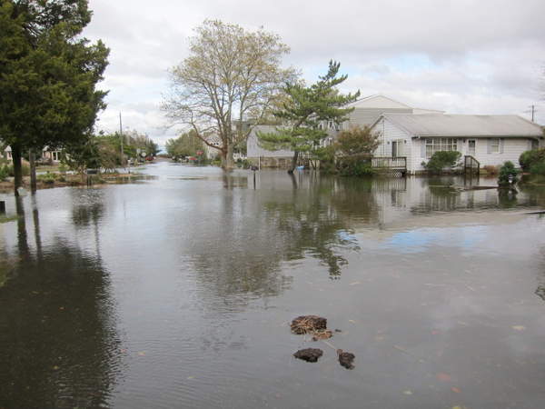
Market Street on the beach in Lewes is in one of the lowest lying areas of town and takes its good old-time draining. This photograph looks northeastward toward the beach, just west of the intersection with Massachusetts Avenue. [Credit: Cape Gazette]

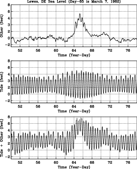
More than I initially thought: the largest storm surge that has hit Delaware was the Ash Wednesday storm on March 6, 1962 which added 5.8 feet to the regular tides and waves. I wrote about this yesterday using public NOAA data. This same storm today would add 6.8 feet to the regular tides and waves. For comparison, Sandy’s storm surge added 5.3 feet. So Sandy was a weak storm by comparison. If it had hit in 1962, it would have added only 4.3 feet. The difference of 1 foot in 50 years is due to steadily rising sea levels:

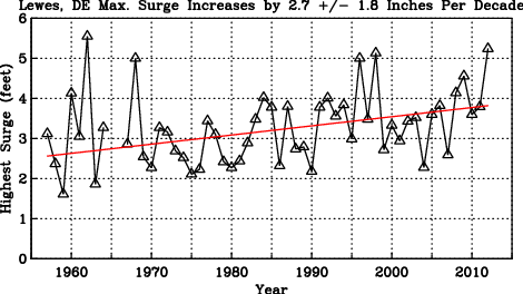
Largest storm surge at Lewes, Delaware each year from 1957 to present. The red line is a linear fit to the data. The slope indicates that the largest storm surge increase by almost 3 inches every 10 years.

On average each year has a larger largest surge than the year before. While this steady increase by 2.8 +/- 1.7 inches each 10 years is statistically significant (95% confidence), picking the extreme each year is perhaps not the best statistic as extremes do not happen often. Please note that a 95% confidence means that there is a 5% chance that the true increase is either smaller than 0.9 inches/decade or larger than 4.5 inches/decade.

What about the mean or average surge each year? From hourly data, I pick the middle surge, that is, half the surges each year are larger and half are smaller:

This increase of 1.4 +/- 0.2 inches per decade (95% confidence) is more in line of the global average. The uncertainty in this trend is smaller than that of the trend for the extreme, because the median sea level varies little from year to year, while the extreme value varies more from year to year. So, from these results we can conclude, that while the mean or median sea level at Lewes increases by perhaps 1.5 inches in 10 years, the extremes increase twice as fast. So, storm surges like Sandy will become more common than they are today mostly because of global warming.

Over the last 50 years we had at least 5 such events in 1962, 1968, 1996, 1998, and 2012. So, on average we have a Sandy-type storm surge greater than 5 feet every 10 years. This contradicts a Wilmington News Journal article today which quotes John Ramsey to describe “… Sandy as a 1-in-200-years storm, unlikely to be repeated anytime soon. That could give coastal communities time enough to deal with the real threats and realities of sea level rise and climate change.” There is no such time, as it is mis-leading to describe Sandy as a 1-in-200-year event when it has happened about every 10 years during the last 55 years. Instead of a 0.5% percent chance of a Sandy-like event to hit Lewes each year, I would raise this chance to be larger than 10%.

Rising Seas, Storms, and Flooding

Ocean waters are rising and flooding inland waters in Delaware and elsewhere. Some of this is perfectly regular and normal such as the up and down of the tides. Some of it is irregular and normal such as caused by storms, river discharges, waves, and weather. And some is caused by global warming as we continue to burn coal and oil to power our economies. Lets have a quick look at what all this looks like and try to put this into some perspective, but Sandy’s 5.3 feet surge last monday was second to the 5.5 feet surge that hit Lewes in 1962.

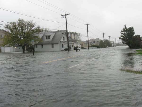
Cedar Street in Lewes flooded on Monday, October 29. (Photo by: Don Bland), as published by Cape Gazette.

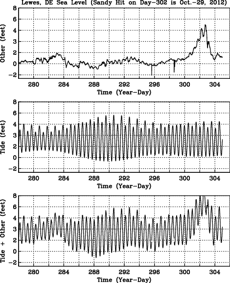
The up and down of the tides each day is about 3 feet in Lewes, Delaware. This large change in sea level is so regular, normal, and predictable, that I remove it from all further discussion, because I want to know how extreme an event this week’s storm Sandy was. For this purpose I downloaded all the hourly tide gauge data from Lewes, Delaware from NOAA. The record starts in 1957 and is ongoing. Here is how the record looks for the last 4 weeks including the surge caused by Sandy last monday:

Sandy’s storm surge added 5.3 feet to the regular tide which is second-largest surge in the historical record. The largest surge at Lewes, DE was caused by the 1962 Ash Wednesday Storm that added 5.5 feet to the regular sea level:

So while Sandy was a very large surge, it was neither unprecedented nor a once in a century event. Furthermore, and this is where I come back to global warming, the 5.3 feet 2012 surge of Sandy includes the last 50 years of steady sea level rise which comes to about an inch every 10-15 years or about half a foot in the ~50 years between 1962 and 2012. So, a repeat of the 1962 storm system would cause a 6.0 feet and not the 5.5 feet surge that took place in 1962.

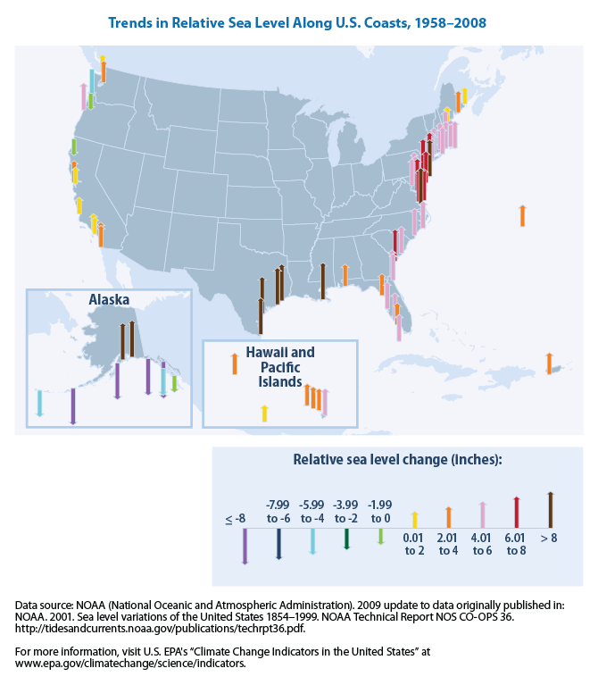
Furthermore, while the real size of the surge depends on where the center of the storm makes land-fall or where you are relative to the storm, the rising seas caused by global warming are much more uniform, that is, they are little different in Boston, New York, Lewes, Norfolk, or even San Francisco:

So, global warming and the rising seas it causes are both real and here to stay. Global warming provides the upward creeping background sea level to which larger tides, waves, and surges add. The combined effect of all these cause the coastal flooding. So 50 years from now, a rare, but perhaps perfectly natural freak storm like Sandy will cause a storm surge of 5.8 instead 5.3 feet on account of global warming. About 1/3 of this added sea level is caused by the oceans expanding as they warm, another 1/3 is caused by melting glaciers and ice sheets in Greenland and Antarctica, and the last 1/3 is caused by other processes. So, what happens on Greenland or China does not stay there, it impacts present and future sea level in Lewes, DE.

Hurricane Sandy, Global Warming, and the Butterfly Effect

I am stupid. I do not believe in Global Warming. No need to believe in what you know. And I know that globally averaged air temperatures increased for the last 150 years or so. I did the math myself using observations to conclude, that air temperatures around northern Greenland and Ellesmere Island increased 5 times the global average over the last 25 years (Greenland’s Warming, Melting, and Sliding to Sea). So, why am I stupid?

Cover of Bloomberg Businessweek, Nov.-5, 2012

I am stupid, because I totally disagree with what has just hit the news stand about Hurricane Sandy’s impact on the eastern seaboard of North America: It’s Global Warming, Stupid screams this week’s edition of Bloomberg Businessweek with a dramatic cover draped in red.

I do not deny that some element of global warming scenarios contributed in some way to this storm, but so did the butterfly I rescued earlier this year from my cat Zoe. The butterfly flapping her wings, I am convinced, contributed to the atmospheric turbulence and thus the weather we got, including Sandy. If this sounds crazy, it is, but so is the headline. We can argue all day, if Global Warming or my Butterfly Effect contributed more significantly to Sandy, but we will not come to a firm scientific conclusion.

The Businessweek article has some excellent points on page three with regard to climate change and policies that we can and should make to reduce carbon emissions, but it discredits these well-reasoned policies by using flood waters in Manhattan as the call for action with a screaming headline calling me stupid. If we make policies based on ill-informed drama, political manipulations, and without supporting good empirical evidence, then we do harm.

A shallow and short-term political victory does not address the deep and long-term social problems posed by climate change. Solutions to these problems such as carbon-trading, energy efficiency, smart growth, and adaptations are all endangered, if we chose to exploit emotions of the moment. This sets us up for an equally ill-informed and short-sighted political backlash. We ignore science at our own peril. This cuts both ways with regard to the political hackery and partisan politics on the issue of climate change. I can’t stand it, but then, I am stupid.

ADDENDUM Nov.-2: An excellent description of the storm’s evolution and relation to climate was published in Science Magazine.