Tag Archives: oceanography

Shots of Airborne Lasers at Petermann Gletscher, Greenland

If shots of whiskey make you dizzy, shots of laser stun. NASA stunned me this week, when I discovered that they provide millions such shots of Greenland from which to construct detailed images of the landscape. The shots are free, no age-limit. This is better than the usual remote sensing or photography of “just” brightness. The laser gives us height, and not just the perception of it by shadows and fake angles of illumination, but hard and direct measurements of, well, height above sea level. Have a look at several million such shots of Petermann Gletscher taken in 2010 before the glacier broke to Manhattan-sized pieces:

Petermann Glacier surface elevation from laser shots on Mar.-24, 2010 at the site where the Manhattan-sized ice island formed Aug.-6, 2010. The background shows the same scene at the same time at 250-m resolution from MODIS (see below). Colors along the 350-m wide laser track line show height above sea level in meters.

Petermann Glacier on March 24, 2010 as seen from MODIS satellite at 250-m resolution with two flight tracks along which laser data are collected. The black box shows the site of the figure above. The color figure on the right shows the slope or gradients of the data shown on left. It emphasizes regions where brightness changes fast. Multivariate calculus is useful!

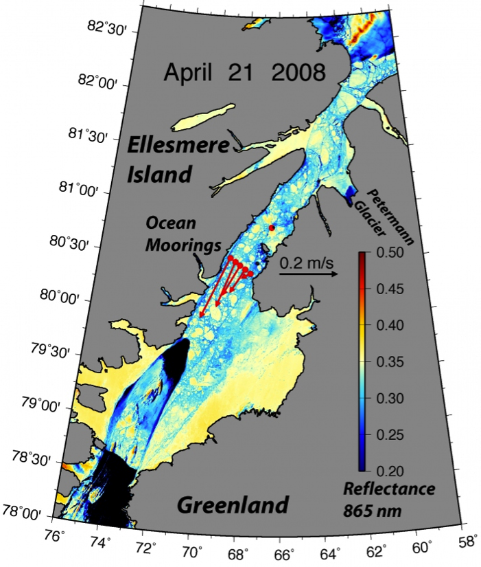
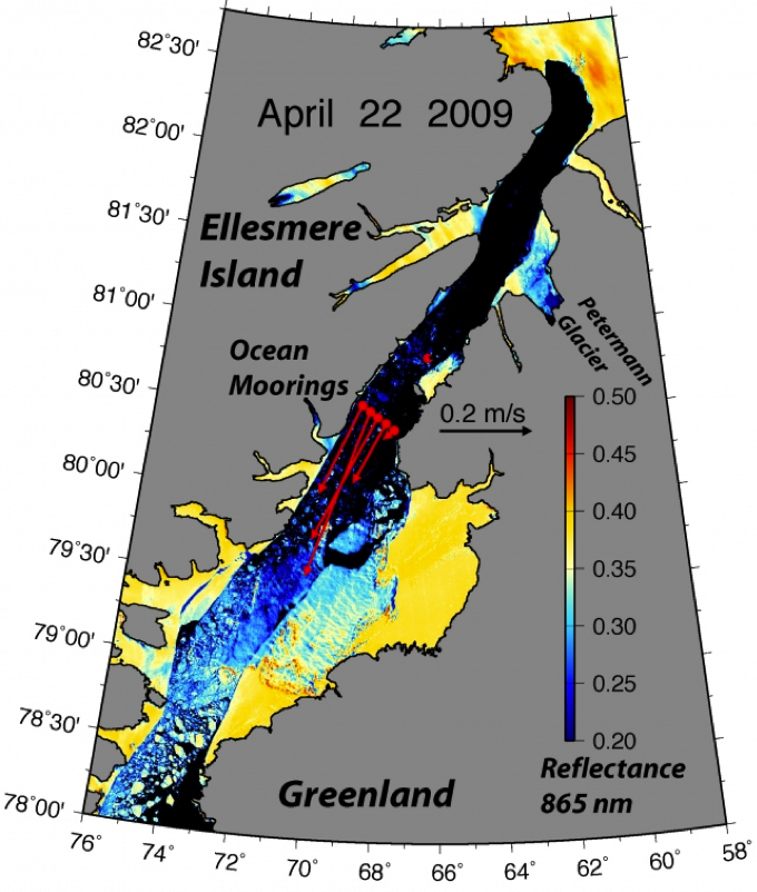
We see two tracks: the one on right (east) has the ice stick more than 20-m above sea level (yellow colors) while about a mile to left (west) the ice’s surface elevation is only 10-m above sea level (light blue). Since the ice is floating and densities of ice and water are known, we can invert this height into an ice thickness. Independent radar measurements from the same track prove that this “hydrostatic” force balance holds, the glacier is indeed floating, so, multiply surface elevation by 10 and you got a good estimate of ice thickness. The dark blue colors of thin ice show meandering rivers and streams, ponds and undulations, as well as a rift or hairline fracture from east to west. This rift is visible both in the right and left track, it is the line along which the glacier will break to form the 2010 ice island. All ice towards the top of this rift has long left the glacier and some of it has hit Newfoundland as seen from the International Space Station by astronaut Ron Garan:

Last remnant of Petermann Ice Island 2010-A as seen from the International Space Station on Aug.-29, 2011 when it was about 3.5 km wide and 3 km long [Photo credit: Ron Garan, NASA]

Both are images of Petermann ice. The photo measures the brightness that hits the lens, but the laser measures both brightness and ice thickness. The laser acts like flash photography: When it is dark, we use a flash to provide the light to make the object “bright.” Now imagine that your camera also measures the time between the flash leaving your camera and brightness from a reflecting object to return it. What you think happens at an instant actually takes time as light travels fast, but not infinitely fast. So you need a very exact clock to measure the distance from your camera to the object. Replace the flash of the camera with a laser, replace the lens of your camera with a light detector and a timer, place the device on a plane, and you got yourself an airborne topographic altimeter. So, what use is there for this besides making pretty and geeky pictures?

The laser documents some of the change in “climate change.” Greenland’s glaciers and ice-sheets are retreating and shrinking. Measuring the surface and bottom of the ice over Greenland with lasers and radars gives ice thickness. The survey lines above were flown in 2002, 2003, 2007, 2010, and 2011. These data are a direct and accurate measure on how much ice is lost or gained at Petermann Gletscher and what is causing it. My bet is on the oceans which in Nares Strait and Petermann Fjord have increased the last 10 years to melt the floating glacier from below.

There is more, but Mia Zapata of the Gits sings hard of “Another Shot of Whiskey.” What a voice …

ResearchBlogging.org

Johnson, H., Münchow, A., Falkner, K., & Melling, H. (2011). Ocean circulation and properties in Petermann Fjord, Greenland Journal of Geophysical Research, 116 (C1) DOI: 10.1029/2010JC006519

Krabill, W., Abdalati, W., Frederick, E., Manizade, S., Martin, C., Sonntag, J., Swift, R., Thomas, R., & Yungel, J. (2002). Aircraft laser altimetry measurement of elevation changes of the greenland ice sheet: technique and accuracy assessment Journal of Geodynamics, 34 (3-4), 357-376 DOI: 10.1016/S0264-3707(02)00040-6

Münchow, A., Falkner, K., Melling, H., Rabe, B., & Johnson, H. (2011). Ocean Warming of Nares Strait Bottom Waters off Northwest Greenland, 2003–2009 Oceanography, 24 (3), 114-123 DOI: 10.5670/oceanog.2011.62

Thomas, R., Frederick, E., Krabill, W., Manizade, S., & Martin, C. (2009). Recent changes on Greenland outlet glaciers Journal of Glaciology, 55 (189), 147-162 DOI: 10.3189/002214309788608958

Storm Surges, Global Warming, and Delaware Beaches

ADDENDUM (Nov.-7, 2012): Time lapse video from Delaware Sea Grant.

Rising seas and flood waters cause most of the damage during storms such as Sandy did last week. Tides, waves, and storms all contribute. We can debate how global warming impacts any of the above, but the arguments are involved. So lets assume, that neither tides, waves, nor storms are impacted by global warming, but that the globally averaged rise in sea level over the last 50 or 100 years is. This global warming induced sea level rise is about half a foot in 50 years (3 mm/year), but why would we care about global averages, when we live in Delaware? Furthermore, why worry about the whimpy surges we get ever 2-3 weeks. We don’t, we worry most about the most extreme events like Sandy and want to know how often they occur. Below I show a Sandy-like event to occur about once every 10 years. Furthermore, over time Delaware’s most extreme storm surges are rising twice as fast as global averages do. So, how much does the global warming impact our local flooding in Delaware?

Market Street on the beach in Lewes is in one of the lowest lying areas of town and takes its good old-time draining. This photograph looks northeastward toward the beach, just west of the intersection with Massachusetts Avenue. [Credit: Cape Gazette]

More than I initially thought: the largest storm surge that has hit Delaware was the Ash Wednesday storm on March 6, 1962 which added 5.8 feet to the regular tides and waves. I wrote about this yesterday using public NOAA data. This same storm today would add 6.8 feet to the regular tides and waves. For comparison, Sandy’s storm surge added 5.3 feet. So Sandy was a weak storm by comparison. If it had hit in 1962, it would have added only 4.3 feet. The difference of 1 foot in 50 years is due to steadily rising sea levels:

Largest storm surge at Lewes, Delaware each year from 1957 to present. The red line is a linear fit to the data. The slope indicates that the largest storm surge increase by almost 3 inches every 10 years.

On average each year has a larger largest surge than the year before. While this steady increase by 2.8 +/- 1.7 inches each 10 years is statistically significant (95% confidence), picking the extreme each year is perhaps not the best statistic as extremes do not happen often. Please note that a 95% confidence means that there is a 5% chance that the true increase is either smaller than 0.9 inches/decade or larger than 4.5 inches/decade.

What about the mean or average surge each year? From hourly data, I pick the middle surge, that is, half the surges each year are larger and half are smaller:

This increase of 1.4 +/- 0.2 inches per decade (95% confidence) is more in line of the global average. The uncertainty in this trend is smaller than that of the trend for the extreme, because the median sea level varies little from year to year, while the extreme value varies more from year to year. So, from these results we can conclude, that while the mean or median sea level at Lewes increases by perhaps 1.5 inches in 10 years, the extremes increase twice as fast. So, storm surges like Sandy will become more common than they are today mostly because of global warming.

Over the last 50 years we had at least 5 such events in 1962, 1968, 1996, 1998, and 2012. So, on average we have a Sandy-type storm surge greater than 5 feet every 10 years. This contradicts a Wilmington News Journal article today which quotes John Ramsey to describe “… Sandy as a 1-in-200-years storm, unlikely to be repeated anytime soon. That could give coastal communities time enough to deal with the real threats and realities of sea level rise and climate change.” There is no such time, as it is mis-leading to describe Sandy as a 1-in-200-year event when it has happened about every 10 years during the last 55 years. Instead of a 0.5% percent chance of a Sandy-like event to hit Lewes each year, I would raise this chance to be larger than 10%.

Rising Seas, Storms, and Flooding

Ocean waters are rising and flooding inland waters in Delaware and elsewhere. Some of this is perfectly regular and normal such as the up and down of the tides. Some of it is irregular and normal such as caused by storms, river discharges, waves, and weather. And some is caused by global warming as we continue to burn coal and oil to power our economies. Lets have a quick look at what all this looks like and try to put this into some perspective, but Sandy’s 5.3 feet surge last monday was second to the 5.5 feet surge that hit Lewes in 1962.

Cedar Street in Lewes flooded on Monday, October 29. (Photo by: Don Bland), as published by Cape Gazette.

The up and down of the tides each day is about 3 feet in Lewes, Delaware. This large change in sea level is so regular, normal, and predictable, that I remove it from all further discussion, because I want to know how extreme an event this week’s storm Sandy was. For this purpose I downloaded all the hourly tide gauge data from Lewes, Delaware from NOAA. The record starts in 1957 and is ongoing. Here is how the record looks for the last 4 weeks including the surge caused by Sandy last monday:

Sandy’s storm surge added 5.3 feet to the regular tide which is second-largest surge in the historical record. The largest surge at Lewes, DE was caused by the 1962 Ash Wednesday Storm that added 5.5 feet to the regular sea level:

So while Sandy was a very large surge, it was neither unprecedented nor a once in a century event. Furthermore, and this is where I come back to global warming, the 5.3 feet 2012 surge of Sandy includes the last 50 years of steady sea level rise which comes to about an inch every 10-15 years or about half a foot in the ~50 years between 1962 and 2012. So, a repeat of the 1962 storm system would cause a 6.0 feet and not the 5.5 feet surge that took place in 1962.

Furthermore, while the real size of the surge depends on where the center of the storm makes land-fall or where you are relative to the storm, the rising seas caused by global warming are much more uniform, that is, they are little different in Boston, New York, Lewes, Norfolk, or even San Francisco:

So, global warming and the rising seas it causes are both real and here to stay. Global warming provides the upward creeping background sea level to which larger tides, waves, and surges add. The combined effect of all these cause the coastal flooding. So 50 years from now, a rare, but perhaps perfectly natural freak storm like Sandy will cause a storm surge of 5.8 instead 5.3 feet on account of global warming. About 1/3 of this added sea level is caused by the oceans expanding as they warm, another 1/3 is caused by melting glaciers and ice sheets in Greenland and Antarctica, and the last 1/3 is caused by other processes. So, what happens on Greenland or China does not stay there, it impacts present and future sea level in Lewes, DE.

Petermann Ice Island 2012 Breaking Up

Dr. Preben Gudmandsen pioneered some of the early micro-wave remote sensors 30-40 years ago that are now used routinely to monitor sea ice, snow, and glaciers. Despite being “retired” for over 20 years, this Danish professor of Electrical Engineering is still very active in all things related to Nares Strait from sea ice, oceanography, glaciers, and winds. He is one of the main instigators to set up the automated weather station at Hans Island.

Nares Strait bottom depth (in meters) according to the International Bathymetric Chart of the Arctic Ocean (IBCAO, version 2, 2008). The black dot in the center of Nares Strait indicates Hans Island.

He also instigated the latest round of exchanges among “Friends of Nares Strait” about the fate of the ice island that broke off earlier this summer from Petermann Gletscher. He asked yesterday what may happen if PII-2012 reaches the sill separating northern Nares Strait and the Arctic Ocean from southern Nares Strait and the Atlantic Ocean. This sill is the deepest connection between the Arctic Ocean to the north and Baffin Bay in the south. The sill is in western Kane Basin off Ellesmere island and is about 220 meters deep.

So, to answer that question one needs to know three things: Where is the ice island, how deep is the water where it is, and how thick is the ice island. Before I could assemble these three things, however, the ice island has already broken into at least three pieces. Luc Desjardins of the Canadian Ice Service answered first by pointing this out. He has access to the commercial RadarSat data that few others have. So, here is the latest from MODIS which answers the first two questions:

Petermann ice island 2012 (PII-2012) breaking apart on Sept.-1, 2012 near the sill of Nares Strait. Faint black lines are bottom contours of 200, 150, 100, and 50 meter depth (IBCAO-2). Bottom left has clouds, top right is the mountainous terrain of Ellesmere Island. The most southerly part of PII-2012 is the thickest as it was attached to the glacier earlier this year. The most northerly section connected to PII-2010 which passed a moored array in place near Hans Island on Sept.-22, 2010.

Petermann Ice Island 2012 as one piece on Aug.-30, 2012 19:20 UTC in Kane Basin over contours of bottom topography.

From the above two MODIS images over contours of bottom topography, the shallowest water that PII-2012 has seen is the 150-m contour to the east towards Greenland. It is possible, however, that PII-2012 may also have hit some shallow topographic feature not properly charted in IBCAO-2008 (there is a 2012 version, I just learnt) or not properly contoured by me. Lets move on the next question, how thick is this ice island?

From data we recovered 3 weeks ago I can say, however, that PII-2012 is thicker than 144 meters. I base this estimate on the ice island that formed in 2010 and that passed over our moored array on Sept.-22, 2010. It hit two ice profiling sonars at 75 meters and damaged the stainless steel guard cage designed to protect the sensors (which they did), e.g.,

Two Ice Profiling Sonars (IPS) aboard the CCGS Henry Larsen in Aug.-2012. The bent stainless steel protective frame was bent by the 2010 ice island that hit both instruments in Sept.-2010. [Photo Credit: Andreas Muenchow]

Another instrument moored deeper at ~360 meter depth sends out acoustic pings and measures how much sound comes back. A weak scatter like some microscopic plankton or grain of mud or sand in the water reflects little energy, but a hard surface like the ice floating atop reflects lots. And here is how a time series of this backscattered energy looks like when an ice island passes over:

A 24-hour segment of acoustic backscatter from a bottom-mounted acoustic Doppler current profiler is show to vary with time and height above the bottom. The dark red represents the sea surface and/or the bottom of ice floating on it. Vertical resolution is 8 meters, temporal resolution is 30 minutes for a 3-year deployment. The main purpose of this instrument is to measure ocean currents at the same spatial and temporal resolution as shown here for backscatter. PII-2012-B passed over the instrument on Sept.-22, 2010 and is here estimated to be about 144 meters thick.

The exact place of the mooring and the time that PII-2010-B was on Sept.-22, 2010 is shown in this MODIS image of that day:

Location of ADCP mooring site (red square) with Petermann Ice Island 2010 segment B overhead on Sept.-22, 2010.

If you like puzzles, then you will like physical oceanography or any field of science or engineering. If you like puzzles, you will correctly notice, that the flat segment of PII-2010-B oriented parallel to the shores of Ellesmere Island fits the flat segment of PII-2012 that also has a hook to the north. These two segments were indeed connected before they separated from the glacier in 2010 and 2012. This is the reason, that the thickest part of the 2010 ice island is the shallowest part of the 2012 ice island, because the ice gets thicker towards the grounding line of Petermann Gletscher.

And finally, if you like puzzles, then you should consider a career in physical oceanography or physics or mathematics or electrical or mechanical or civil engineering. These are fields where jobs and careers are plentiful and people live long and happy lives: Preben chose Electrical Engineering 70 years ago in Denmark, I chose physical oceanography 30 years ago in Germany, and Allison chose physics 3 years ago in the U.S. of A. Sadly, few American students chose to compete for these jobs and lives, because they need to take a “difficult” undergraduate major. Allison did, she picked physics and oceanography, and so can you.

University of Delaware summer intern Allison Einolf from Macalester College, Minnesota in Nares Strait in Aug.-2012 aboard CCGS Henry Larsen. Allison studies physics. [Photo Credit: Jo Poole, British Columbia]

Ice Thickness in Nares Strait 2008 and 2009

[Editor’s Note: Undergraduate Julie Jones of the University of Delaware summarizes her work that was supervised by Helga Huntley as part of an NSF-funded summer internship.]

Three years ago in 2009 Andreas Muenchow left from Delaware for Greenland with students Pat Ryan and Berit Rabe to recover instruments that recorded salinity, temperature, current velocities, and ice thickness in Nares Strait since 2007.  This summer, I used those observations to estimate ice thickness for April through June in 2008 and compare them to estimates for the same spring period in 2009.  An ice bridge had formed in 2008 but not in 2009.  Working as a group, we wanted to investigate the effect of ice arches on the ice thickness.  Allison Einolf, another summer intern who focused on ocean currents during the same time periods and Andreas produced these maps that introduce the study area, spatial ice cover, and mean ocean currents:

Image

Nares Strait MODIS satellite imagery of the study area and ice arch April 21, 2008. Red dots are instrument locations. Arrows show current velocities.

Image

Nares Strait MODIS satellite imagery of the study area and ice arch April 22, 2009. Red dots are instrument locations. Arrows show current velocities. Note the lack of the southern ice arch, but the presence of one north of the study area.

I used Matlab for most of the data processing, more specifically the Ice Profiling Sonar (IPS) Processing Toolbox for Matlab provided by the manufacturer of the instrument that collected the data: ASL Environmental Sciences, Inc. First I transformed the data from the IPS instrument into a range time series.  I then manually “despiked” the data, taking out any data points that were likely due to bubbles or fish within the acoustic path from the sensor system to the ice above and back.  In a second step I wrote a function using sound speed data from Andreas, atmospheric pressure from Dr. Samelson at Oregon State University, and pressure (depth) data from the IPS instrument to get a time series of the thickness of the ice.  In a third step I applied a Lanczos raised cosine filter that was taught as part of a 2012 Summer Intern Page Workshop. Hence I finally had some nicely filtered data for the periods of the April-June of 2008 and 2009.

Now the results:  Just as we expected, there was much thicker ice in the 2008 spring with a southern ice arch present than there was in the spring of 2009 when no such ice arch was present:

Histogram for April – June 2008 ice. There is a peak at 3 meters, with almost 25% of the ice that thick.

Histogram for April – June 2009 ice. The ice does not get thicker then 2 meters with most of the ice thinner than one meter.

The histograms show thicker ice in 2008, about 2-6 meters on average and with some ice even reaching 10 meters.  In 2009, the ice doesn’t get thicker than 2 meters with most of the ice being thinner than 1 meter.  More specifically, the mean ice thickness for April – June 2008 (2009) is 3.8 (0.58) meters with a standard deviation of 1.8 (0.29) meters.  This further shows that there was thicker ice in 2008 than there was in 2009.  I attributed the cause for the thin 2009 ice to ice flowing freely through Nares Strait all winter and spring as no ice arch in the south blocked such flow.  The ice, thus, did not spend enough time in the high Arctic to thicken.

I noticed something else in my histograms when the 2008 ice bridge collapsed.

April 2008 ice thickness

May 2008 ice thickness

June 2008 Ice Thickness

The monthly histograms show that the ice in April and May is thicker than the ice in June.  We know that the 2008 ice bridge collapsed near June 6th, so it is interesting and it makes a lot of sense that the ice in June would be thinner than the ice two months earlier.

The mean ice thickness for April 2008 was 4.6 meters with a standard deviation of 2.40 meters.  In May 2008 the mean ice thickness was 3.5 meters with a standard deviation of 1.40 meters.  Lastly, in June the mean ice thickness was 3.5 meters with a standard deviation of 1.30 meters.  The ice thickness decreased after April and the variability decreases in June, which helps detect the bridge collapse in the data.

Lastly here are the filtered time series of April – June of 2008 and 2009.

Filtered time series for April – June 2008

Filtered time Series for April – June 2009 with the same scale as 2008 (above figure)

Filtered time series for April – June 2009 with a different scale to see the variability over time more clearly.

Hopefully we can see more interesting and exciting results from the instruments that the Nares Strait team picked up this summer even though they were hit hard by the 2010 Petermann Ice Island!

Two Ice Profiling Sonars (IPS) aboard the CCGS Henry Larsen in Aug.-2012. The protective stainless steel frame was bent by the 2010 ice island that hit both instruments in Sept.-2010. [Photo Credit: Andreas Muenchow]