Saturday, 4:30pm, no breakfast, no lunch, but lots of reading, thinking, and dreaming on how to draw that perfect plot. How can I convey data and science from Greenland as oceans, glaciers, and ice are all changing faster than I can process data, faster than I can think? What is signal, what is noise? How to get rid of all the clutter everywhere?
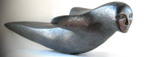
Inuit carving taken from EastGreenland.com.
Calming my nerves, I am thinking of the above carving. Calming my mind, I am thinking of the essay by Michael Shermer which was published by Scientific American in April 2005. It reviews work by Edward Tufte after an interview with him [source] from which I take the following wise words on how to convey information well and ethically:
Information displays should be documentary, comparative, casual and explanatory, quantified, multivariate, exploratory, and sceptical.
1. Document sources and characteristics of the data;
2. Enforce appropriate comparisons;
3. Demonstrate mechanisms of cause and effect;
4. Express those mechanisms quantitatively;
5. Recognize the inherently multivariate nature of analytical problems;
6. Inspect and evaluate alternate explanations.
![Charles Joseph Minard's graph showing the decreasing size of the Grande Army as it marches to Moscow (brown line, from left to right) and back (black line, from right to left) with the size of the army equal to the width of the line. Temperature is plotted on the lower graph for the return journey (multiply Réaumur temperatures by 1¼ to get Celsius, e.g. −30 °R = −37.5 °C). [From WikiPedia.org]](https://icyseas.org/wp-content/uploads/2013/11/minard.png)
Charles Joseph Minard’s graph showing how Napoleon’s Grande Army decreases on its march to Moscow (brown line, from left to right) and back (black line, from right to left). The size of the army is indicated by the width of the line. Temperature is plotted on the lower graph for the return journey, multiply Réaumur temperatures by 1¼ to get Celsius, e.g. −30 °R = −37.5 °C. [From WikiPedia.org]
I enjoy my daily struggles with graphic design. A more practical and wordy essay titled “Graphical Rhetoric” (.pdf) was written by Duncan Agnew and has been posted by my favorite graphics software designer, geophysicist Dr. Robert L. Parker of Scripps Institution of Oceanography. He also gave us plotxy (old and open Fortran source code and executable) to make graphs like this one:
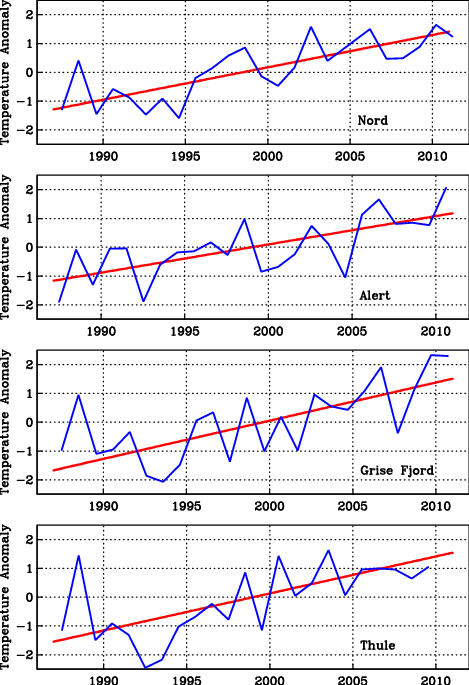
Annual averages and trends of air temperature anomalies for the 1987-2010 period for (top to bottom) Station Nord (North-East Greenland), Alert (Arctic Ocean, Canada), Grise Fjord (Baffin Bay, Canada), and Thule (North-West Greenland)
The above plot is far from perfect by the 6 design rules above; but on perfection, Dr. Daniel Steinbock tells us that “Perfect is Dead: Design Lessons from the Uncarved Block. To be human, so his argument, is to be imperfect. True, but shall we not also aspire to become better, to reduce clutter, to simplify as much as possible (but no more)?
Better eat now … pickled herrings.


Yes if you thinking about your trip to NE-Greenland and Jøkelsbugt, it will be important to limit the areas to focus on, I guess there a few cul-de-sacs.
Glad that the carving is still giving you peace!
It sure does … and it fits the title of this post with its elegant simplicity and intensity.
I am on an adventure today, visiting blogs from Greenland. While the carving is beautiful and I can kinda see how it could be related to data graphs the number stuff loses me!
But then again you mentioned pickled herring, and for me that’s a yum!
Growing up in a family of Polish/Italian descent, the Polish side has me eating pickled herring at New Years for good luck!
Yes, this essay covers several abstract topics all at once. The number stuff is about the warming climate with its many devils in the details.
You may find my post about an Air Force Base in North-Greenland at Thule written more clearly: “I am an air force brat. My father and my father-in-law enlisted …”
As for bits of pickled herrings, well, I can’t get enough of them to eat.