Radars, lasers, and fancy computers all shape the way we see the shape of glaciers. An airplane flies along a line down the glacier with (1) a good GPS. It carries (2) a vertical laser that measures the distance from the plane to the surface below while (3) an ice-penetrating radar measures where the ice meets the ocean. All these data are distributed freely by the University of Kansas’ Center for Remote Sensing of Ice Sheets (CReSIS) that is part of NASA’s Operation IceBridge.

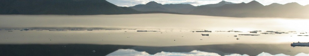
March-24, 2010 view of Petermann Glacier from NASA’s DC-8 aircraft. Photo credit goes to Michael Studinger of NASA’s IceBridge program who also blogged about this flight.
From CReSIS I gathered the data from Petermann Glacier before its break-up in 2010 and 2012. I show two flight tracks on a MODIS map for the same day that NASA’s DC-8 was collecting the shape data. There are two tracks as the airplane flies along the fjord out towards the ocean, turns, and flies back up inland. The seaward (red) track is slightly offset from the landward (black) track.

Petermann Glacier on March 24, 2010 from MODIS. The left panel shows the reflectance while the right panel shows the magnitude of the spatial gradient of this signal. Red and black dots are the flight tracks from which the shape of the glacier was measured by radar flown on a DC-8. The dark black line indicates where the glacier is grounded to bed rock ~500 meters below sea-level. The 3 boxes indicate location where the floating ice shelf terminated before 2010 (top box), after 2010 (middle box), and now (bottom box) due to the 2010 and 2012 ice islands. Top left are clouds, mountain shadows on left also.
The laser gives us the top surface of the ice while the radar gives us the bottom surface. Connect these two and we get ice thickness. Below I show how these ice elevations change along the glacier. The ocean is to the right near 65 km while the grounding line of the glacier is near -20 km, so the part of the glacier that is floating on the ocean was about 80 km in 2010, that’s about 50 miles. Now why is the red shape so different from the black line?

Shape of Petermann Glacier’s floating ice shelf on March 24, 2010 (top panel) and ice thickness (bottom panel). Radar data from University of Kansas, Center for Remote Sensing of Ice Sheets (CReSIS) with EGM2008 geoid corrections applied by me.
Well, the two tracks were NOT the same and these data show that the glacier varies in thickness and shape at small scales. The floating ice-sheet has lots of topography. It has hills, valleys, channels, and troughs. It stuns me to see how long and how steep this one specific channel is: it changes by almost 200 meters in 2 km. That’s huge. We do not fully understand how these channels form, why they are there, if they change over time, or perhaps most importantly, how do they relate to the stability of this or other glaciers. A first theoreticial PhD thesis was recently submitted by Carl Gladish. It is thought-provoking, but it does not settle the issue. We do not even know how many such channels there are, but there are ideas on how to perhaps do this with data both in hand and more to be collected.
Simplifying future analyses, I changed my Petermann MODIS and CReSIS co-ordinate system from latitude and longitude to a distance in kilometers along and across the glacier. The standard MODIS “color” (lets call this f) varies as one walks the glacier in its along-stream (call this x) and across-stream (call this y) directions. The color f is a function of x and y which scientists write as f=f(x,y). Now compare this color f(x,y) with the SPATIAL CHANGE (call this the slopes) of color that I show in the right panel. The MODIS data are the same, but why do they look so different in the two panels?
Well, the slopes draw the eye to smaller scale features in the right panel. This technique sharpens edges, fronts, and small spatial irregularities that our eyes tend to skip over. Our brains are trained to integrate and to condense information looking for the largest patterns first. So, taking the difference between adjacent values to get slopes and shapes, I do exactly the opposite and make sure that small irregularities stand out:

Close-up of March 24, 2010 MODIS image from the grounding line (black line at bottom) to the location of the present seaward front of the glacier (black box at top).
Notice the many stripes along the glacier near the bottom (x=0) right (y=80) near where the red triangle is. I believe these structures relate to sub-surface melt-channels of intense ice-ocean interactions, but belief is not truth and as scientists we must proof our believes and truths in ways that other people can check by repeating the experiments or calculations. There is so much more fun work to do, but, sadly, there are only 24 hours to a day.
Oh, and a (British) submarine is perhaps on the way to dive under this ice-shelf to take a close look and lots of data of under-ice topography, temperature, salinity, and bottom topography, if we can get a ship and experiment to get it there. So much work to do … [to be continued]


The challenge is to discover the difference between the values for heat input into the floating ice sheet tongue confined within the fjord and the input from the melt water, (and associated debris flow, itself containing a heat input value from its own turbulent motion), flowing down from the main ice sheet and on out under the grounding line and into the fjord.
You will need a very extensive survey of the flows running underneath the ice sheet tongue.
Speaking of ice tongues, Thwaites Glacier, Antarctica , Pine Islands neighbor has experienced a loss not unlike Petermann.
Yes, the physics and some of the geometries are very similar. The scales in Antarctica are much larger than they are in Greenland, though. This also applies to the (logistical) costs to study the problem that contributes to global sealevel rise. There is so much that is both uncertain and exciting to explore with both in-situ and remotely sensed data as well as computer models.
In this case the ice tongue calved off during the 2012 Austral winter which is unusual. Also the fjord walls are not the pinning points, but sub-glacial bedrock ridges and knobs. In this case the calving leaves the current terminus short of reaching the bedrock pinning point.
What makes you think that all this is known for Petermann (pinning points, lateral and vertical stress distributions)? I do not think it is … there is lots of NASA IceBridge and NASA/NSF CReSIS data that has yet to be analyzed, interpreted, and made available to a wider community.
Is there any word on whether the Brits are going ahead with the submarine observations?
Terry
Yes there is, Terry. And that word would be a yes. The caveat is that they need a ship and a larger science program to get them there. Devil, details, taxes … and much work that many people are currently working on. I can’t be more specific than this at the moment, but that hopefully changes before the next ice-melt season is over 😉